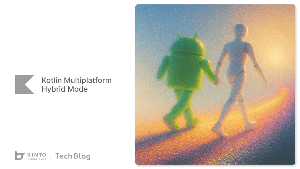
Kotlin Multiplatform ハイブリッドモード:Compose Multiplatform が SwiftUI や Jetpack Compose と融合
はじめに
こんにちは!Yao Xie です。 KINTOテクノロジーズのモバイルアプリ開発グループで、 Android のKINTO かんたん申込みアプリ を開発しています。本記事では、Compose Multiplatform とネイティブの UI フレームワークの両方を活用したハイブリッドモデルを実装する方法について、私の考えをいくつか共有したいと思います。
モバイルアプリの開発では、限られた予算や多様なチーム規模、厳しい納期などに直面しつつ、長期的な保守性と一貫したユーザー体験の確保が求められる場合が多くあります。Kotlin Multiplatform (KMP) 上に構築されたハイブリッド アーキテクチャには、コア UI フレームワークとして Compose Multiplatform が組み込まれ、iOS の SwiftUI や Android の Jetpack Compose といったネイティブフレームワークと組み合わせることで、そういった課題に柔軟に対応することができます。少ない予算で MVP を素早く立ち上げる場合でも、完成度の高いアプリへとスケールアップする場合でも、このアプローチなら制約に適応でき、コード品質も長期的に維持できます。

さまざまな制約に対応できる、柔軟で保守しやすいアプローチ
一貫性を保ちながらの迅速な開発
限られた予算、小規模なチーム、タイトなスケジュールといった制約のあるプロジェクトにおいて、私が感じている主なメリットは次のとおりです。
- 共有ビジネスロジック: ネットワーク処理、データモデル、ビジネスルールといったコア機能を KMP のモジュールに一度記述することで、Android と iOS の両方で一貫した動作が保証され、コードの重複を避けつつ将来的なメンテナンスが楽になります。
- Compose Multiplatform による共有 UI:Compose Multiplatform は Kotlin Multiplatform エコシステムの一部で、共有 Kotlin コードを基盤にして自然なかたちで成り立ち、UI コンポーネントを構築します。UI の大部分を、共用のコンポーザブルなコンポーネントとして開発します。Android では Jetpack Compose を通じてそのまま活用でき、iOS でも ComposeUIViewController などのヘルパーを使ってこれらのコンポーネントを組み込むことが可能です。このように統一されたアプローチを取ることで、両プラットフォームにおいて共通の設計・動作ガイドラインに従うことができ、長期的なサポートも容易になります。
この戦略で、一貫性を維持しながら開発時間を最小限に抑えることができます。高品質なユーザーエクスペリエンスの提供と将来を見据えたコード設計にとって、この要素は重要なポイントとなります。

- Android ロボットは、Google が作成および提供している作品から複製または変更したものであり、クリエイティブ・コモンズ表示 3.0 ライセンスに記載された条件に従って使用しています。*
ネイティブ拡張によるスケールアップ
プロジェクトに多くの資金、人員、追加の時間が確保できるようになると、次のようなことが可能になります。
- 段階的なネイティブ統合:強固な共有基盤があれば、ネイティブの UI 要素を使用して主要な画面を徐々に置き換えたり、改善したりすることができますたとえば、SwiftUI で iOS の重要な画面を強化し、プラットフォーム固有のデザイン標準により適した形に仕上げられます。
- expect/actual メカニズム:Kotlin の expect/actual パターンを使用することで、プラットフォーム固有のボタンなどといった汎用的な共有コンポーネントを定義し、それぞれのネイティブ実装を提供できます。こうすると、まずは共有 UI で開発を始め、洗練されたネイティブの改良を後から一番重要な箇所に限定して加えることができるようになります。

多様なチーム規模とプロジェクトのタイムラインに対応
ハイブリッドアプローチは、プロジェクトの成長に応じて臨機応変に対応できるように設計されています。
- 小規模なチームやタイトなスケジュールの場合:コードの再利用を最大限に活用することが焦点になります。少人数のチームでも共有のビジネスロジックや UI を構築・維持することができ、一貫性を保ちつつ、市場投入までのスピードを加速できます。
- 大規模なチームや開発期間に余裕がある場合:チームが拡大したりスケジュールに余裕ができたら、ネイティブコンポーネントの開発に追加のリソースを投入して、ユーザーエクスペリエンスを向上させます。こういった段階的な戦略を取ることでリスクを最小限に抑え、コアロジックの安定性と保守性を長期にわたって確保できます。
共有ロジックと UI の一貫性をプラットフォーム間で保つと、複雑さと技術的な負債が軽減され、プロジェクトの保守や拡張がもっと楽になります。

Kotlin Multiplatform ハイブリッドモードを示すコードスニペット
共有ビジネスロジック
この共有モジュールでは、Android アプリと iOS アプリの両方で同じコアロジックを利用することができます。このため、一貫性が保たれてメンテナンスにかかるオーバーヘッドが軽減されます。
// Api
interface Api {
    suspend fun getUserProfile():User
}

class ApiImpl(private val client:HttpClient) :Api {
    override suspend fun getUserProfile():User {
        return client.get {
            url {
                protocol = URLProtocol.HTTPS
                host = "yourdomain.com"
                path("yourpath")
            }
        }.safeBody()
    }
}
// Repository
interface UserRepository {
    suspend fun getUserProfile():Flow<User>
}

class UserRepositoryImpl(private val api:Api) :UserRepository {
    override suspend fun getUserProfile():Flow<User> {
        return flowOf(api.getUserProfile())
    }
}

// ViewModel
class ProfileViewModel(
    private val repository:UserRepository,
) :ViewModel() {

    private val _uiState = MutableStateFlow(ProfileUiState())
    val uiState:StateFlow<ProfileUiState> = _uiState.asStateFlow()

    @OptIn(ExperimentalCoroutinesApi::class)
    fun onAction(action:ProfileScreenAction) {
        when (action) {
            is ProfileScreenAction.OnInit -> {
                viewModelScope.launch {
                    // Set loading state to true
                    _uiState.update { it.copy(isLoading = true) }

                    // Retrieve authorization info and then fetch user profile data
                    repository.getAuthorizationInfo()
                        .flatMapLatest { authInfo ->
                            // If authInfo exists, call getUserProfile() to get user data; otherwise, emit null
                            if (authInfo != null) {
                                repository.getUserProfile()
                            } else {
                                flowOf(null)
                            }
                        }
                        // Catch any exceptions in the Flow chain
                        .catch { e ->
                            e.printStackTrace()
                        }
                        // Collect the user profile data and update the UI state
                        .collect { userProfile ->
                            _uiState.update { state ->
                                state.copy(
                                    isLoading = false,
                                    data = userProfile,
                                    errorMessage = if (userProfile == null) "User profile data is null" else null
                                )
                            }
                        }
                }
            }
        }
    }
}
Compose Multiplatform による共有 UI
Kotlin Multiplatform に統合されている Compose Multiplatform は、共有の Kotlin コード上で UI コンポーネントの作成が可能です。
@Composable
fun ProfileScreen(
    viewModel:ProfileViewModel = koinViewModel()
) {
    val uiState = viewModel.uiState.collectAsState().value

    LaunchedEffect(Unit) { viewModel.onAction(ProfileScreenAction.OnInit) }

    Column(
        modifier = Modifier
            .fillMaxSize()
            .verticalScroll(rememberScrollState())
            .background(White)
            .padding(16.dp)
    ) {
        // Profile header with image and user details
        Row(
            modifier = Modifier
                .fillMaxWidth()
                .background(White, shape = RoundedCornerShape(16.dp))
                .padding(16.dp),
            verticalAlignment = Alignment.CenterVertically
        ) {
            AsyncImage(
                model = uiState.data.profileImage,
                contentDescription = "Profile Image",
                modifier = Modifier
                    .size(64.dp)
                    .clip(CircleShape)
            )
            Spacer(modifier = Modifier.width(16.dp))
            Column {
                Text(
                    text = uiState.data.userName,
                    fontSize = 16.sp,
                    color = Color.Black
                )
                Text(
                    text = uiState.data.email,
                    fontSize = 14.sp,
                    color = Color.Blue.copy(alpha = 0.6f)
                )
            }
        }
        Spacer(modifier = Modifier.height(16.dp))
        MenuLabel(label = "Account Settings")
        ....
    }
}
リーンアプローチ:このコンポーザブルを両プラットフォームで直接使用すると、外観と動作の一貫性が維持できて便利だと思います。
スケールアプローチ:基盤となるビジネスロジックには手を加えず、必要に応じてネイティブコンポーネントを使用して UI を強化します。
expect/actual 経由のネイティブ UI
expect コンポーネントを定義します。
@Composable
expect fun PlatformButton(
    modifier:Modifier = Modifier,
    label:String,
    onClick: () -> Unit
)
Android 向けの実装 (androidMain)
@Composable
actual fun PlatformButton(
    modifier:Modifier,
    label:String,
    onClick: () -> Unit
) {
    Button(
        onClick = onClick,
        modifier = modifier
    ) {
        Text(text = label)
    }
}
iOS 向けの実装 (iosMain)
@Composable
actual fun PlatformButton(
    modifier:Modifier,
    label:String,
    onClick: () -> Unit
) {
    UIKitView(
        modifier = modifier,
        factory = {
            // Create a native UIButton instance.
            val button = UIButton.buttonWithType(buttonType = 0)
            button.setTitle(label, forState = UIControlStateNormal)
            // Style the button
            ...

            // Create a target object to handle button clicks.
            val target = object :NSObject() {
                @ObjCAction
                fun onButtonClicked() {
                    onClick()
                }
            }
            // Add the target with an action selector.
            button.addTarget(
                target = target,
                action = NSSelectorFromString("onButtonClicked"),
                forControlEvents = UIControlEventTouchUpInside
            )
            button
        }
    )
}
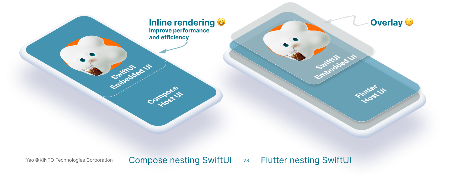
ブレンド UI:Flutter に対する大きな強み
Flutter と異なり、Compose Multiplatform は1 つの画面上で共有 UI とネイティブコンポーネントをシームレスに組み合わせることをサポートしてくれます。
共有 UI からネイティブ UI へ完全に切り替える必要のない場合が多く、1つの画面上で両者を組み合わせることができます。このアプローチで、画面全体をどちらか一方のフレームワークに完全に任せることなくCompose Multiplatform とネイティブフレームワークそれぞれの強みを活かすことができます。たとえば、iOS で SwiftUI のネイティブリストと並べて共有の コンポーザブルヘッダーを表示したいとします。
ブレンド UI は、次のように構築できます。
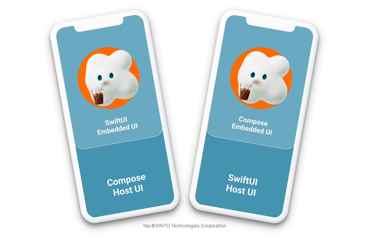
ネイティブレイアウトに共有コンポーザブルを埋め込む
Compose Multiplatform の強みのひとつは、共有 Compose UI コンポーネントをネイティブ SwiftUI レイアウト内にシームレスに埋め込めることです。開発者は画面全体を書き直さなくとも、共有コンポーネントを段階的に導入することができます。この柔軟性は、Flutter のオーバーレイ方式では実現が難しいものです。
たとえば、SwiftUI をコンテナとして使用して、その中に UIViewController でラップした Compose Multiplatform の共有 UI を埋め込むことができます。
import SwiftUI
import shared  // Import the shared KMP framework

struct ComposeContainerView:UIViewControllerRepresentable {
    let user:User

    func makeUIViewController(context:Context) -> UIViewController {
        // Use the Compose wrapper to create the UIViewController
        return AppComposeUI().createProfileVC(user)
    }

    func updateUIViewController(_ uiViewController:UIViewController, context:Context) { }
}

struct ContentView:View {
    let user:User

    var body: some View {
        VStack {
            Text("Native SwiftUI Header")
                .font(.headline)
                .padding()
            // Embed the Compose UI inside SwiftUI.
            ComposeContainerView(user: user)
                .frame(height:250)
            List {
                Text("Native SwiftUI Item 1")
                Text("Native SwiftUI Item 2")
            }
        }
    }
}
Compose Multiplatform 画面にネイティブ iOS UI を 埋め込む
Compose Multiplatform では、共有 Compose 画面内に SwiftUI や UIKit などのネイティブ iOS ビューを埋め込むことも可能です。これも、Flutter では簡単に実現できない機能のひとつです。
埋め込む SwiftUI ビューを定義します。
import SwiftUI
struct MySwiftUIView:View {
    let user:User
    var body: some View {
        VStack {
            Text("Native SwiftUI Content")
                .font(.body)
            Text("Welcome, \(user.firstName)")
        }
        .padding()
        .background(Color.gray.opacity(0.2))
        .cornerRadius(8)
    }
}
次に、UIKitView を使用してこのネイティブ ビューを共有 Compose UI に統合します。
@Composable
fun ComposeWithNativeUI(user:User) {
    Column {
        // Shared Compose UI header.
        ProfileHeader(user = user)
        Spacer(modifier = Modifier.height(16.dp))
        // Embed a native iOS view using UIKitView.
        UIKitView(factory = {
            // Create a UIHostingController with a SwiftUI view.
            val hostingController = UIHostingController(rootView = MySwiftUIView(user = user))
            hostingController.view
        }, modifier = Modifier.fillMaxWidth().height(100.dp))
    }
}
この双方向のインライン統合により、Compose Multiplatform が Flutter と明確に差別化されます。これでネイティブのルックアンドフィールを保ちながら、共有 UI コンポーネントを段階的に導入できるようになります。共有コードの効率性とネイティブ UI の豊かさ・品質を兼ね備えているので、開発者は柔軟に対応でき、大規模な書き換えリスクも抑えられます。
Compose Multiplatform は、共有 UI とネイティブプラットフォーム UI をより柔軟できめ細かく統合できます。この点で、Flutter よりも大きな強みがあります。Flutter は通常、オーバーレイ方式で共有 UI コンポーネントをレンダリングします。それとは異なり、Compose Multiplatform はインラインレンダリングを採用していて、共有 UI とネイティブ UIの要素を自然に組み合わせることができます。
長所
柔軟性、保守性、拡張性のベストプラクティス
ラピッドプロトタイピングを取り入れる
ユーザーがまだアプリに触れていない段階で、ピクセル単位の細部を完璧に仕上げようと何週間も費やすのは、リスクが高いことだと痛感しました。それを痛感しました。最近では、私たちのチームは 1〜2 週間で共有 UI のプロトタイプを作成し、関係者に配布して、早期にフィードバックを収集するようにしています。アイデアに手応えを感じたら、それまでに作ったものは捨てずに、ネイティブの装飾(アニメーション、プラットフォーム固有のジェスチャーなど)を重ねていきます。
段階的な開発を計画する
私たちの経験則は、「まずは小さくリリース、後からリファクタリング」です。最初は、コアロジック用の Kotlin Multiplatform モジュールと単独の共有 Compose 画面からスタートします。その構成で上手く動くことが確認できたら、次の画面の実装に進んだり、共有ウィジェットを SwiftUI や Jetpack Compose のバージョンに置き換えたりと、作業を1つずつ進めます。徐々に進めるやり方で、開発スピードを保ち、書き直しを避けることができます。
リソース、品質、スケーラビリティのバランスをとる
チームがまだ2人だけだった頃は、UI の9割を共有コードで作っていました。それが、限られた体制でできる精一杯の方法だったからです。メンバーが増えてデザインへのこだわりも強くなるにつれて、重要なフローはネイティブ実装に切り替え、その他の部分は共有コードのままにしました。このように段階的に移行したことで、バックログを現実的な状態に保ち、リリースに支障をきたすことなく品質を高めることができました。
一貫性を保つ
ビジネスロジックを1つの Kotlin モジュールに集約することで、マージに伴う悩みの種が数え切れないほど軽減されました。1回のバグ修正で、すべてのプラットフォームに反映されます。「iOS は直ったけど、Android はまだバグってる」のように取り残されることは、もうありません。派手さはありません。ですが、この共通コアがあるからこそ、チームは締め切り直前の夜でも安眠することができます。
変化への適応力を確保する
複数のプラットフォームにまたがるプロジェクトを率いた経験から言えるのは、成功するチームはアーキテクチャを静的な設計図ではなく、生き物のような存在として扱っています。予算が厳しくなったり、スケジュールが変わったり、突然新しいスキルを持つメンバーが加わっても対応できるよう、すべてのレイヤーを柔軟に設計しています。Compose Multiplatform を使用することで共有 UI とネイティブ UI をオンデマンドで組み合わせられるので、「MVP モード」から「ネイティブ仕上げモード」へ、数ヶ月とかからずに数日で切り替えることができます。製品戦略や市場が一夜にして変わったときも、この臨機応変さには何度も助けられてきました。
結論
Kotlin Multiplatform と Compose Multiplatform を基盤に、ネイティブ UI フレームワークと併用して構築されたこの適応力の高いハイブリッドアーキテクチャは、他に類を見ない柔軟性を備えています。このハイブリッドアーキテクチャがあれば、一貫性と長期的な保守性を維持しつつ、予算、チーム規模、スケジュールといった制約に応じて開発戦略を柔軟に調整できます。小規模なプロジェクトでは、コードの再利用を最大限に活用してスピーディに立ち上げましょう。そしてリソースが増えてきたら、コアロジックはそのままに、重要な画面をネイティブ UI で徐々に強化します。
重複の削減、メンテナンスの効率化に、柔軟で段階的なこのモデルを取り入れてみてください。そしてプロジェクトの成長に応じて拡張していける、一貫性のある高品質なユーザーエクスペリエンスを実現してください。
関連記事 | Related Posts
Kotlin Multiplatform ハイブリッドモード:Compose Multiplatform が SwiftUI や Jetpack Compose と融合
SwiftUI in Compose Multiplatform of KMP

Applying KMP to an Existing App: Our Team’s Experience and Achievements
Mobile App Development Using Kotlin Multiplatform Mobile (KMM) and Compose Multiplatform
Mobile App Development Using Kotlin Multiplatform Mobile (KMM)
SwiftUIをCompose Multiplatformで使用する
We are hiring!
【ソフトウェアエンジニア(リーダークラス)】共通サービス開発G/東京・大阪・福岡
共通サービス開発グループについてWebサービスやモバイルアプリの開発において、必要となる共通機能=会員プラットフォームや決済プラットフォームなどの企画・開発を手がけるグループです。KINTOの名前が付くサービスやKINTOに関わりのあるサービスを同一のユーザーアカウントに対して提供し、より良いユーザー体験を実現できるよう、様々な共通機能や顧客基盤を構築していくことを目的としています。
【ソフトウェアエンジニア(メンバークラス)】共通サービス開発G/東京・大阪・福岡
共通サービス開発グループについてWebサービスやモバイルアプリの開発において、必要となる共通機能=会員プラットフォームや決済プラットフォームなどの企画・開発を手がけるグループです。KINTOの名前が付くサービスやKINTOに関わりのあるサービスを同一のユーザーアカウントに対して提供し、より良いユーザー体験を実現できるよう、様々な共通機能や顧客基盤を構築していくことを目的としています。