When We Put Compose on Top of BottomSheetDialogFragment, Anchoring a Button to the Bottom Proved Harder Than Expected

This article is part of day 6 of KINTO Technologies Advent Calendar 2024. 🎅🎄
Introduction
Merry Christmas 🔔. I am Romie (@Romie_ktc) from Osaka Tech Lab, where I work on Android-side development for the my route app in the Mobile App Development Group. In the my route Android team, we are currently switching the UI implementation from XML over to Jetpack Compose (hereinafter, Compose). However, since we cannot refactor everything all in one go, there will inevitably be situations where parts converted to Compose will be layered on top of XML. In this article, how we implemented it by overlaying Compose on top of the BottomSheet XML.
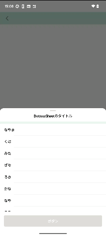 What the finished result looks like
Basics
The implementation is done with the following classes, which inherit BottomSheetDialogFragment.
class MixComposedBottomSheetDialog : BottomSheetDialogFragment()
Set the Basic Behavior of the BottomSheet.
Here, we set the behavior of the BottomSheet. The following code is put in onCreateView.
dialog?.setOnShowListener { dialogInterface ->
    val bottomSheetDialog = dialogInterface as BottomSheetDialog
    val bottomSheet = bottomSheetDialog.findViewById<View>(com.google.android.material.R.id.design_bottom_sheet)
    // If you want to set rounded corners and a background color, follow the steps below
    context?.let { bottomSheet?.background = ContextCompat.getDrawable(it, R.drawable.background_map_bottom_sheet) }
    val bottomSheetBehavior = bottomSheet?.let { BottomSheetBehavior.from(it) }
    bottomSheetBehavior?.let { behavior ->
        // Set maxHeight and peekHeight to whatever heights you want.
        behavior.maxHeight = EXPANDED_HEIGHT // Set the height for when the BottomSheet is expanded as far as it will go
        behavior.peekHeight = COLLAPSED_HEIGHT // Set the height for when the BottomSheet is displayed in its initial state
        behavior.isHideable = false
        behavior.isDraggable = true
    }
}
Compose
By returning ComposeView via onCreateView, you can put Compose on top of BottomSheetDialogFragment.
return ComposeView(requireContext()).apply {
    setViewCompositionStrategy(ViewCompositionStrategy.DisposeOnViewTreeLifecycleDestroyed)
    setContent {
        BottomSheetContents()
    }
}
If this is all you want to do, then it is easy enough to understand. However, if you want to add a button that will always be at the bottom of the bottom sheet, things get trickier.
Developing Things Further
The button itself is implemented with Compose. However, adding a button in this way means it will not be displayed unless you scroll through the contents.
return ComposeView(requireContext()).apply {
    setViewCompositionStrategy(ViewCompositionStrategy.DisposeOnViewTreeLifecycleDestroyed)
    setContent {
        BottomSheetContents()
        ButtonOnBottomSheet()
    }
}
To ensure that the button will always be anchored to the bottom of the bottom sheet and will not get pulled about even by scrolling through the contents, you need to implement something like the following:
val button =
    ComposeView(context ?: return@setOnShowListener).apply {
        setViewCompositionStrategy(ViewCompositionStrategy.DisposeOnViewTreeLifecycleDestroyed)
        setContent {
            ButtonOnBottomSheet()
        }
    }
To anchor the button to the bottom of the bottom sheet, use the following code. Using this code enables you to directly retrieve the layout implemented with BottomSheetDialogFragment. Consequently, it enables you to manipulate views more flexibly.
val containerLayout = dialogInterface.findViewById<FrameLayout>(com.google.android.material.R.id.container)
val coordinatorLayout = dialogInterface.findViewById<CoordinatorLayout>(com.google.android.material.R.id.coordinator)
clipChildren is a property of ViewGroup that specifies whether to clip the drawing of a child view if it will be drawn outside the boundary of the parent view. It will be used when something overlaps other elements of the bottom sheet.
// The default value is true, and setting it to false lets you display child views as is even if they go outside the boundary of the parent.
button.clipChildren = false

button.layoutParams =
    FrameLayout.LayoutParams(
        FrameLayout.LayoutParams.MATCH_PARENT,
        FrameLayout.LayoutParams.WRAP_CONTENT,
    ).apply {
        gravity = Gravity.BOTTOM
    }
containerLayout?.addView(button)

button.post {
    val layoutParams = coordinatorLayout?.layoutParams as? ViewGroup.MarginLayoutParams
    layoutParams?.apply {
        button.measure(
            View.MeasureSpec.makeMeasureSpec(0, View.MeasureSpec.UNSPECIFIED),
            View.MeasureSpec.makeMeasureSpec(0, View.MeasureSpec.UNSPECIFIED),
        )
        this.bottomMargin = button.measuredHeight
        containerLayout?.requestLayout()
    }
}
Summary
Summarizing the implementation so far, we have the following:
override fun onCreateView(): View {
    dialog?.setOnShowListener { dialogInterface ->
        val bottomSheetDialog = dialogInterface as BottomSheetDialog

        val containerLayout = dialogInterface.findViewById<FrameLayout>(com.google.android.material.R.id.container)
        val coordinatorLayout = dialogInterface.findViewById<CoordinatorLayout>(com.google.android.material.R.id.coordinator)
        val bottomSheet = bottomSheetDialog.findViewById<View>(com.google.android.material.R.id.design_bottom_sheet)
        context?.let { bottomSheet?.background = ContextCompat.getDrawable(it, R.drawable.background_map_bottom_sheet) }

        val button =
            ComposeView(context ?: return@setOnShowListener).apply {
                setViewCompositionStrategy(ViewCompositionStrategy.DisposeOnViewTreeLifecycleDestroyed)
                setContent {
                    ButtonOnBottomSheet()
                }
            }
        button.clipChildren = false

        button.layoutParams =
            FrameLayout.LayoutParams(
                FrameLayout.LayoutParams.MATCH_PARENT,
                FrameLayout.LayoutParams.WRAP_CONTENT,
            ).apply {
                gravity = Gravity.BOTTOM
            }
        containerLayout?.addView(button)

        button.post {
            val layoutParams = coordinatorLayout?.layoutParams as? ViewGroup.MarginLayoutParams
            layoutParams?.apply {
                button.measure(
                    View.MeasureSpec.makeMeasureSpec(0, View.MeasureSpec.UNSPECIFIED),
                    View.MeasureSpec.makeMeasureSpec(0, View.MeasureSpec.UNSPECIFIED),
                )
                this.bottomMargin = button.measuredHeight
                containerLayout?.requestLayout()
                val bottomSheetBehavior = bottomSheet?.let { BottomSheetBehavior.from(it) }
                bottomSheetBehavior?.let { behavior ->
                    // Set maxHeight and peekHeight to whatever heights you want.
                    behavior.maxHeight = EXPANDED_HEIGHT // Set the height for when the BottomSheet is expanded as far as it will go
                    behavior.peekHeight = COLLAPSED_HEIGHT // Set the height for when the bottom sheet is displayed in its initial state
                    behavior.isHideable = false
                    behavior.isDraggable = true
                }
            }
        }
    }

    return ComposeView(requireContext()).apply {
        setViewCompositionStrategy(ViewCompositionStrategy.DisposeOnViewTreeLifecycleDestroyed)
        setContent {
            BottomSheetContents()
        }
    }
}
In other words, here's how we implemented it:
- Create a BottomSheet in xml.
- Adjust the layout (i.e., the heights and so on).
- In order to attach the button to the bottom of the BottomSheet, prepare some more layout details and combine everything together.
- It means that we overlaid the Compose content onto the BottomSheet.
Thank you for reading all the way to the end!
関連記事 | Related Posts
When We Put Compose on Top of BottomSheetDialogFragment, Anchoring a Button to the Bottom Proved Harder Than Expected
Android View から Jetpack Compose への移行の第一歩
必須! 既存のAndroidアプリをedge-to-edge対応にするための速習ガイド

Compose超初心者のPreview感動体験
myroute Android AppでのJetpack Compose
Compose化した画面の初期化処理、initブロックでやるか?LaunchedEffect(Unit)内でやるか?
We are hiring!
ビジネスアナリスト(マーケティング/事業分析)/分析プロデュースG/東京・大阪・福岡
デジタル戦略部 分析プロデュースグループについて本グループは、『KINTO』において経営注力のもと立ち上げられた分析組織です。決まった正解が少ない環境の中で、「なぜ」を起点に事業と向き合い、分析を軸に意思決定を前に進める役割を担っています。
【オープンポジション】「気になる!」方はまずはこちらからご応募ください。/東京・名古屋・大阪・福岡
業務内容国内外のKINTOサービスや、トヨタグループの金融、モビリティサービスの内製開発組織である同社にて、ご経験・ご志向性に応じて配属を決定し、ご活躍いただきます。