Jetpack Compose Animation Techniques: Enhance App Impressions with Minimal Code Changes
This article is for Day 8 of the KINTO Technologies Advent Calendar 2025.
I'm Tsuyoshi Yamada, an Android engineer at KINTO Technologies.
In this article, I'll introduce a collection of examples for adding animations to Jetpack Compose UIs with minimal code additions and changes to enhance the impression of animations.
1. Introduction
Animation is one of the key elements that significantly affects the impression of a smartphone app. Well-placed, thoughtful animations provide visual feedback for user actions, make app behavior easier to understand, enhance the app's impression, and increase user trust in quality. Jetpack Compose leverages the characteristics of declarative UI to enable highly productive animation implementation with shorter, more concise code than the traditional View system. This article introduces practical techniques for easily adding animations to existing source code with minimal additions and modifications.
This article verifies source code using Jetpack Compose Libraries BOM 2025.12.00, which includes the latest stable version 1.10.0 of Compose Animation at the time of writing.
2. Animation for UI Components with Coordinate Specifications
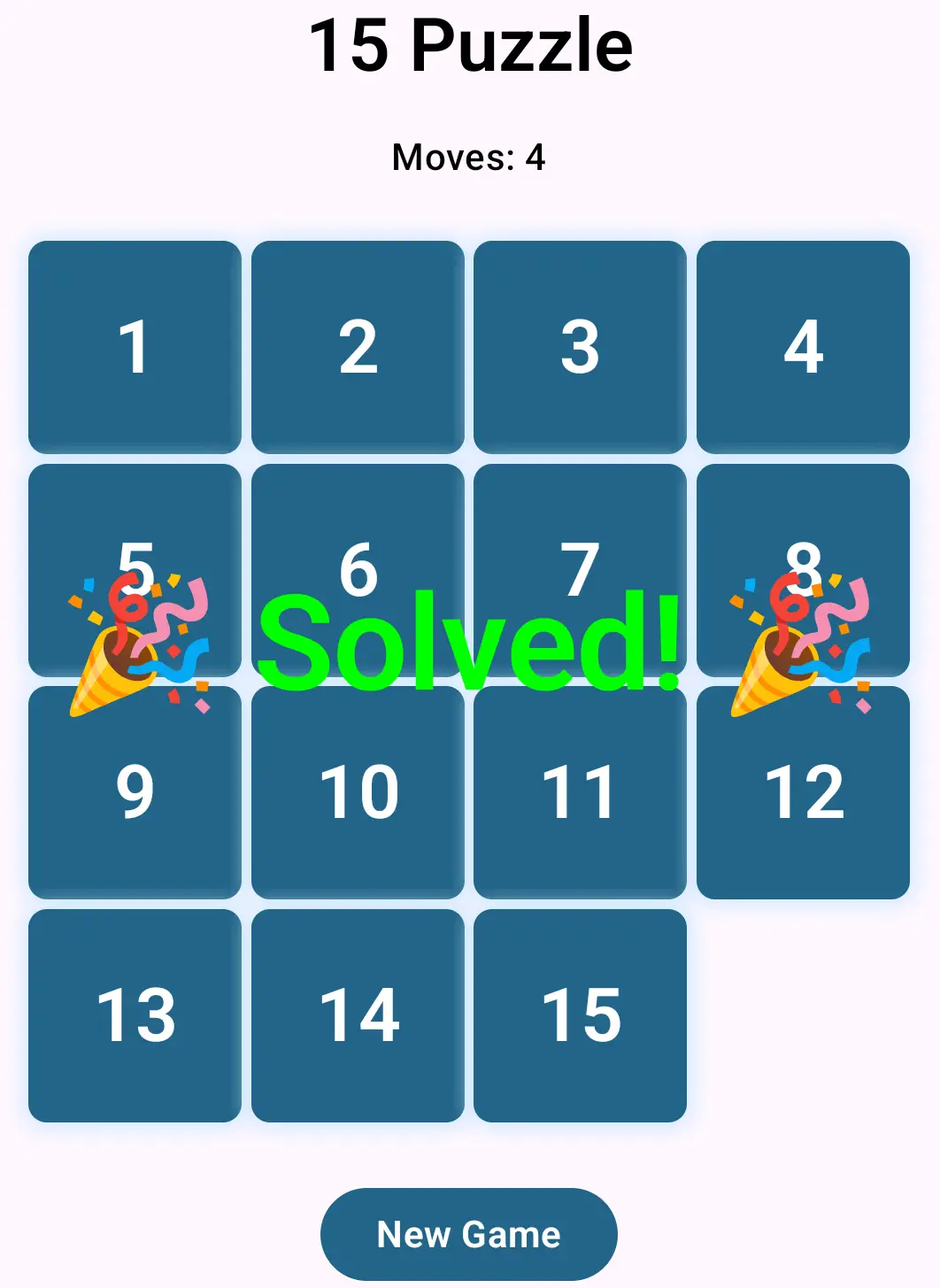
The following code implements a simple puzzle game (15 Puzzle) in concise code:
@Composable
fun Puzzle15(modifier: Modifier = Modifier) {
    var puzzleState by remember {
        mutableStateOf(PuzzleState.generate())
    }
    var moves by remember { mutableIntStateOf(puzzleState.moves) }
    val solved = puzzleState.isSolved()

    val titleStyle = MaterialTheme.typography.headlineLarge.merge(fontWeight = FontWeight.W600)
    val movesStyle = MaterialTheme.typography.titleMedium
    val solvedStyle =
        MaterialTheme.typography.titleLarge.merge(color = Color.Green, fontWeight = FontWeight.W600)
    val buttonStyle = MaterialTheme.typography.titleMedium.merge(fontWeight = FontWeight.W600)

    Box(modifier = Modifier.fillMaxWidth(), contentAlignment = Alignment.Center) {
        Column(
            modifier = modifier
                .fillMaxSize()
                .padding(16.dp),
            horizontalAlignment = Alignment.CenterHorizontally,
            verticalArrangement = Arrangement.Center
        ) {
            Text(
                text = "15 Puzzle",
                style = titleStyle,
                modifier = Modifier.padding(bottom = 16.dp)
            )

            Text(text = "Moves: $moves", style = movesStyle)

            PuzzleGrid(
                puzzleState = puzzleState,
                modifier = Modifier.padding(vertical = 24.dp)
            ) { index ->
                if (solved) return@PuzzleGrid
                puzzleState.moveTile(index)
                moves = puzzleState.moves
            }

            Button(onClick = {
                puzzleState = PuzzleState.generate()
                moves = 0
            }) {
                Text("New Game", style = buttonStyle)
            }
        }

        if (solved) {
            Text(text = "🎉 Solved! 🎉", style = solvedStyle)
        }
    }
}
The 15 tiles drawn in a 4x4 grid are displayed with the following code:
@Composable
private fun PuzzleGrid(
    puzzleState: PuzzleState,
    modifier: Modifier = Modifier,
    onTileClick: (Int) -> Unit
) {
    BoxWithConstraints(
        modifier = modifier
            .fillMaxWidth()
            .aspectRatio(1F)
    ) {
        val gridSize = maxWidth
        val tileSize = (gridSize - 12.dp) / 4 // 3 gaps of 4dp

        for (position in 0.until(PuzzleState.GRID_COUNT)) {
            val value = puzzleState.tileAt(position)
            if (value == 0) continue
            val targetOffset = DpOffset(
                x = (tileSize + 4.dp) * (position % 4),
                y = (tileSize + 4.dp) * (position / 4)
            )

            PuzzleTile(
                value = value,
                onClick = { onTileClick(position) },
                modifier = Modifier
                    .offset(x = targetOffset.x, y = targetOffset.y)
                    .size(tileSize)
            )
        }
    }
}
Users tap movable tiles to move them to empty squares, repeating this operation to complete the puzzle. Up to 3 tiles can be moved simultaneously in a single move. While this is enjoyable enough as a simple game, it would be nice to have the physical sensation of moving tiles like in a real-world puzzle game. We aim to express this through animation.
The class representing the logical puzzle state is as follows:
class PuzzleState private constructor(private val tiles: IntArray) {
    var moves = 0
        private set

    fun isSolved(): Boolean = tiles.all { tiles[it] == it + 1 || it == 15 }

    private fun getMoveOffsetOrZero(index: Int): Int {
        val emptyIndex = tiles.indexOf(0)
        val row = index / 4
        val col = index % 4
        val emptyRow = emptyIndex / 4
        val emptyCol = emptyIndex % 4

        return when {
            row == emptyRow -> {
                if (col < emptyCol) 1 else -1
            }

            col == emptyCol -> {
                if (row < emptyRow) 4 else -4
            }

            else -> 0
        }
    }

    fun moveTile(index: Int) {
        val offset = getMoveOffsetOrZero(index)
        if (offset == 0) return

        var position = index
        do {
            position += offset
        } while (position >= 0 && position < tiles.size && tiles[position] != 0)
        do {
            val next = position - offset
            tiles[position] = tiles[next]
            position = next
        } while (position != index)
        tiles[index] = 0
        moves += 1
    }

    fun tileAt(index: Int) = tiles[index]

    companion object {
        const val GRID_COUNT = 16

        fun generate(): PuzzleState {
            val tiles = IntArray(GRID_COUNT) { it }
            // Shuffle (generate only solvable configurations)
            do {
                tiles.shuffle(Random.Default)
            } while (!isSolvable(tiles))
            return PuzzleState(tiles)
        }

        private fun isSolvable(tiles: IntArray): Boolean {
            val inversions = (0..15).sumOf { idx ->
                (idx + 1 until tiles.size).count {
                    tiles[idx] != 0 && tiles[it] != 0 && tiles[idx] > tiles[it]
                }
            }
            // Solvable if blank is on odd row (from bottom) and inversions are even, or blank is on even row and inversions are odd
            return (3 - tiles.indexOf(0) / 4) % 2 == inversions % 2
        }
    }
}
2.1. Define a State that Holds Coordinate (Offset) State
In the following code, we convert targetOffset from the original PuzzleGrid(...) using animateValueAsState(...) to define a new animatedOffset, and replace the arguments of Modifier.offset(...) in PuzzleTile(...). animatedOffset represents the same offset as targetOffset while having the capability to smoothly express changes in offset from before to after tile movement.
However, in this example, these 12 lines of code alone don't animate; we needed to use the variable tilePositions that sorts the display order, as commented with // Track current position of each tile (by value). This sorting ensures that the order of tiles in the for loop within PuzzleGrid(...) is always kept in order of the numbers on the tiles. By doing this, under Jetpack Compose's declarative UI concept, we ensure expression continuity by always identifying tiles 1-15 as the same before and after movement, enabling animation display (we hoped the label argument of animateValueAsState would identify composable identity, but this effect was not confirmed in androidx.compose.animation library 1.10.0. Also, using key(...) to identify composables was considered, but this also doesn't seem to work):
@Composable
private fun PuzzleGrid(
    puzzleState: PuzzleState,
    modifier: Modifier = Modifier,
    onTileClick: (Int) -> Unit
) {
    // Track current position of each tile (by value)
    val tilePositions = IntArray(16) { -1 }
    repeat(PuzzleState.GRID_COUNT) { index ->
        tilePositions[puzzleState.tileAt(index)] = index
    }

    BoxWithConstraints(
        modifier = modifier
            .fillMaxWidth()
            .aspectRatio(1F)
    ) {
        val gridSize = maxWidth
        val tileSize = (gridSize - 12.dp) / 4 // 3 gaps of 4dp

        // Draw tiles except blank (for each value 1-15)
        for (value in 1.until(PuzzleState.GRID_COUNT)) {
            val position = tilePositions[value]
            if (position == -1) continue
            val targetOffset = DpOffset(
                x = (tileSize + 4.dp) * (position % 4),
                y = (tileSize + 4.dp) * (position / 4)
            )

            val animatedOffset by animateValueAsState(
                targetValue = targetOffset,
                typeConverter = TwoWayConverter(
                    convertToVector = { AnimationVector2D(it.x.value, it.y.value) },
                    convertFromVector = { DpOffset(Dp(it.v1), Dp(it.v2)) }
                ),
                animationSpec = spring(
                    dampingRatio = Spring.DampingRatioNoBouncy,
                    stiffness = Spring.StiffnessMedium
                ),
                label = "tile_$value"
            )

            PuzzleTile(
                value = value,
                onClick = { onTileClick(position) },
                modifier = Modifier
                    .offset(x = animatedOffset.x, y = animatedOffset.y)
                    .size(tileSize)
            )
        }
    }
}
Nonetheless, with the addition of about a dozen lines of code and a few changes, we were able to express animation while keeping the code structure mostly intact. To customize this animation, try changing the typeConverter, animationSpec, and other arguments of animateValueAsState(...). I'll continue introducing techniques for efficiently adding animations in the following sections.
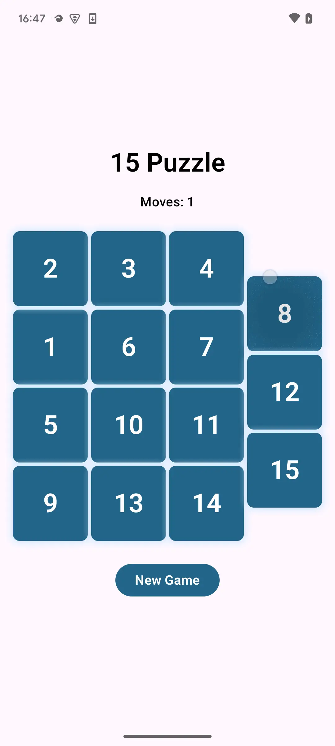
Fig. 1: Puzzle animating
3. Adding Animation for Show/Hide Transitions
In the puzzle game above, the display when solving the puzzle is rather plain, so we'd like to add some flair. That said, since it's a mini-game, something modest will do. For now, let's consider an effect where something pops out when the puzzle is solved.
There's a simple method prepared for this.
3.1. Wrap with AnimatedVisibility(...) and Add Modifier.animateEnterExit(...) Inside
Simply changing if (solved) { ... } to AnimatedVisibility(solved) { ... } enables default animations when transitioning from hidden to visible and from visible to hidden. To change the default animation, add animateEnterExit(...) to the Modifier of each composable wrapped by AnimatedVisibility(solved) { ... }:
@Composable
fun Puzzle15(modifier: Modifier = Modifier) {

    // ...

    Box(modifier = Modifier.fillMaxWidth(), contentAlignment = Alignment.Center) {

        // ...

        AnimatedVisibility(solved) {
            Text(
                text = "🎉 Solved! 🎉",
                modifier = Modifier.animateEnterExit(
                    enter = scaleIn(
                        animationSpec = spring(
                            dampingRatio = Spring.DampingRatioHighBouncy,
                            stiffness = Spring.StiffnessMedium
                        )
                    ),
                    exit = None
                ),
                style = solvedStyle
            )
        }
    }
}
The enter and exit of Modifier.animateEnterExit(...) set the animations for transitioning from hidden to visible and from visible to hidden, respectively. The default values are set to fadeIn() and fadeOut(), respectively. In this case, since we only want to set animation when appearing, we set None for exit so it disappears without animation.
Wrapping a composable with an upper-level composable to create a scope (AnimatedVisibilityScope) and adding individual settings to the Modifier of wrapped individual composables is a frequently used technique in Jetpack Compose. Similar techniques will appear later.
4. Expressing Animation Where Old Screen Disappears and New Screen Appears on Screen Update
The following code represents the action of moving on a 2D integer coordinate plane by tapping arrow buttons for up, down, left, and right:
@Composable
fun FlatField(modifier: Modifier = Modifier) {
    var xy by remember { mutableStateOf(Coordinates2D(0, 0)) }

    Box(
        modifier = Modifier
            .fillMaxSize()
            .background(xy.background)
            .safeContentPadding()
    ) {
        IconButton(
            modifier = modifier.align(Alignment.CenterStart),
            onClick = { xy = xy.goLeft() }
        ) {
            Icon(
                modifier = Modifier.size(64.dp),
                imageVector = Icons.AutoMirrored.Filled.ArrowBack,
                contentDescription = "goLeft",
                tint = xy.foreground
            )
        }

        IconButton(
            modifier = Modifier.align(Alignment.TopCenter),
            onClick = { xy = xy.goUp() }
        ) {
            Icon(
                modifier = Modifier
                    .size(64.dp)
                    .rotate(90F),
                imageVector = Icons.AutoMirrored.Filled.ArrowBack,
                contentDescription = "goUp",
                tint = xy.foreground
            )
        }

        IconButton(
            modifier = Modifier.align(Alignment.CenterEnd),
            onClick = { xy = xy.goRight() }
        ) {
            Icon(
                modifier = Modifier.size(64.dp),
                imageVector = Icons.AutoMirrored.Filled.ArrowForward,
                contentDescription = "goRight",
                tint = xy.foreground
            )
        }

        IconButton(
            modifier = Modifier.align(Alignment.BottomCenter),
            onClick = { xy = xy.goDown() }
        ) {
            Icon(
                modifier = Modifier
                    .size(64.dp)
                    .rotate(90F),
                imageVector = Icons.AutoMirrored.Filled.ArrowForward,
                contentDescription = "goDown",
                tint = xy.foreground
            )
        }

        Text(
            text = xy.coordinateString,
            modifier = Modifier.align(Alignment.Center),
            color = xy.foreground,
            fontSize = 64.sp
        )
    }
}
You can repeat operations like moving from the initial white location to the red location via the down button, then to the blue location via the right button, and so on, but without motion, it's difficult to grasp the sense of movement. This is exactly when adding animation is effective.
The class representing the state during movement is as follows:
data class Coordinates2D(val x: Int, val y: Int) {
    val background: Color
    val foreground: Color
    val coordinateString: String

    init {
        val index = nonNegativeRemainder()
        background = backgroundColors[index]
        foreground = foregroundColors[index]
        coordinateString = coordinateString(x, y)
    }

    private fun nonNegativeRemainder(): Int = ((x + y) % 3).let { if (it < 0) it + 3 else it }

    fun goLeft() = Coordinates2D(x - 1, y)

    fun goUp() = Coordinates2D(x, y - 1)

    fun goRight() = Coordinates2D(x + 1, y)

    fun goDown() = Coordinates2D(x, y + 1)

    companion object Companion {
        private val backgroundColors =
            arrayOf(Color.White, Color(0xED, 0x29, 0x39), Color(0x00, 0x23, 0x95))
        private val foregroundColors = arrayOf(Color.Black, Color.White, Color.White)

        private fun coordinateString(x: Int, y: Int) = if (x == 0 && y == 0) "O" else "(${x}, ${y})"
    }
}
4.1. Wrap with AnimatedContent(...) and Add Animation for Transitioning from Old Screen to New Screen
The following wraps the Box(...) inside FlatField(Modifier) with AnimatedContent(...), but since the animation definition requires information about the size of Box(...), we change Box(...) to BoxWithConstraints(...), reference constraints, and use the values of maxWidth and maxHeight as arguments to AnimatedContent(...):
@Composable
fun FlatField(modifier: Modifier = Modifier) {
    var xy by remember { mutableStateOf(Coordinates2D(0, 0)) }

    var width by remember { mutableIntStateOf(0) }
    var height by remember { mutableIntStateOf(0) }

    AnimatedContent(
        modifier = modifier.fillMaxSize(),
        targetState = xy,
        transitionSpec = {
            val deltaX = targetState.x - initialState.x
            val deltaY = targetState.y - initialState.y

            slideIn { IntOffset(x = deltaX * width, y = deltaY * height) } togetherWith
                    slideOut { IntOffset(x = -deltaX * width, y = -deltaY * height) }
        },
        label = "coordinates2D"
    ) { targetXy ->
        BoxWithConstraints(
            modifier = Modifier
                .fillMaxSize()
                .background(targetXy.background)
                .safeContentPadding()
        ) {
            width = constraints.maxWidth
            height = constraints.maxHeight

            IconButton(
                modifier = Modifier.align(Alignment.CenterStart),
                onClick = { xy = targetXy.goLeft() }
            ) {
                Icon(
                    modifier = Modifier.size(64.dp),
                    imageVector = Icons.AutoMirrored.Filled.ArrowBack,
                    contentDescription = "goLeft",
                    tint = targetXy.foreground
                )
            }

            IconButton(
                modifier = Modifier.align(Alignment.TopCenter),
                onClick = { xy = targetXy.goUp() }
            ) {
                Icon(
                    modifier = Modifier
                        .size(64.dp)
                        .rotate(90F),
                    imageVector = Icons.AutoMirrored.Filled.ArrowBack,
                    contentDescription = "goUp",
                    tint = targetXy.foreground
                )
            }

            IconButton(
                modifier = Modifier.align(Alignment.CenterEnd),
                onClick = { xy = targetXy.goRight() }
            ) {
                Icon(
                    modifier = Modifier.size(64.dp),
                    imageVector = Icons.AutoMirrored.Filled.ArrowForward,
                    contentDescription = "goRight",
                    tint = targetXy.foreground
                )
            }

            IconButton(
                modifier = Modifier.align(Alignment.BottomCenter),
                onClick = { xy = targetXy.goDown() }
            ) {
                Icon(
                    modifier = Modifier
                        .size(64.dp)
                        .rotate(90F),
                    imageVector = Icons.AutoMirrored.Filled.ArrowForward,
                    contentDescription = "goDown",
                    tint = targetXy.foreground
                )
            }

            Text(
                text = targetXy.coordinateString,
                modifier = Modifier.align(Alignment.Center),
                color = targetXy.foreground,
                fontSize = 64.sp
            )
        }
    }
}
In the transitionSpec argument of AnimatedContent(...), we define the animation by merging slideOut { ... } that pushes out the old screen and slideIn { ... } that brings in the new screen using infix EnterTransition.togetherWith(ExitTransition). The argument (targetXy) of the lambda expression given to the content argument of AnimatedContent(...) holds the state of the screen being pushed out, and the state is updated by assigning the new state obtained from targetXy to xy in the onClick of each IconButton(...).
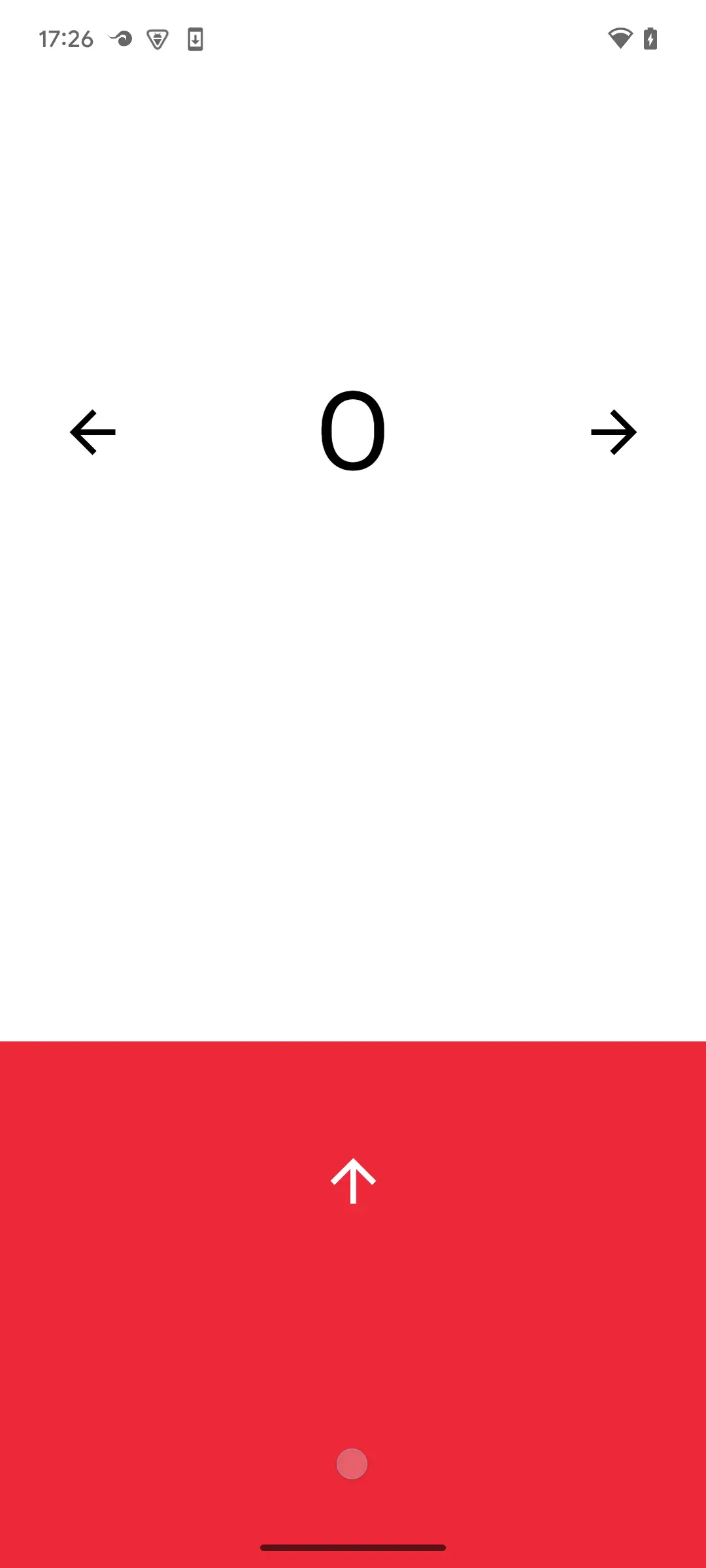
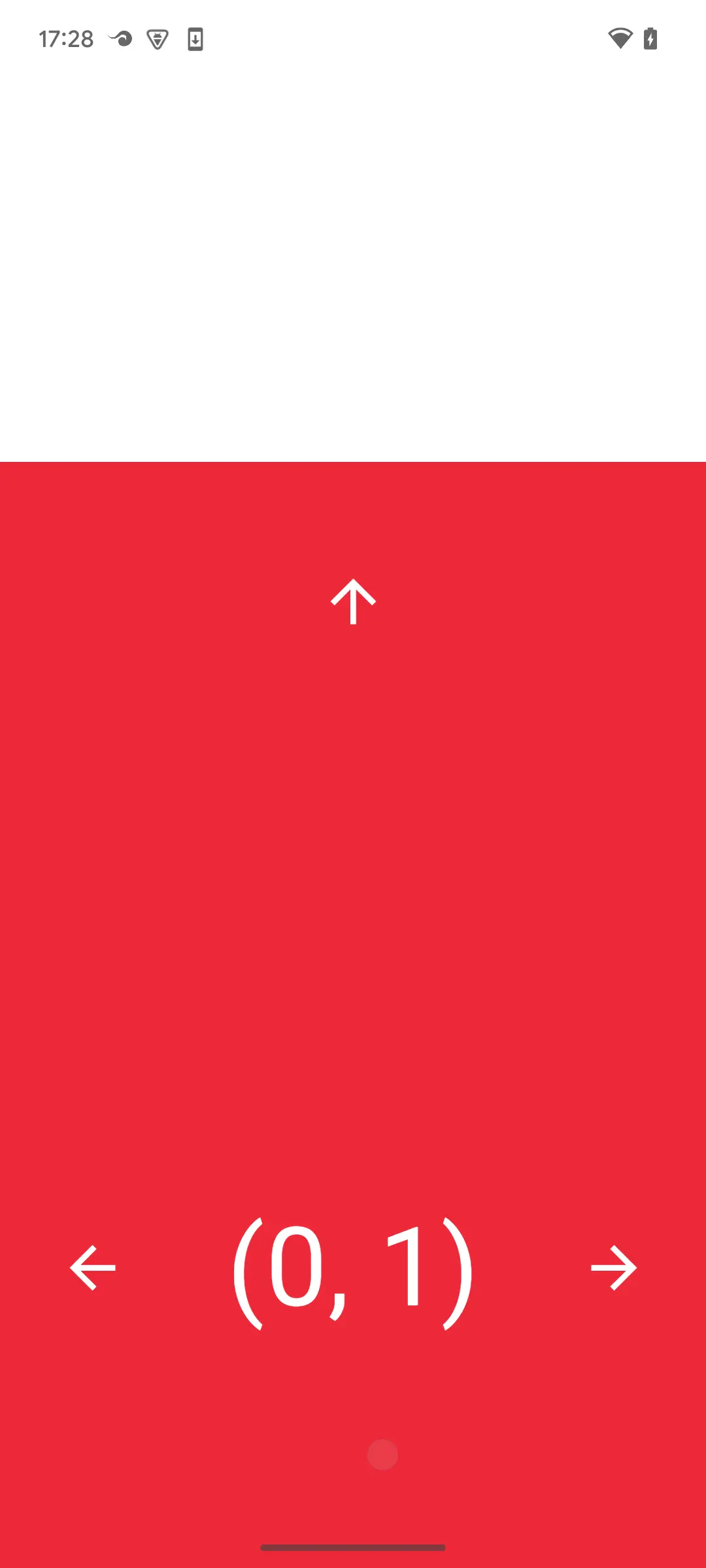
Fig. 2-1, 2-2: Pseudo-scroll by animation
With this code, if you (forcibly build while ignoring compiler warnings by) writing xy = xy.goLeft() instead of using targetXy, the old screen being pushed out during animation won't display correctly. This writing style shows that AnimatedContent(...) correctly manages the state during animation. To customize this animation, try changing the transitionSpec argument of AnimatedContent(...), etc.
Adding animation makes it much easier to grasp the sense of position movement. Looking at this motion, it seems this could also be used as a two-dimensional pager. Jetpack Compose provides HorizontalPager for horizontal scrolling and VerticalPager for vertical scrolling, but there's no standard two-dimensional pager. However, you can create a pager-like UI just by adding animation. Of course, since we've only added animation, you can't swipe to see part of an adjacent page, but with just about a dozen lines of additions and some changes, you can significantly change the app's impression.
5. Animation Connecting Before and After Screen Transitions in NavHost(...)
Starting from Compose Animation version 1.10.0, SharedTransitionLayout became stable. This defines shared elements for screens created with composables. What are shared elements? Check the short video in Shared element transitions in Compose.
Here's a code example when using NavHost(...):
private val colorMap = mapOf(
    "赤" to Color.Red,
    "緑" to Color.Green,
    "青" to Color.Blue,
    "シアン" to Color.Cyan,
    "マゼンタ" to Color.Magenta,
    "黄" to Color.Yellow,
    "茶" to Color(132, 74, 43),
    "群青" to Color(76, 108, 179),
    "カーキー" to Color(197, 160, 90)
)

@Composable
fun GridTransform(modifier: Modifier = Modifier) {
    val navController = rememberNavController()
    NavHost(
        modifier = modifier
            .safeContentPadding()
            .fillMaxSize(),
        navController = navController,
        startDestination = ROUTE_SMALL_SQUARE
    ) {
        composable(route = ROUTE_SMALL_SQUARE) {
            val onClick: (String) -> Unit = {
                navController.navigate("$ROUTE_LARGE_SQUARE?$ARG_SHARED=$it")
            }
            Box(
                modifier = Modifier.fillMaxSize(),
                contentAlignment = Alignment.Center
            ) {
                Column(
                    modifier = Modifier
                        .aspectRatio(1f)
                        .padding(8.dp)
                        .fillMaxSize()
                        .background(
                            color = MaterialTheme.colorScheme.primaryContainer,
                            shape = RoundedCornerShape(16.dp)
                        )
                ) {
                    Row(
                        modifier = Modifier.fillMaxWidth(),
                        horizontalArrangement = Arrangement.spacedBy(8.dp)
                    ) {
                        ColorButton(
                            "赤",
                            modifier = Modifier.weight(1f),
                            onClick = onClick
                        )

                        ColorButton(
                            "緑",
                            modifier = Modifier.weight(1f),
                            onClick = onClick
                        )

                        ColorButton(
                            "青",
                            modifier = Modifier.weight(1f),
                            onClick = onClick
                        )
                    }

                    Row(
                        modifier = Modifier.fillMaxWidth(),
                        horizontalArrangement = Arrangement.spacedBy(8.dp)
                    ) {
                        ColorButton(
                            "シアン",
                            modifier = Modifier.weight(1f),
                            onClick = onClick
                        )

                        ColorButton(
                            "マゼンタ",
                            modifier = Modifier.weight(1f),
                            onClick = onClick
                        )

                        ColorButton(
                            "黄",
                            modifier = Modifier.weight(1f),
                            onClick = onClick
                        )
                    }

                    Row(
                        modifier = Modifier.fillMaxWidth(),
                        horizontalArrangement = Arrangement.spacedBy(8.dp)
                    ) {
                        ColorButton(
                            "茶",
                            modifier = Modifier.weight(1f),
                            onClick = onClick
                        )

                        ColorButton(
                            "群青",
                            modifier = Modifier.weight(1f),
                            onClick = onClick
                        )

                        ColorButton(
                            "カーキー",
                            modifier = Modifier.weight(1f),
                            onClick = onClick
                        )
                    }
                }
            }
        }

        composable(
            route = "$ROUTE_LARGE_SQUARE?$ARG_SHARED={sharedKey}",
            arguments = listOf(navArgument("sharedKey") { type = NavType.StringType })
        ) { entry ->
            val colorName = entry.arguments?.getString("sharedKey") ?: ""
            LargeSquare(colorName) {
                navController.popBackStack()
            }
        }
    }
}

@Composable
fun ColorButton(
    colorName: String,
    modifier: Modifier = Modifier,
    onClick: (String) -> Unit
) {
    TextButton(
        modifier = modifier
            .padding(16.dp)
            .aspectRatio(1f)
            .background(color = colorMap[colorName]!!, shape = RoundedCornerShape(16.dp)),
        onClick = { onClick(colorName) }
    ) {
        Text(colorName, color = Color.White)
    }
}

@Composable
private fun LargeSquare(
    colorName: String,
    modifier: Modifier = Modifier,
    onBack: () -> Unit
) {
    Box(
        modifier = modifier
            .padding(16.dp)
            .fillMaxSize()
            .aspectRatio(1f)
            .background(color = colorMap[colorName]!!, shape = RoundedCornerShape(16.dp))
            .clickable { onBack() }
    ) {
        Text(text = colorName, modifier = Modifier.padding(8.dp), color = Color.White)
    }
}
Note: This code omits countermeasures against rapid tapping of the back button and 9-color buttons for simplicity. Please test while avoiding rapid tapping in short intervals.
On the initial screen, 9 color buttons are displayed, and tapping a button shows a large square in the tapped button's color. When the large square is displayed, pressing the back button (or performing a back gesture) returns to the 9-color button screen. Here, you can see fade-in and fade-out animations when returning to the large square screen by button tap and when returning to the 9-color button screen by back button. This is specified by the default values of the enterTransition, exitTransition, popEnterTransition, popExitTransition, sizeTransform arguments of NavHost(...). You can override this setting with animation that associates shared elements before and after specific screen transitions by adding code and making modifications as shown below for specific screen transitions.
For implementing shared element animation in screen transitions that don't involve back stack changes via NavHost(...), refer to Shared element transitions in Compose. During screen transitions from left to right and right to left in the table below, the animation visually expresses that the square on the right screen that appeared from the button tapped on the left screen (bottom right) is exactly the target content.
| 9-color button screen | Large square screen |
|---|---|
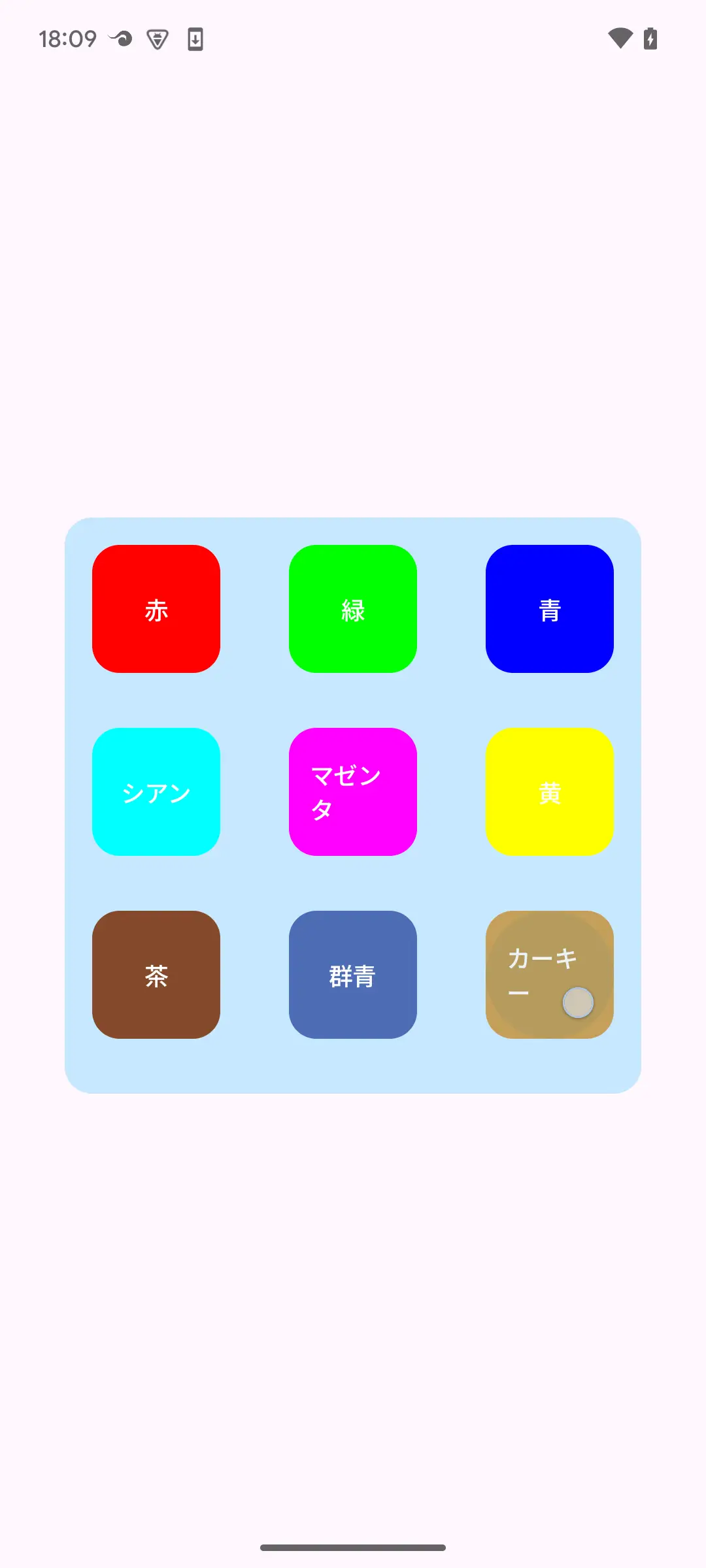 Fig. 3-1 Fig. 3-1 |
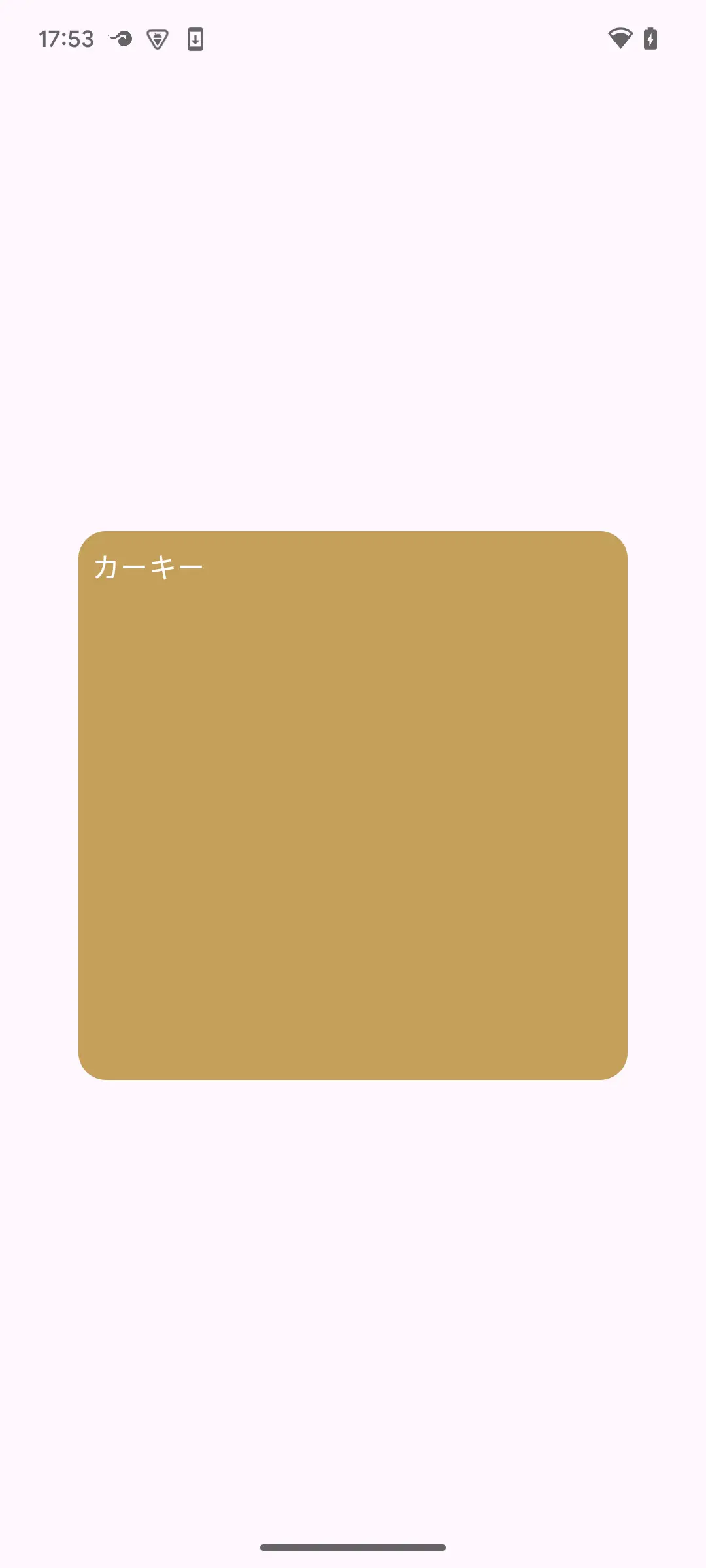 Fig. 3-2 Fig. 3-2 |
5.1. Wrap with SharedTransitionLayout { ... } and Share Screen Elements
Here we introduce the implementation of shared element animation before and after screen transitions via NavHost(...):
@Composable
fun GridTransform(modifier: Modifier = Modifier) {
    val navController = rememberNavController()
    SharedTransitionLayout {
        NavHost(
            modifier = modifier
                .safeContentPadding()
                .fillMaxSize(),
            navController = navController,
            startDestination = ROUTE_SMALL_SQUARE
        ) {
            composable(route = ROUTE_SMALL_SQUARE) {
                val onClick: (String) -> Unit = {
                    navController.navigate("$ROUTE_LARGE_SQUARE?$ARG_SHARED=$it")
                }
                Box(
                    modifier = Modifier.fillMaxSize(),
                    contentAlignment = Alignment.Center
                ) {
                    Column(
                        modifier = Modifier
                            .aspectRatio(1f)
                            .padding(8.dp)
                            .fillMaxSize()
                            .background(
                                color = MaterialTheme.colorScheme.primaryContainer,
                                shape = RoundedCornerShape(16.dp)
                            )
                    ) {
                        Row(
                            modifier = Modifier.fillMaxWidth(),
                            horizontalArrangement = Arrangement.spacedBy(8.dp)
                        ) {
                            ColorButton(
                                this@composable,
                                "赤",
                                modifier = Modifier.weight(1f),
                                onClick = onClick
                            )

                            ColorButton(
                                this@composable,
                                "緑",
                                modifier = Modifier.weight(1f),
                                onClick = onClick
                            )

                            ColorButton(
                                this@composable,
                                "青",
                                modifier = Modifier.weight(1f),
                                onClick = onClick
                            )
                        }

                        Row(
                            modifier = Modifier.fillMaxWidth(),
                            horizontalArrangement = Arrangement.spacedBy(8.dp)
                        ) {
                            ColorButton(
                                this@composable,
                                "シアン",
                                modifier = Modifier.weight(1f),
                                onClick = onClick
                            )

                            ColorButton(
                                this@composable,
                                "マゼンタ",
                                modifier = Modifier.weight(1f),
                                onClick = onClick
                            )

                            ColorButton(
                                this@composable,
                                "黄",
                                modifier = Modifier.weight(1f),
                                onClick = onClick
                            )
                        }

                        Row(
                            modifier = Modifier.fillMaxWidth(),
                            horizontalArrangement = Arrangement.spacedBy(8.dp)
                        ) {
                            ColorButton(
                                this@composable,
                                "茶",
                                modifier = Modifier.weight(1f),
                                onClick = onClick
                            )

                            ColorButton(
                                this@composable,
                                "群青",
                                modifier = Modifier.weight(1f),
                                onClick = onClick
                            )

                            ColorButton(
                                this@composable,
                                "カーキー",
                                modifier = Modifier.weight(1f),
                                onClick = onClick
                            )
                        }
                    }
                }
            }

            composable(
                route = "$ROUTE_LARGE_SQUARE?$ARG_SHARED={sharedKey}",
                arguments = listOf(navArgument("sharedKey") { type = NavType.StringType })
            ) { entry ->
                val colorName = entry.arguments?.getString("sharedKey") ?: ""
                LargeSquare(this, colorName) {
                    navController.popBackStack()
                }
            }
        }
    }
}

@Composable
fun SharedTransitionScope.ColorButton(
    animatedContentScope: AnimatedVisibilityScope,
    colorName: String,
    modifier: Modifier = Modifier,
    onClick: (String) -> Unit
) {
    TextButton(
        modifier = modifier
            .padding(16.dp)
            .aspectRatio(1f)
            .background(color = colorMap[colorName]!!, shape = RoundedCornerShape(16.dp))
            .sharedBounds(
                sharedContentState = rememberSharedContentState(colorName),
                animatedVisibilityScope = animatedContentScope,
                boundsTransform = { _, _ ->
                    tween(durationMillis = 500)
                },
                enter = fadeIn(),
                exit = fadeOut(),
                resizeMode = SharedTransitionScope.ResizeMode.scaleToBounds()
            ),
        onClick = { onClick(colorName) }
    ) {
        Text(colorName, color = Color.White)
    }
}

@Composable
private fun SharedTransitionScope.LargeSquare(
    animatedContentScope: AnimatedVisibilityScope,
    colorName: String,
    modifier: Modifier = Modifier,
    onBack: () -> Unit
) {
    Box(
        modifier = modifier
            .padding(16.dp)
            .fillMaxSize()
            .aspectRatio(1f)
            .background(color = colorMap[colorName]!!, shape = RoundedCornerShape(16.dp))
            .sharedBounds(
                sharedContentState = rememberSharedContentState(colorName),
                animatedVisibilityScope = animatedContentScope,
                boundsTransform = { _, _ ->
                    tween(durationMillis = 500)
                },
                enter = fadeIn(),
                exit = fadeOut(),
                resizeMode = SharedTransitionScope.ResizeMode.scaleToBounds()
            )
            .clickable { onBack() }
    ) {
        Text(text = colorName, modifier = Modifier.padding(8.dp), color = Color.White)
    }
}
Wrapping the outer layer with SharedTransitionLayout { ... } and using Modifier.sharedBounds(...) within SharedTransitionScope to associate shared elements is the same as for screen transitions that don't use NavHost(...). For the animatedVisibilityScope argument of Modifier.sharedBounds(...), we use AnimatedContentScope (this@composable) derived from NavGraphBuilder.composable(...). This enables displaying animation between shared elements during screen transitions via NavHost(...). In SharedTransitionScope.ColorButton(...) and SharedTransitionScope.LargeSquare(...), verify that screen elements are shared before and after screen transitions by using the button's color name as the key argument of rememberSharedContentState(Any).
The new coding required to set up shared element animation is:
- Wrap with
SharedTransitionLayout { ... } - Set
sharedBounds(...)(or sharedElement(...)) to define shared elements and match thekeybetween shared elements - Pass the two scopes
SharedTransitionScopeand AnimatedVisibilityScope required for 2. to the composable
These can be implemented without significantly changing the structure of the code before animation settings. If it's difficult to apply with minimal changes to existing code, try refactoring to a structure that's easier to modify.
Shared element animation is beautiful when it fits well, but animation that perfectly matches the screen design image may be difficult. In that case, try adjusting the enter, exit, boundsTransform, resizeMode arguments of Modifier.sharedBounds(...), etc.
5.2. Relationship with Predictive Back
Shared element animation overrides the default screen transition animation of NavGraphBuilder.composable(...). Additionally, when predictive back animation is enabled, that is, when android:enableOnBackInvokedCallback="true" is specified in AndroidManifest.xml for API levels 33-35, or when android:enableOnBackInvokedCallback="false" is not specified in AndroidManifest.xml for API level 36 or higher, it also overrides the back animation via NavHost(...). Build the app with predictive back animation enabled, set the device to gesture navigation mode, and slowly perform the back gesture on the large square screen above, and you can easily confirm that the shared element animation slowly reverses. Also, on API level 36 or higher and Android OS 16 or higher, setting to button navigation mode and long-pressing the back button should show the shared element reverse animation.
Thus, the back animation of NavHost(...) affects the predictive back animation settings. With this in mind, you need to decide whether to enable predictive back animation settings. As of API level 36, you can disable predictive back animation by specifying android:enableOnBackInvokedCallback="false".
6. Conclusion
This article introduced 4 examples of techniques for implementing practical animations in Jetpack Compose with minimal changes. Animation within apps is not essential functionality in most cases, so implementation tends to be omitted especially in development projects with tight schedules. But depending on usage, it has the potential to bring significant usability improvements and greatly enhance the app's impression. If there are abundant means to achieve this with minimal effort, you can easily try implementation. Many APIs in Compose Animation are designed to be declarative, meaning you can add animations with the feeling of declaring that you'll animate UI elements, making it easy to avoid the complexity of having to define behavior through detailed procedural descriptions. I hope these can be utilized to improve the quality of many apps.
7. References
関連記事 | Related Posts
Jetpack Compose Animation Techniques: Enhance App Impressions with Minimal Code Changes
Android View から Jetpack Compose への移行の第一歩

myroute Android AppでのJetpack Compose
Compose超初心者のPreview感動体験
First Steps When Migrating From Android View to Jetpack Compose
Compose化した画面の初期化処理、initブロックでやるか?LaunchedEffect(Unit)内でやるか?
We are hiring!
PjM(新規システムの構想検討とプロジェクト推進)/ プロジェクト推進G/東京・名古屋
業務内容トヨタグループ内でデジタル領域における業務改善やシステム化を推進していただくポジションです。現場に深く入り込み、実務と企画の両面から支援を行います。
【PdM】オープンポジション/東京・名古屋・大阪
募集背景KINTOテクノロジーズでは新たな事業展開と共に開発するプロダクトが拡大しています。サービスの新規立ち上げ、立ち上げたプロダクトのグロースを推進し、KINTOの事業展開を支えるプロダクトマネージャーを求めています。