InlineContent in Jetpack Compose: The Hidden Gem for Complex Text UI

Introduction
Hello! I'm Rasel, and today I want to share something that most Android developers overlook - the inlineContent property of Jetpack Compose's Text composable.
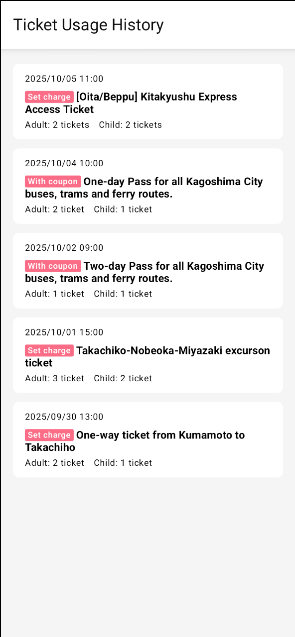
Recently, while working on the my route app at KINTO Technologies Corporation, we encountered a UI challenge that seemed simple but turned out to be quite complex: displaying colored benefit labels inline with ticket names in our ticket usage history screen.
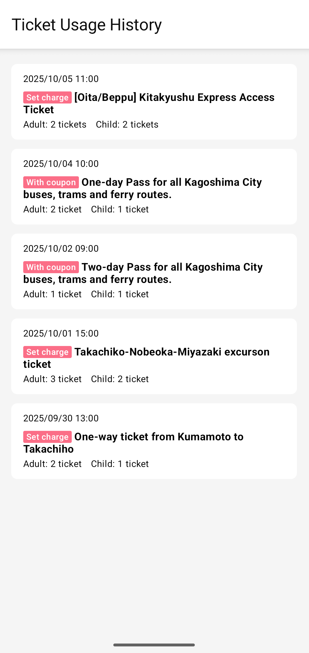
The tickets shown are samples. Please check the app for tickets that are actually on sale.
As you can see in the design, we needed a pink labeled text with rounded corners that flows naturally with the ticket name text. Most developers would reach for Row or FlowRow to solve this, but these approaches have significant limitations when dealing with text that needs to wrap and flow naturally.
The Problem: When Row and FlowRow Fall Short
Consider this UI pattern from our actual design:
[With coupon] One-day Pass for all Kagoshima City buses, trams and ferry routes.
Where [With coupon] is a pink label with rounded corners that must appear seamlessly inline with the text.
Approach 1: Using Row (The Naive Solution)
@Composable
fun TicketNameWithRow(name: String, benefitLabel: String) {
    Row(
        horizontalArrangement = Arrangement.spacedBy(4.dp),
        verticalAlignment = Alignment.CenterVertically,
    ) {
        Box(
            modifier = Modifier
                .background(
                    color = MaterialTheme.colors.subPink, // Design system color
                    shape = RoundedCornerShape(2.dp),
                )
                .padding(horizontal = 4.dp),
            contentAlignment = Alignment.Center,
        ) {
            Text(
                text = benefitLabel,
                style = MaterialTheme.typography.body3Bold,
                color = MaterialTheme.colors.onPrimaryHighEmphasis,
            )
        }

        Text(
            text = name,
            style = MaterialTheme.typography.body2Bold,
        )
    }
}
Result:
Problems with Row:
- Label doesn't align perfectly with text baseline
- Inconsistent spacing when text wraps
- Breaks the natural text flow
Approach 2: Using FlowRow (Better, But Still Limited)
@Composable
fun TicketNameWithFlowRow(name: String, benefitLabel: String) {
    FlowRow(
        horizontalArrangement = Arrangement.spacedBy(4.dp),
        verticalAlignment = Alignment.CenterVertically,
    ) {
        Box(
            modifier = Modifier
                .background(
                    color = MaterialTheme.colors.subPink,
                    shape = RoundedCornerShape(2.dp),
                )
                .padding(horizontal = 4.dp),
            contentAlignment = Alignment.Center,
        ) {
            Text(
                text = benefitLabel,
                style = MaterialTheme.typography.body3Bold,
                color = MaterialTheme.colors.onPrimaryHighEmphasis,
            )
        }

        Text(
            text = name,
            style = MaterialTheme.typography.body2Bold,
        )
    }
}
Result:

As shown above, the UI still doesn't align perfectly with our design. The label and text do not flow naturally when wrapping.
Another Approach: Using AnnotatedString (SpanStyle)
Before Jetpack Compose supported true inline composables, many developers tried to achieve similar effects using only AnnotatedString and SpanStyle. This approach uses background color and rounded corners via SpanStyle to style part of the text as a label.
Approach 3: AnnotatedString with SpanStyle
This method is limited compared to inlineContent, but can be useful for simple cases where you only need background color and text styling (not custom composables or padding).
@Composable
fun TicketNameWithAnnotatedString(name: String, benefitLabel: String) {
    val cornerRadius = with(LocalDensity.current) { 2.dp.toPx() }
    val drawStyle = Stroke(pathEffect = PathEffect.cornerPathEffect(cornerRadius))
    val nameStyle = MaterialTheme.typography.body2Bold.toSpanStyle()
    val benefitStyle = MaterialTheme.typography.body3Bold.copy(
        color = MaterialTheme.colors.onPrimaryHighEmphasis,
        background = MaterialTheme.colors.subPink,
        drawStyle = drawStyle,
    ).toSpanStyle()

    val annotatedString =
        remember(name, benefitLabel) {
            buildAnnotatedString {
                withStyle(style = benefitStyle) {
                    append(" $benefitLabel ") // Add spaces for padding effect
                }
                append(" ")
                withStyle(style = nameStyle) {
                    append(name)
                }
            }
        }

    Text(text = annotatedString)
}
Result:
Limitations:
- Rounded corners are not achieved properly while using proper value from design (background is mostly a rectangle, and needs to adjust value to make it rounded, still proper rounding is not achieved)
- No custom composable or icon support
- Padding is simulated with spaces, not true padding
- Baseline alignment is good, but label may not look as polished as with
inlineContent - Text styling also gets changed from design
When to use:
- When you only need a colored background and simple text styling
- When you want a dependency-free, simple solution for basic badges
The Solution: InlineContent - The Proper Way
InlineContent allows you to embed custom composable directly within text, treating them as characters in the text flow. Here's how we implemented it in the my route app:
Step 1: Understanding the Production Implementation
Below is a simplified version of our production code, showing how to use inlineContent to embed a custom label inside text:
@Composable
private fun TicketNameWithBenefit(
    name: String,
    benefitLabel: String,
) {
    val nameStyle = MaterialTheme.typography.body2Bold.toSpanStyle()

    val annotatedString = remember(name, benefitLabel) {
        buildAnnotatedString {
            appendInlineContent(benefitLabel) // Use label text as unique key
            append(" ")
            withStyle(style = nameStyle) {
                append(name)
            }
        }
    }

    // ... (inline content implementation)

    Text(
        text = annotatedString,
        inlineContent = inlineContent,
    )
}
Step 2: Dynamic Width Calculation (The Critical Part)
Calculating the exact width for the label background is essential for a seamless look. Here is how we do it:
The most challenging aspect is calculating the exact width needed for the label background:
val density = LocalDensity.current
val textMeasurer = rememberTextMeasurer()
val horizontalPadding = 4.dp

val benefitLabelBgWidthSp = remember(benefitLabel) {
    val textLayoutMeasure = textMeasurer.measure(
        text = benefitLabel,
        style = benefitStyle,
    )
    with(density) {
        (textLayoutMeasure.size.width.toDp() + (horizontalPadding * 2)).toSp()
    }
}
Why this is complex:
- Text Measurement: We need to measure the text before rendering
- Unit Conversion: Convert between pixels, dp, and sp correctly
- Padding Calculation: Include padding in the total width
- Density Awareness: Handle different screen densities
Step 3: Creating the Inline Content Mapping
Now, we map the label to a composable using InlineTextContent, ensuring it aligns and sizes perfectly:
val inlineContent = remember(benefitLabel, benefitLabelBgWidthSp) {
    mapOf(
        benefitLabel to InlineTextContent(
            placeholder = Placeholder(
                width = benefitLabelBgWidthSp,
                height = benefitStyle.lineHeight,
                placeholderVerticalAlign = PlaceholderVerticalAlign.Center,
            ),
        ) {
            Box(
                modifier = Modifier
                    .background(
                        color = MaterialTheme.colors.subPink,
                        shape = RoundedCornerShape(2.dp)
                    )
                    .padding(horizontal = horizontalPadding),
                contentAlignment = Alignment.Center,
            ) {
                Text(
                    text = benefitLabel,
                    style = benefitStyle,
                    color = MaterialTheme.colors.onPrimaryHighEmphasis,
                )
            }
        }
    )
}
Key implementation details:
placeholderVerticalAlign = PlaceholderVerticalAlign.Centerensures perfect alignmentheight = benefitStyle.lineHeightmatches the text height exactly- Dynamic width calculation ensures perfect fit for any label text
The Complete Production Implementation
Here's our actual implementation from the my route app:
@Composable
private fun TicketNameWithBenefit(
    name: String,
    benefitLabel: String,
) {
    val nameStyle = MaterialTheme.typography.body2Bold.toSpanStyle()
    val benefitStyle = MaterialTheme.typography.body3Bold
    val annotatedString =
        remember(name, benefitLabel) {
            buildAnnotatedString {
                appendInlineContent(benefitLabel)
                append(" ")
                withStyle(style = nameStyle) {
                    append(name)
                }
            }
        }

    val density = LocalDensity.current
    val textMeasurer = rememberTextMeasurer()
    val horizontalPadding = 4.dp

    val benefitLabelBgWidthSp =
        remember(benefitLabel) {
            val textLayoutMeasure = textMeasurer.measure(text = benefitLabel, style = benefitStyle)
            with(density) {
                (textLayoutMeasure.size.width.toDp() + (horizontalPadding * 2)).toSp()
            }
        }

    val inlineContent =
        remember(benefitLabel, benefitLabelBgWidthSp) {
            mapOf(
                benefitLabel to
                    InlineTextContent(
                        placeholder =
                            Placeholder(
                                width = benefitLabelBgWidthSp,
                                height = benefitStyle.lineHeight,
                                placeholderVerticalAlign = PlaceholderVerticalAlign.Center,
                            ),
                    ) {
                        Box(
                            modifier =
                                Modifier
                                    .background(
                                        color = MaterialTheme.colors.subPink,
                                        shape = RoundedCornerShape(2.dp),
                                    )
                                    .padding(horizontal = horizontalPadding),
                            contentAlignment = Alignment.Center,
                        ) {
                            Text(
                                text = benefitLabel,
                                style = benefitStyle,
                                color = MaterialTheme.colors.onPrimaryHighEmphasis,
                            )
                        }
                    },
            )
        }

    Text(
        text = annotatedString,
        inlineContent = inlineContent,
    )
}
Result:
As you can see, this implementation perfectly aligns with our design goal.
Why We Switched from External Library
When we couldn't achieve our design using Row, FlowRow and even AnnotatedString approach, we tried using an third party library:
val extendedSpans = remember {
  ExtendedSpans(
    RoundedCornerSpanPainter(…),
  )
}

Text(
  modifier = Modifier.drawBehind(extendedSpans),
  text = remember(text) {
    extendedSpans.extend(text)
  },
  onTextLayout = { result ->
    extendedSpans.onTextLayout(result)
  }
)
By using a third-party library, we finally achieved our design goal. But we don't want to ship another library with our app just for this single Text UI item and reconsidered other approaches.
Problems we encountered:
- Additional dependency for a simple feature
- Less control over styling and behavior
- Potential compatibility issues with future Compose versions
The native solution proved to be better:
- No external dependencies
- Full control over styling and behavior
- Better performance
- Future-proof with Compose updates
Advantages of InlineContent Approach
- Natural Text Flow: Labels wrap with text naturally, maintaining proper line breaks
- Perfect Alignment: Consistent baseline alignment with surrounding text
- Flexible Styling: Full support for complex text formatting (bold, colors, sizes)
- Dynamic Sizing: Adapts to content automatically while maintaining design consistency
- Performance: Efficient rendering as part of the text layout engine
- Accessibility: Screen readers handle it as part of the text flow
Common Pitfalls and Solutions
Pitfall 1: Hardcoded Dimensions
❌ Wrong:
Placeholder(width = 60.sp, height = 16.sp) // Fixed dimensions
✅ Correct:
Placeholder(
    width = calculatedWidth, // Dynamic based on content
    height = textStyle.lineHeight, // Match text height
)
Pitfall 2: Incorrect Unit Conversion
❌ Wrong:
textLayout.size.width.toSp() // Direct conversion loses density information
✅ Correct:
with(density) {
    textLayout.size.width.toDp().toSp() // Proper density-aware conversion
}
Pitfall 3: Missing Performance Optimization
❌ Wrong:
// Recalculated on every composition
val inlineContent = mapOf(...)
val annotatedString = buildAnnotatedString { ... }
✅ Correct:
val inlineContent = remember(dependencies) { mapOf(...) }
val annotatedString = remember(dependencies) { buildAnnotatedString { ... } }
Use Cases Beyond Benefit Labels
This technique works excellently for:
- Status badges in lists
- Rating stars within reviews
- Currency symbols with special styling
- Icon indicators in text
- Highlighted keywords in search results
Performance Considerations
The remember usage is crucial for performance:
// Expensive operations cached properly
val benefitLabelBgWidthSp = remember(benefitLabel) { /* text measurement */ }
val inlineContent = remember(benefitLabel, width) { /* composable creation */ }
val annotatedString = remember(name, benefitLabel) { /* string building */ }
This ensures calculations only happen when dependencies change, not on every composition.
Conclusion
InlineContent is a powerful but underutilized feature of Jetpack Compose. When you need to embed custom UI within text flow, it's the superior solution compared to layout-based approaches like Row or FlowRow.
The dynamic width calculation technique we've implemented solves the common problem of perfectly fitting background elements to text content. While the implementation requires understanding text measurement and unit conversion, the result is a professional, performant UI that scales well across different devices and text sizes.
Our experience transitioning from an external library to this native solution proved that sometimes the built-in tools, when used correctly, provide the best balance of performance, maintainability, and design flexibility.
Next time you encounter inline UI challenges, remember: inlineContent is your friend!
Key Takeaways:
- Use
InlineContentfor true inline UI elements that need to flow with text - Implement dynamic width calculation using
TextMeasurerfor perfect fitting - Optimize with
rememberfor performance, especially text measurements - Prefer native solutions over external libraries when built-in APIs suffice
- Pay attention to unit conversion and density handling
Happy coding!
関連記事 | Related Posts

Jetpack Compose in myroute Android App
myroute Android AppでのJetpack Compose
Jetpack Compose Animation Techniques: Enhance App Impressions with Minimal Code Changes

Android View から Jetpack Compose への移行の第一歩
小規模なコード修正で効果的にアプリの印象を改善する、Jetpack Composeのアニメーション追加のテクニック

When We Put Compose on Top of BottomSheetDialogFragment, Anchoring a Button to the Bottom Proved Harder Than Expected
We are hiring!
【バックエンドエンジニア】my route開発G/東京
my routeについてmy routeの概要 my routeは、移動需要を創出するために「魅力ある地域情報の発信」、「最適な移動手段の提案」、「交通機関や施設利用のスムーズな予約・決済」をワンストップで提供する、スマートフォン向けマルチモーダルモビリティサービスです。
PjM(新規システムの構想検討とプロジェクト推進)/ プロジェクト推進G/東京・名古屋
業務内容トヨタグループ内でデジタル領域における業務改善やシステム化を推進していただくポジションです。現場に深く入り込み、実務と企画の両面から支援を行います。