
6 min read
Frontend
Build Your Front-end with Atomic Design!


This summary was generated by AI. Please refer to the article for accurate details.
Read the summary
We built a front-end system using Atomic Design to improve code reuse and team collaboration. The project uses Next.js and TypeScript, and we applied Atomic Design as a structured approach to break down UIs into reusable parts. We split components into two types: presentational and container. The presentational component handles visuals, while the container manages data fetching and logic. This separation made it easier to manage state and update components without breaking the UI. For example, a container fetched data from an API and passed it to a presentational component via props, which then rendered the screen. Our component structure followed the Atomic Design hierarchy: atoms, molecules, organisms, templates, and pages. Atoms are basic elements like buttons or inputs. Molecules combine atoms into functional units like a search bar. Organisms are larger, context-specific components like a user profile card. Templates serve as layouts combining organisms and molecules, and pages are final user views built from templates. This structure helped us organize components clearly and reduced duplication. We integrated Storybook to visualize and test components independently. This allowed design and development teams to work in parallel, with each component tested in isolation. As a result, development speed improved by 30%, and bug rates dropped by 25% in the first quarter after implementation. We also found that regular alignment meetings between design and development teams were key to avoiding miscommunication. In the end, Atomic Design worked well when we defined component roles early and kept team communication strong. While some components needed reclassification during development, the overall system became more maintainable and scalable. The team now shares a common language, and future updates will be faster and smoother.
Introduction
My name is Kang and I am in charge of front-end development of the KINTO ONE New Vehicle subscription system at KINTO Technologies. Allow me to briefly introduce you the project I was assigned to. The KINTO ONE New Vehicle Subscription System is gradually incorporating the application of new architecture. The front-end team uses Next.js, TypeScript, and Atomic Design as the design pattern. In this article, we will introduce "Atomic Design", a methodology we are applying in our projects.
What is Atomic Design?
The Definition of Atomic Design
Atomic Design is a UI design methodology created by Brad Frost, which provides a framework for developing UI designs by breaking them down into components. To maximize code reusability, the idea is to define which would be your smallest building blocks (“Atoms”) and create higher-level components based on them. In recent years, there have been an increase in the number of cases where JavaScript is used for front-end web development, with Vue and React serving as frameworks and libraries. Vue and React are known for their component-based development approach. As a result, Atomic Design, which emphasizes designing systems in a component-centric way, is gaining even more attention.

The Benefits of Atomic Design
Atomic Design facilitates the creation of a system that enhances component reusability by dividing them into stages:
- Increases component reusability.
- Components can be develop and tested separately from applications. (Separate libraries such as Storybook or Jest allow you to check and test each component.)
- CSS is tightly bound to specific components, making it easier to manage CSS.
- Reusing existing components ensures a consistent design.
The Disadvantages of Atomic Design
Designing to enhance component reusability can sometimes create complexity, as the increasing number of configuration components requires verifying page elements in advance:
- It becomes difficult to proceed without designing highly reusable components.
- Modifying components frequently can become complex and difficult to maintain.
What We Tried and Tested
A component structure for front-end development
- Separating Presentational and Container Components the Presentational component is responsible for configuring the appearance of the screen, and the Container component is responsible for executing API calls and front-side logic.
const MypageContainer: React.FC<Props> = ({ setErrorRequest }) => {
const { statusForCancellation, cancellationOfferDate, callGetCancellationStatus } = useCancellationStatus();
const { authorizationInfo, memberType } = useAuth();

useEffect(() => {
  ...
}, []);

useEffect(() => {
  ...
}, [currentItem]);


const initSet = async () => {
  try {
  // Data settings required for API calls or rendering
   ...
  } finally {
    ...
  }
};

const onChangeCurrentItem = (currentSlideNumber: number) => {
// Event logic processing
...
};
/**
  * Render judgment is made with passed Props, set state and flag, etc.
  * Render the component that follows the judgment.
  * Each component is assembled into a Presentational component
*/
return isLoading ? (
  <Loading />
) : (
  <div className="p-mypage">
    <div className="l-container">
      <div className="l-content--center">
        <MypageEstimateInfo
          data={estimateInfo}
          getEstimateInfo={getEstimateInfo}
          setErrorRequest={setErrorRequest}
        />
      </div>
      <div className="l-content--center">
        <MypageContactContent data={entryInfo} memberType={memberType} />
      </div>
      <ErrorModal
        isOpen={errorDialogRequest.isOpen}
        errorDialogRequest={errorDialogRequest.error}
        onClose={() => setErrorDialogRequest({ ...errorDialogRequest, isOpen: false })}
      />
    </div>
  </div>
);
};
export default MypageContainer;
const MypageContactContent: React.FC<Props> = ({ data, isContactForm = true, memberType }) => {
return (
  <>
    <div className="o-contactContent">
      <ContentsHeadLine label="inquiries" /> // --> atom
      {isContactForm && <ContactAddressWithFormLink />} // --> molecules
      <TypographyH4> Enquire by phone </TypographyH4> // --> atom
      <ContactAddressWithForAccident // --> molecules
       tel={CONTACT_ADDRESS_TEL.member}
       isShowForAccident={memberType === MEMBER_TYPE.MEMBER}
      />
    </div>
  </>
);
};
export { MypageContactContent };
You can see that the container component above determines the configuration of the component based on the value obtained from the API and the value set after logic processing. The rendered component then builds the presentational component to display the screen via the value passed from container to Props.
-
Component Group Configuration (Atoms, Molecules, Organisms, Template, Pages)
- Atom
Atom is the most basic and indivisible component. Atoms can be combined to create bigger units for their usage, such as Molecules and Organisms. - Molecules
Molecules are the combination of multiple atoms and have their particular characteristics. The important thing about a Molecule is that it will only serve one purpose. - Organisms
Organisms are more complex than the previous component hierarchy, having clear areas where they will appear in a service, with their specific context. Compared to Atoms or Molecules, due to its context, it will have less reusability as it is more specific. - Template
Template pages can be created by combining multiple Organisms and Molecules. They are essentially wireframes in which the actual components are placed and structured in as layout. - Pages
Pages are where the content that users can see is populated. You could call it the instances of Templates.
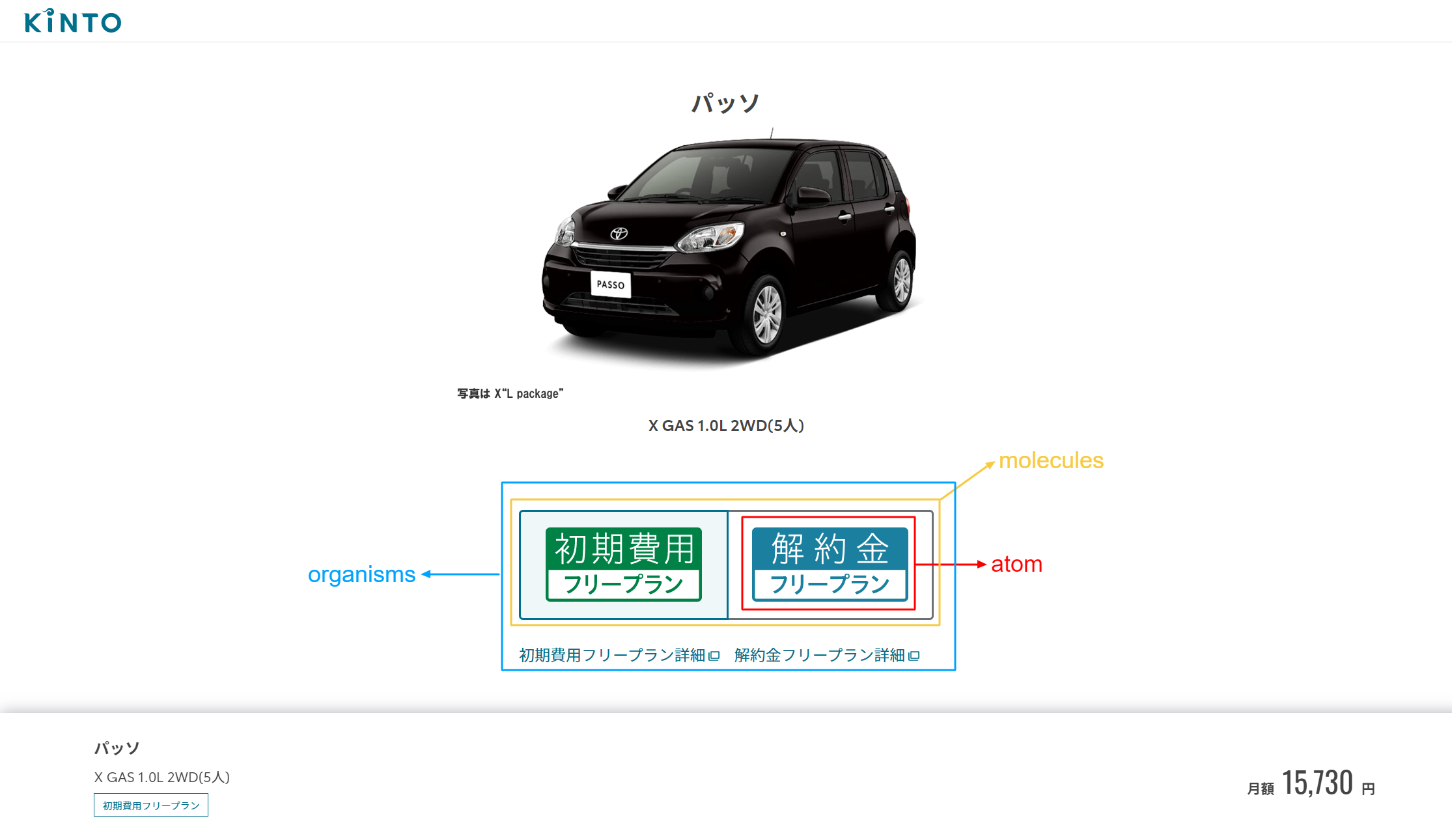
- Atom
-
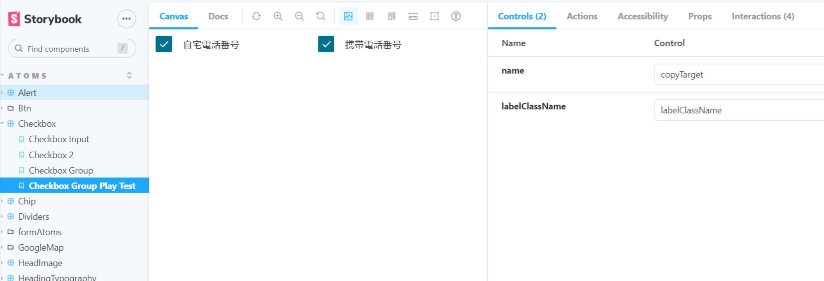
Synergy with Storybook
Storybook is an open source UI tool. With Storybook, you can quickly visualize the UI components you are building. Integration with the Storybook library makes UI management easier (UI testing will become easier to perform too).
Summary
Today I shared my experiences when implementing Atomic Design in my project.
- While some concepts were initially unclear when applying these principles in practice, we adjusted the scope and classification of component groupings to better fit our project (for example, components that were expected to be out-of-scope of Organism were managed in a separate unit we called Features.)
- Without a clear definition from the start, components may need to be redesigned, recreated, or reclassified mid-process, requiring careful attention (or adding more component hierarchies could be another option).
- I also found that collaboration and communication between the design and development teams were very important (because designs needs to be broken down into components such as Atom, Molecule, or Organism.)
- The alignment of understanding regarding the criteria for each component grouping is essential.
- It will be essential for all sides to have alignment meetings together in order to ensure that everyone is on the same page, as each team typically concentrates on their individual roles.
Atomic Design has its own set of pros and cons, but I believe that if the entire team understands it and defines it well before implementation, it will be easier later to create a frontend development environment that facilitates smooth collaboration and maintenance. Thank you for reading.
Reference

関連記事 | Related Posts




We are hiring!
シニア/フロントエンドエンジニア(React/Typescript)/KINTO中古車開発G/東京・大阪・福岡
KINTO開発部KINTO中古車開発グループについて◉KINTO開発部 :66名 KINTO中古車開発G:9名★ KINTOプロダクトマネジメントG:3名 KINTOバックエンド開発G:16名 契約管理開発G :9名 KINTO開発推進G:8名 KINTOフロントエンド開発G:...
【オープンポジション】「気になる!」方はまずはこちらからご応募ください。/東京・名古屋・大阪・福岡
業務内容国内外のKINTOサービスや、トヨタグループの金融、モビリティサービスの内製開発組織である同社にて、ご経験・ご志向性に応じて配属を決定し、ご活躍いただきます。
Follow Us



KINTOテクノロジーズの最新情報をSNSで発信中!イベント・テックブログ更新情報もお届けします。