An Approach to Improving the Quality of In-App Ad Creatives
Introduction
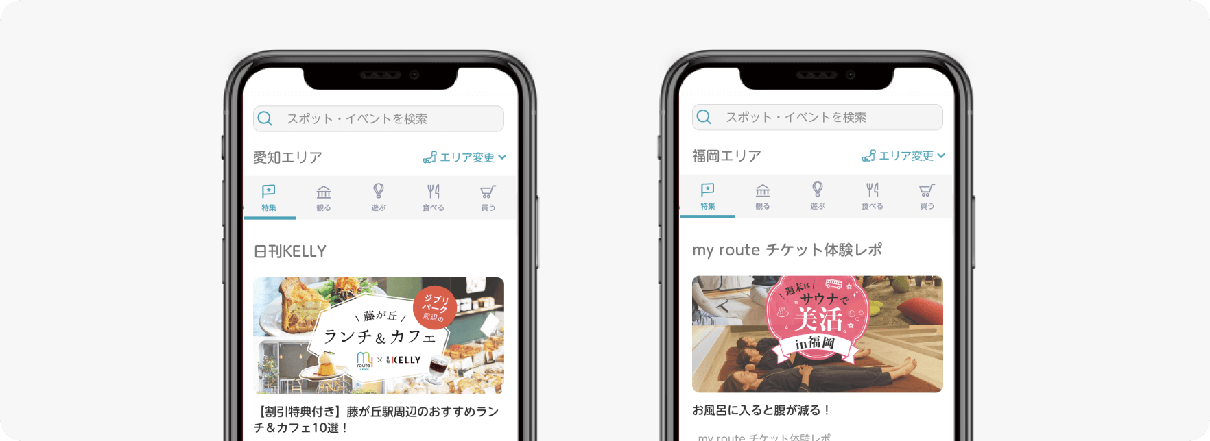
I’m Kai Yamamoto, a designer for my route by KINTO at KINTO Technologies. I mainly handle advertising design for my route by KINTO, including landing pages and banners, as well as organizing app screen flows and developing design guidelines. my route by KINTO is a multimodal mobility service that provides a complete set of travel features—all in one app—from searching and booking transportation to making payments. It also enhances urban mobility by offering information on event spots and local shops that help “bring the city to life.”
Challenges to Solve
Aiming to boost ticket sales and weekly usage, we worked together with representatives from Toyota Financial Services Corporation as part of our initiatives. my route by KINTO includes a content section called Feature Articles. Users are guided to these articles through in-app pop-ups, designed to encourage outings and increase app engagement. The design task this time was to improve the quality of the in-app pop-up.
Creative Improvement Approaches
"Improving creative quality" is a fairly vague goal, so we focused on narrowing the gap between the current state and the intended outcome. We started by identifying the issues, and from there, extracted three key challenges we needed to address in this design.
-
Take an approach that fits the target audience. By building a shared understanding of the target user among the team, it became easier to make design decisions—such as choosing a color tone or adjusting corner roundness—that matched the user.
-
Ensure consistency between the article and the design. As an extreme example, even if the pop-up has a stylish design, users might lose interest and exit without reading it if the article is about something like "going out to see autumn leaves and visiting a cute café." That's why it was important to read the article thoroughly beforehand and imagine expressions that aligned with the content.
-
Deliver a sense of excitement that makes users want to go out. This may sound abstract, but unlike typical ads that highlight clear benefits like "Limited time offer!" or "Only 1000 yen!" this pop-up simply asks, "Why not go out and have some fun?" With that in mind, we focused on creating an excitement factor that would resonate when users saw the ad.
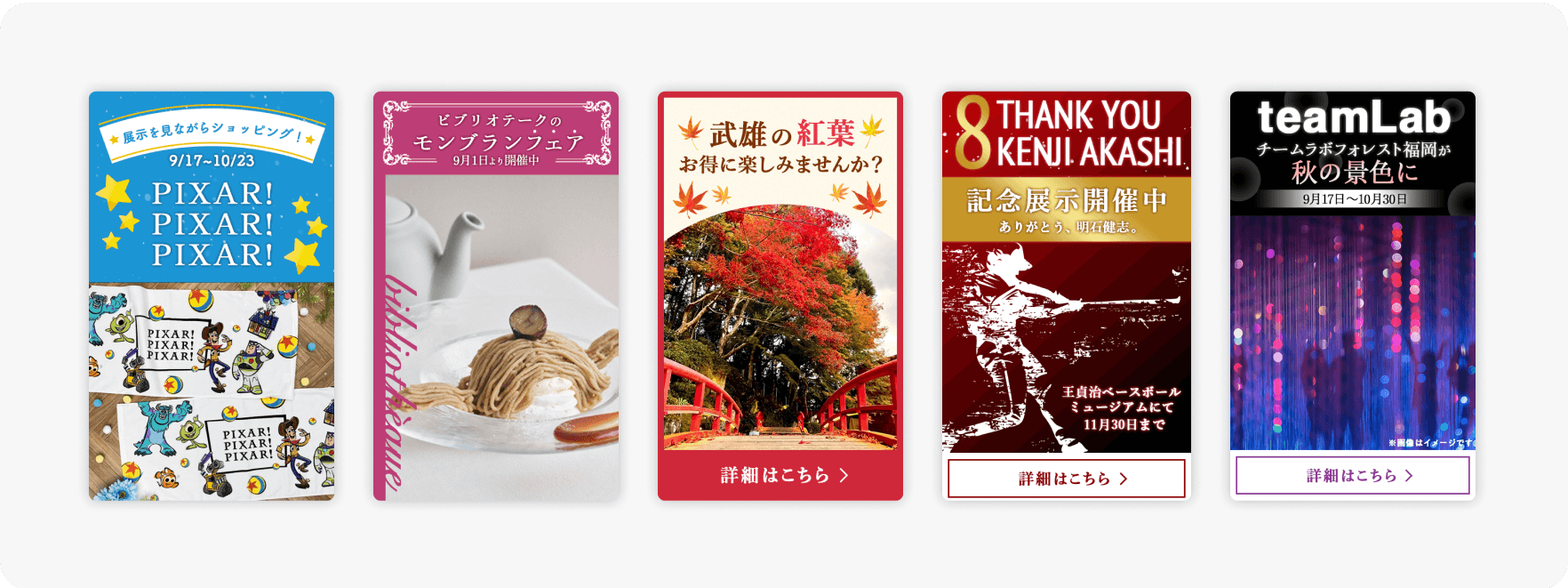
Pop-Up Presentation Approaches
In addition to design-related challenges, we also considered how to present the pop-up, as this was another important factor. We wanted to run A/B tests to identify the most effective presentation, so we explored several layer patterns.
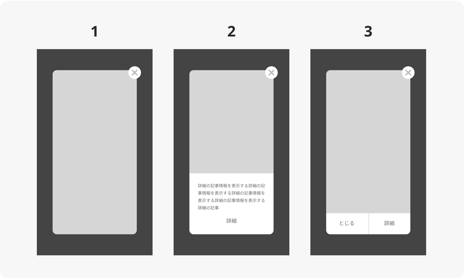
Pattern 1 had a strong advertising feel but tended to be effective when the content shown was relevant to the user. This approach was also seen in ad displays on major video platforms. Pattern 2 felt more friendly and thoughtful, as it included detailed descriptions. However, if the text was too long, users might lose interest. Pattern 3 was a versatile type, commonly seen in carrier pop-ups. We wondered whether it would be suitable for this particular campaign.We tried multiple approaches with these considerations in mind.
Results
As you can see, we explored various directions to upgrade the design. Three months after introducing weekly pop-ups, daily active users (DAU) increased by 1,100. While this figure also reflects the impact of other campaigns, the click-through rate for the pop-ups improved from 7 % to nearly 19 % each time, marking an 11 % increase. This positive result was certainly supported by the strong problem-solving efforts on the business side by the Toyota Financial Services team. However, I believe the key factor was the bi-weekly communication, which helped us deepen our shared understanding of the business goals, article content, and design direction.
Future Challenges
There is still room for improvement. Going forward, we aim to share this initiative with regional partners, deepen our understanding of effective advertising design, and develop design guidelines to maintain consistent quality. We will continue to refine our designs through the PDCA cycle.
関連記事 | Related Posts
We are hiring!
【PdM】オープンポジション/東京・名古屋・大阪
募集背景KINTOテクノロジーズでは新たな事業展開と共に開発するプロダクトが拡大しています。サービスの新規立ち上げ、立ち上げたプロダクトのグロースを推進し、KINTOの事業展開を支えるプロダクトマネージャーを求めています。
【オープンポジション】「気になる!」方はまずはこちらからご応募ください。/東京・名古屋・大阪・福岡
業務内容国内外のKINTOサービスや、トヨタグループの金融、モビリティサービスの内製開発組織である同社にて、ご経験・ご志向性に応じて配属を決定し、ご活躍いただきます。