Vueでpropsとslotを使って再利用コンポーネントを開発する話

こんにちは、KINTO Technologiesグローバル開発部でフロントエンド開発をしているクリスです。
普段フロントエンド開発でコンポーネントを開発する際はpropsを利用して必要な情報を渡す、という話はよく耳にすると思います。Angular, React, Vue, Svelteといった今よく使われているフレームワークではそれぞれの書き方でこの機能を実現しています。すべてのフレームワークを言及すると非常に長い記事になってしまうので、今回はグローバル開発部で良く使っているVueについて話したいと思います。
コンポーネントの再利用性を考える時に、propsだけでは実現しにくい可能性があります。そこで登場するのがslotという機能です。本記事は両者について説明し、利用事例を比較したいと思います。
Propsで情報を渡す
例えば、タイトルがついているテーブル情報を再利用できるコンポーネントとして実装する必要があるとします。タイトル、ヘッダーとデータを渡すためにそれぞれのpropsを渡せば、やりたいことがすぐ実現できます。
# コンポーネント
<template>
  <div>
    <h5>{{ title }}</h5>
    <table>
      <tr>
        <th v-for="header in headers" :key="header">{{ header }}</th>
      </tr>
      <tr v-for="(row, i) in data" :key="i">
        <td v-for="(column, j) in row" :key="`${i}-${j}`">{{ column }}</td>
      </tr>
    </table>
  </div>
</template>

<script>
export default {
  name: 'DataTable',
  props: {
    title,
    headers,
    data
  },
}
</script>
# コンポーネントを呼び出す親
<template>
  <DataTable :title="title" :headers="headers" :data="data"/>
</template>

<script>
// コンポーネントのimport文を省略します
export default {
  data() {
    return {
      title: 'Title',
      headers: ['C1', 'C2', 'C3', 'C4'],
      data: [
        {
          c1: `R1-C1`,
          c2: `R1-C2`,
          c3: `R1-C3`,
          c4: `R1-C4`,
        },
        {
          c1: `R2-C1`,
          c2: `R2-C2`,
          c3: `R2-C3`,
          c4: `R2-C4`,
        },
      ]
    }
  },
}
</script>
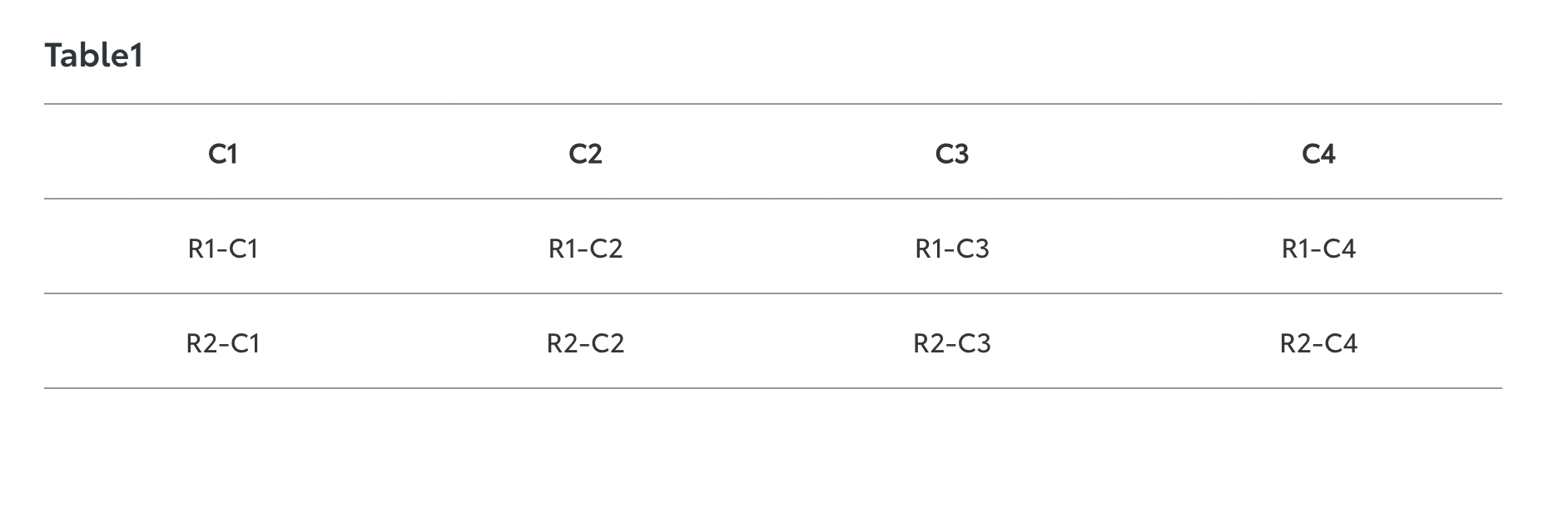
上記のコードで以下のテーブルを作成することができます。(CSSによる簡単なスタイリングをつけていますが、本記事と関係ないため割愛します。)
Propsの利用について少し補足すると、Vue.jsではTypeScriptを利用しなくても、簡単な型チェックができたり、呼び出し元からもらったデータに対してバリデーションをかけられたりします。以下が例になりますが、詳しくはVue.jsの公式ドキュメントから確認してみてください。(本記事の全サンプルコードにこのような設定をつける長くなってしまうため、割愛します)
<script>
export default {
  props: {
    title: {
      // String型のprop。二つ以上の型があり得る場合は[String, Number]などで書きます
      type: String,

      // このpropは必ず呼び出し元から渡してもらう必要があります
      required: true,

      // propのバリデーションチェック。Booleanを返すことで結果を判定します
      validator(value) {
        return value.startsWith('Title')
      }
    },
  },
}
</script>
Propsのみを利用する際の問題点
型の指定、値のバリデーションなどの機能がついているpropsは確かに便利ですが、やりたいことによっては物足りないと感じてしまう時があります。例えばこのような要件を聞いたことありませんか?
- テーブルセルに表示している値を条件によって太文字だったり、斜体だったり、テキストの色を変えられるようにする
- テーブルの各行に一つ以上のアクションを起こすボタンを表示できるようにし、条件によってdisabledできるようにする
聞くと普通に納得できそうな要件ですが、propsのみで実現しようとすると、複雑なコードになりがちです。
セルのスタイルを変更するには、判定のロジックもpropsとしてコンポーネントに渡すようにするか、この値はスタイル変更が必要というマーキングをデータオブジェクトに追加する必要があり、データ行ごとにボタンをつけるには以下のようにボタンの情報をpropsとしてコンポーネントに渡す必要があります。
例えば最初に出したサンプルコードを追加実装すると、以下のようなコードになります。
<template>
  <div>
    <h5>{{ title }}</h5>
    <table>
      <tr>
        <th v-for="header in headers" :key="header">{{ header }}</th>
      </tr>
      <tr v-for="(row, i) in data" :key="i">
        <!-- 受け取ったスタイルを判定する関数でクラス情報を取得 -->
        <td
          v-for="(value, j) in row"
          :class="cellStyle(value)"
          :key="`${i}-${j}`"
        >
          {{ value }}
        </td>
        <!-- ボタンがある場合はボタンの列を別途用意 -->
        <td v-if="buttons.length > 0">
          <button
            v-for="button in buttons"
            :class="button.class"
            :disabled="button.disabled(row)"
            @click="button.onClick(row)"
            :key="`${button}-${i}`"
          >
            {{ button.text }}
          </button>
        </td>
      </tr>
    </table>
  </div>
</template>

<script>
export default {
  props: {
    title,
    headers,
    data,
    // セルのスタイルを決めるロジックをpropsとして受け取る
    cellStyle,
    // ボタン情報をpropとして受け取る
    buttons,
  },
}
</script>
<template>
  <!-- クラス情報を返す関数とbuttonsに関する情報をpropsとして渡す -->
  <DataTable :title="title" :headers="headers" :data="data" :cell-style="cellStyle()" :buttons="buttons" />
</template>

<script>
export default {
  data() {
    return {
      // その他のdata情報を省略
      buttons: [
        {
          text: '編集',
          class: 'btn-primary',
          disabled: (rowData) => {
            // ボタンをdisabledにするかどうかの判断ロジック
          },
          onClick: (rowData) => {
            // ボタンの押下後ロジック
          },
        },
        {
          text: '削除',
          class: 'btn-danger',
          disabled: (rowData) => {
            // ボタンをdisabledにするかどうかの判断ロジック
          },
          onClick: (rowData) => {
            // ボタンの押下後ロジック
          },
        },
      ],
    }
  },
  methods: {
    cellStyle() {
      return (val) => {
        // 必要なスタイルクラス情報を返すロジック
      }
    }
  }
}
</script>
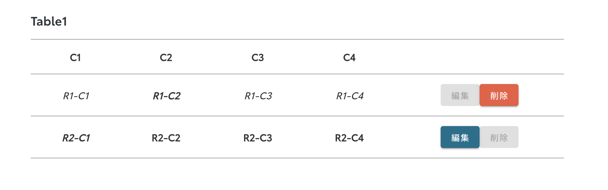
こちらのスクショはボタンの表示とともに、条件に応じてセルのテキストにスタイルをかけたり、表示したボタンをdisabledにするロジックを入れた結果になります。
ただ、もしさらにセル内のhtml構造そのものを制御したい場合(例:<p> タグ、<span> タグ、<li>タグなどを入れる)、
htmlコードを文字列のpropsとして子コンポーネントに渡し、v-htmlを使って表示する必要があります。
v-htmlというのも便利なやり方ですが、htmlコードを文字列で構築するため、たくさんの動的な要素を入れると読みづらくなってしまいます。
上記の話をまとめると、propsのみを利用する場合は子コンポーネントとしてどう受け取るかを深く悩む必要があります。
Slotでpropsの足りない部分を補う
そこでslot機能の出番です。公式ドキュメントにもこの機能の説明がありますが、コンポーネントにslot枠を作成し、呼び出し元から指定したtemplate枠内のhtml情報を渡すことによって、実装したい内容を対象のslot枠に当てはめることができます。
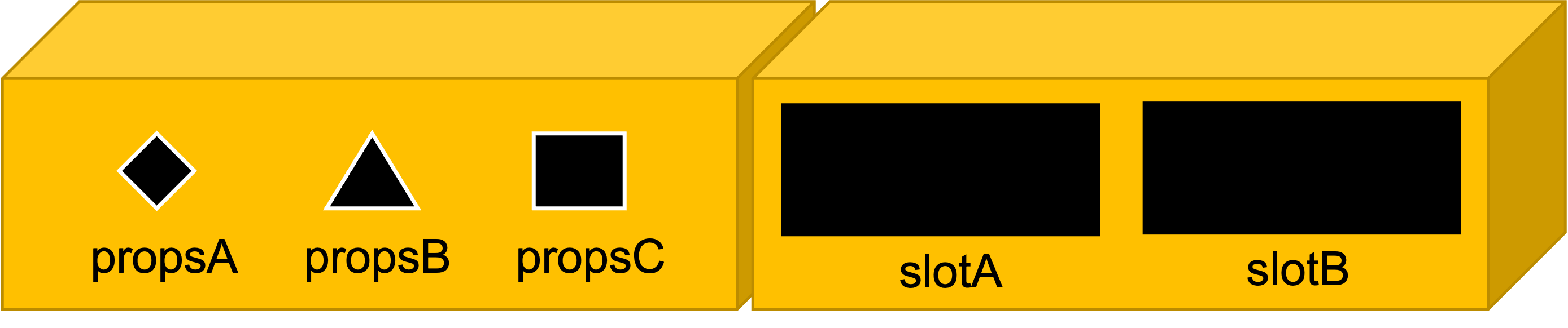
上記のイラストはあくまでイメージですが、左側の箱はpropsを利用したコンポーネントで、右側の箱はslotを利用したコンポーネントです。
Propsの場合、各入口が狭く、型も決まっているため、実装者からはコンポーネントが決めた情報しか渡せないイメージですが、slotの場合は入口がだいぶ広くなるため、何をコンポーネントに渡すかは実装者がより決定権を持っています。
例えば、前半で例としてあげたデータテーブルの実装でslotを使ってみるとします。
<template>
  <div>
    <!-- default slot -->
    <slot />
    <!-- tableというslot -->
    <slot name="table" />
  </div>
</template>
<template>
  <DataTable>
    <!-- コンポーネントの中にhtmlコードを書くと、自動的にコンポーネント側で宣言されたslotに当てはめます -->

    <!-- 特にtemplateで囲まなければdefaultのslotに当てはめます -->
    <h5>Title</h5>

    <!-- tableというslotに当てはめます -->
    <template #table>
      <table>
        <tr>
          <th v-for="header in headers" :keys="header">{{ header }}</th>
        </tr>
        <tr v-for="(row, i) in data" :keys="`row-${i}`">
          <td
            v-for="(column, j) in row"
            :class="{
              'font-italic': italicFont(column),
              'font-weight-bold': boldFont(column)
            }"
            :key="`row-${i}-col-${j}`"
          >
            {{ column }}
          </td>
          <td>
            <button :disabled="editDisabled(column.c1)" @click="edit(column.c1)">編集</button>
            <button :disabled="destroyDisabled(column.c1)" @click="click(column.c1)">削除</button>
          </td>
        </tr>
      </table>
    </template>
  </DataTable>
</template>

<script>
export default {
  // data情報を省略
  methods: {
    edit(id) {
      // その行のデータを編集するロジック
    },
    destroy(id) {
      // その行のデータを削除するロジック
    },
    italicFont(val) {
      // 斜体にする判断ロジック
    },
    boldFont(val) {
      // 太文字にする判断ロジック
    },
    editDisabled(id) {
      // 編集ボタンをdisabledする判断ロジック
    },
    destroyDisabled(id) {
      // 削除ボタンをdisabledする判断ロジック
    }
  },
}
</script>
この例でいうと、コンポーネントにpropsを渡しておらず、かなりすっきりして見えますが、一つ問題があります。それは、実装者の好きなようになんでも実装できてしまうことです。例えば上記のコンポーネントを利用すると、親ファイルで以下のように指定のタグ(タイトルはh5タグ、テーブルはtableタグなど)を利用し、適切なスタイルをつけるべきなのに、実装者への共有不足、もしくは実装の知識不足で別のタグを利用してしまう可能性があります。そうなると、実際の見た目では違く見えてしまうかもしれませんし、テストの際に各画面サイズで崩れていないか再確認する必要があります。
<template>
  <DataTable>
    <!-- h5ではなく、h1を利用 -->
    <h1>Title</h1>

    <template #table>
      <!-- <table>, <tr>や<th>を利用せず<div>を利用 -->
      <div>
        <div>
          <div v-for="header in headers" :keys="header">{{ header }}</div>
          <div></div>
        </div>
        <div v-for="(row, i) in data" :keys="`row-${i}`">
          <div v-for="(column, j) in row" :key="`row-${i}-col-${j}`">
            {{ column }}
          </div>
          <div>
            <button :disabled="editDisabled(column.c1)" @click="edit(column.c1)">編集</button>
            <button :disabled="destroyDisabled(column.c1)" @click="click(column.c1)">削除</button>
          </div>
        </div>
      </div>
    </template>
  </DataTable>
</template>
テーブルなのにすべて<div>タグを利用するとは極端な例かもしれませんが、必要以上な自由度は与えない方が無難です。会社やチームによって解釈が違いますが、私にとっての理想は、デザイナーと相談した上で、必要な部分だけ自由を与えることです。どの部分が実装時の仕様に応じて自由に実装してもらっていいか、どの部分が必ず一つのやり方に従ってもらわないといけないかを決めてから、propsの利用や、slotを使い分けるべきと思います。
<template>
  <div>
    <!-- 必ずテキストを<h5>に入るようにpropsを利用 -->
    <h5>{{ title }}</h5>

    <!-- 必ず<table>タグを利用 -->
    <table>
      <tr>
        <!-- header情報をpropsで渡すことで、必ず<th>を利用する -->
        <th v-for="header in headers" :key="header">{{ header }}</th>
      </tr>

      <!-- 渡されたデータの行数に応じて動的にslotを生成 -->
      <!-- v-bindを利用して、呼び出し元のtemplateにデータを渡す -->
      <slot name="table-item" v-for="row in data" v-bind="row" />
    </table>
  </div>
</template>

<script>
export default {
  data() {
    return {
      title,
      headers,
      data
    }
  }
}
</script>
<template>
  <!-- タイトルとヘッダーはpropsで渡す -->
  <DataTable title="Title" :headers="headers" :data="data">

    <!-- コンポーネント側のv-bindされたデータを受け取る -->
    <template #table-item="row">

      <!-- 行のデータを受け取り、表示方法を定義 -->
      <tr>
        <td v-for="(column, i) in row" :key="`col-${i}`">
          {{ column }}
        </td>
        <td>
          <button :disabled="editDisabled(column.c1)" @click="edit(column.c1)">編集</button>
          <button :disabled="destroyDisabled(column.c1)" @click="click(column.c1)">削除</button>
        </td>
      </tr>
    </template>
  </DataTable>
</template>
ちなみに、slotを利用する際に、コンポーネント側で this.$scopedSlotsを利用することで、どのslotが呼び出し元に利用され、またどのように利用されているか確認することができます。ユースケースは様々ありますが、例えば利用されているslotの中でどんなタグが利用されているか調べることができます。これは先述したslotの自由度が高すぎる問題に対して、一種のマイルドなバリデーションをかけることが可能になります。
<template>
  <DataTable title="Title" :headers="headers" :data="data">
    <template #table-item="row">

      <!-- <tr>ではない場合は何かしらの方法で実装者にお知らせするなど -->
      <div>
        <td v-for="(column, i) in row" :key="`col-${i}`">
          {{ column }}
        </td>
      </div>
    </template>
  </DataTable>
</template>
まとめ
最後のまとめですが、Vueによる再利用コンポーネントの開発ではpropsを利用するのが一番簡単なものの、本記事にある事例のように柔軟性が欠けています。一方、slotを利用すると、実装者がより自由に実装できますが、様々な理由で、想定しなかった実装方法を利用したことによって、品質担保ができなくなる可能性があります。
そこで、コンポーネントの開発関係者を交えてあらかじめコンポーネントのどの部分にどのレベルの自由を与えるかを決めた上、与えてもいい自由度に合わせてpropsとslotを使い分けて開発し、コンポーネントの利用者に対してもドキュメントなどを通して、仕様を理解してもらったほうがいいと思います。
関連記事 | Related Posts


We are hiring!
【SRE】xRE G/東京・大阪・名古屋・福岡
xREグループについてxREグループは、SRE / DBRE の専門性を活かしながら、プロダクト横断で信頼性・運用品質・開発生産性の向上を支える組織です。私たちは、単一プロダクトの信頼性改善にとどまらず、その知見を抽象化し、トヨタグループ全体に展開することで「信頼性の標準」を定義することを目指しています。
【オープンポジション】「気になる!」方はまずはこちらからご応募ください。/東京・名古屋・大阪・福岡
業務内容国内外のKINTOサービスや、トヨタグループの金融、モビリティサービスの内製開発組織である同社にて、ご経験・ご志向性に応じて配属を決定し、ご活躍いただきます。