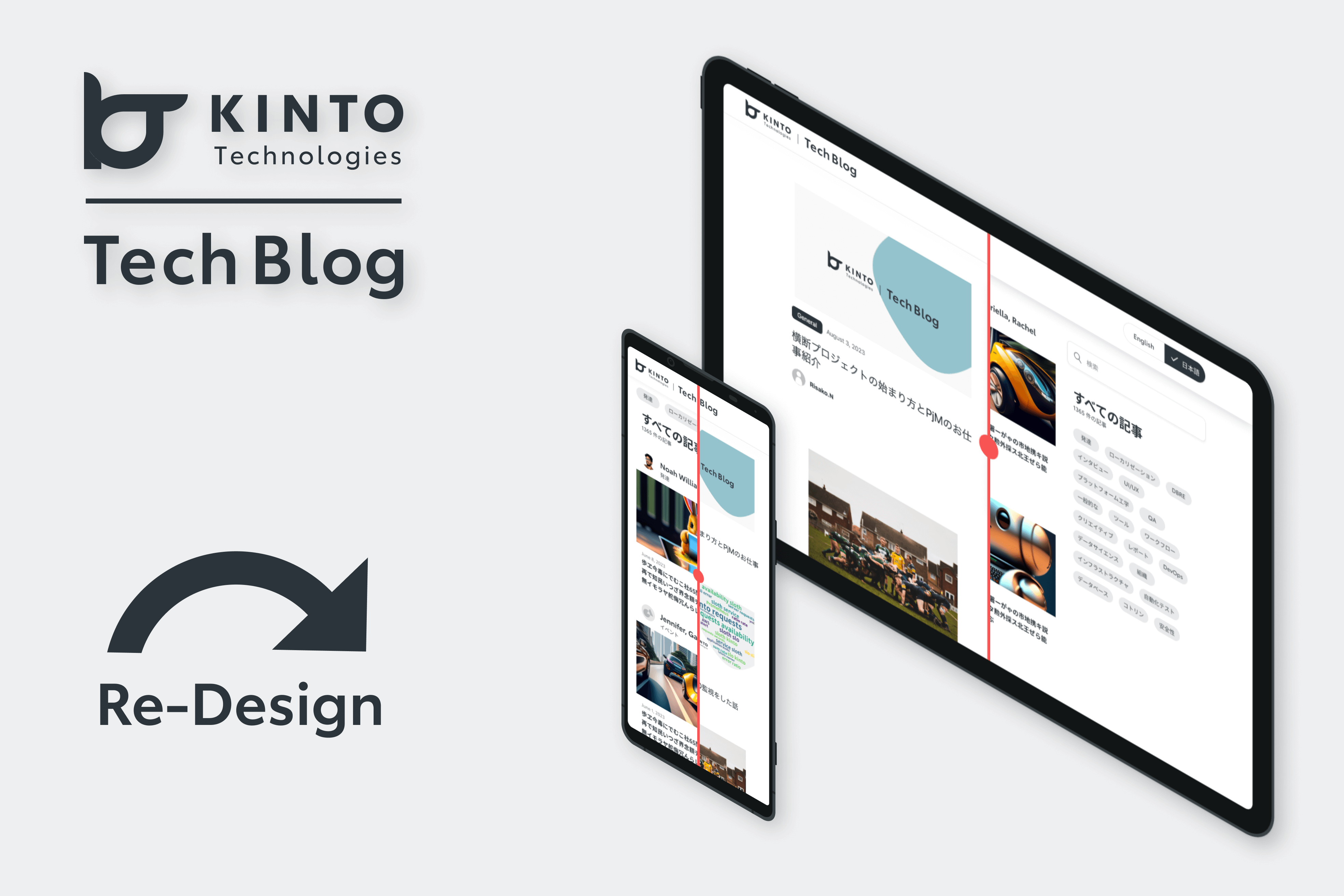
エキサイティングなTechBlogのデザイン変更
はじめまして!グローバル開発グループUXUIチームのモジです。
KINTOテクノロジーズでの私の主な役割はプロダクトデザインで、自分のビジネス知識とデザイン・スキルを融合できる点が気に入っています。私は、使いやすく、美しく、測定可能な結果を生み出すユーザーインターフェースの創造を目指しています。
私の究極の目的は、複雑な問題をシンプルでユーザーフレンドリーな体験に変え、ユーザーが満足できるようにすることです。
TechBlogに初めて記事を書きます! TechBlog自体のデザイン変更プロセスについてご紹介します。楽しんでいただけると嬉しいです。
取り組み範囲と困難だったこと
昨今のデジタル社会では、変化に適応するために刷新と再開発が常に必要です。KINTOテクノロジーズでは、TechBlogのデザイン変更を2つのフェーズ段階に分けて実施することを決定し、大きな変化を遂げました。
KINTOデザインシステムに準拠することを大前提として、各フェーズにはユーザーエクスペリエンス向上と機能性向上といった明確な目的を設定しました。
以下の画像は、TechBlogチームと協議した結果、デザインを変更した範囲を示しています。
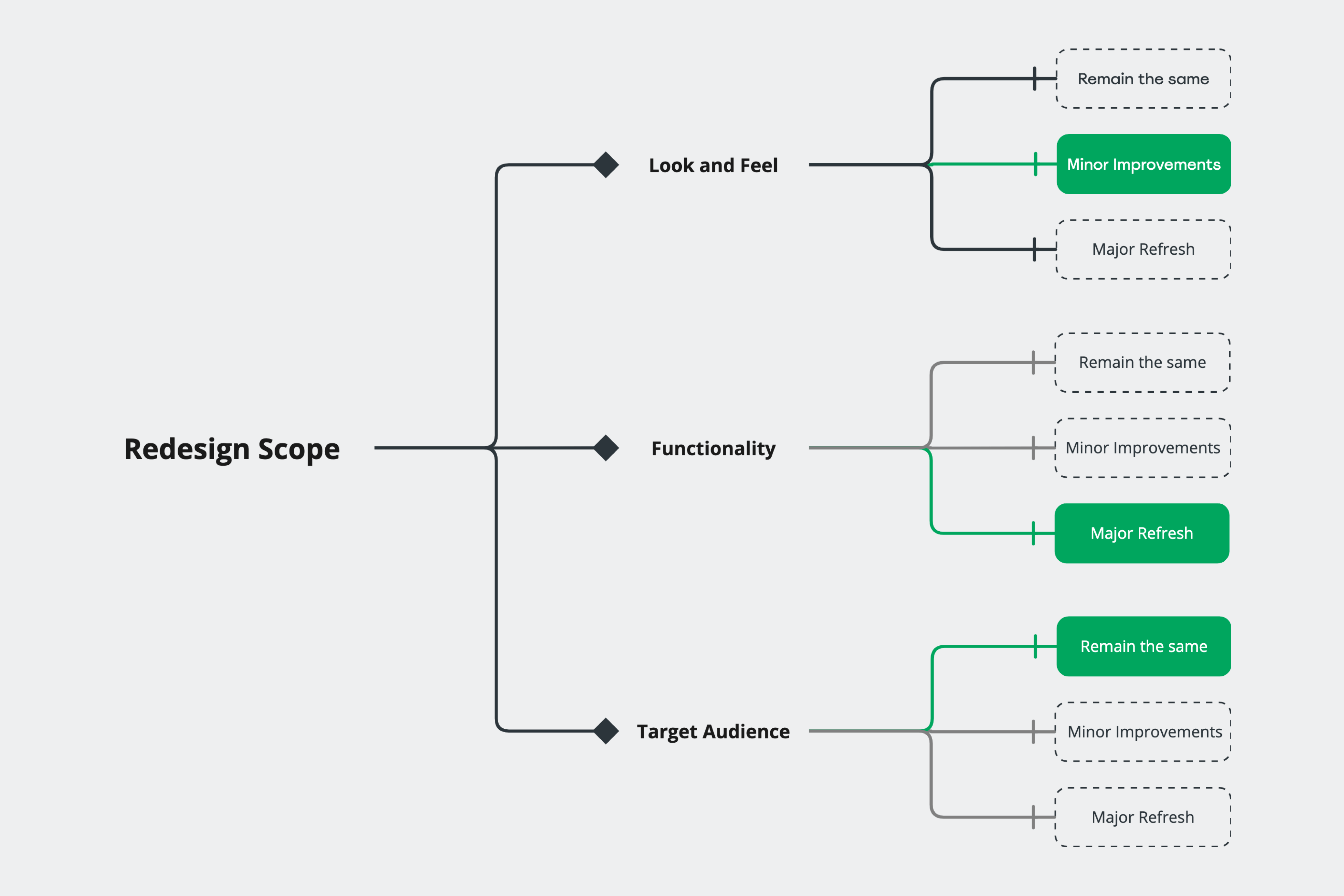
デザイン変更の範囲
デザイン変更のプロセスでは、入り組んだ迷路を潜り抜けるように様々な困難が待ち受けていました。
KINTOデザインシステムは、動的で常に進化を続けています。また、ウェブパターンについては、デスクトップビュー用の組み合わせに限られてしまっていました。このような状況においては、新しい機能をKINTOデザインシステムに合わせるために、綿密な計画を立て実行する必要があり、これが大きな課題のひとつとなりました。
こういった複雑さに加えて、時間的な制約と、モバイルビューとデスクトップビューという2つのプラットフォームに対してデザイン変更を行う必要性がありました。
以下の画像では、モバイルとデスクトップの両方のビューにおける現デザインの主な問題点を示しています。
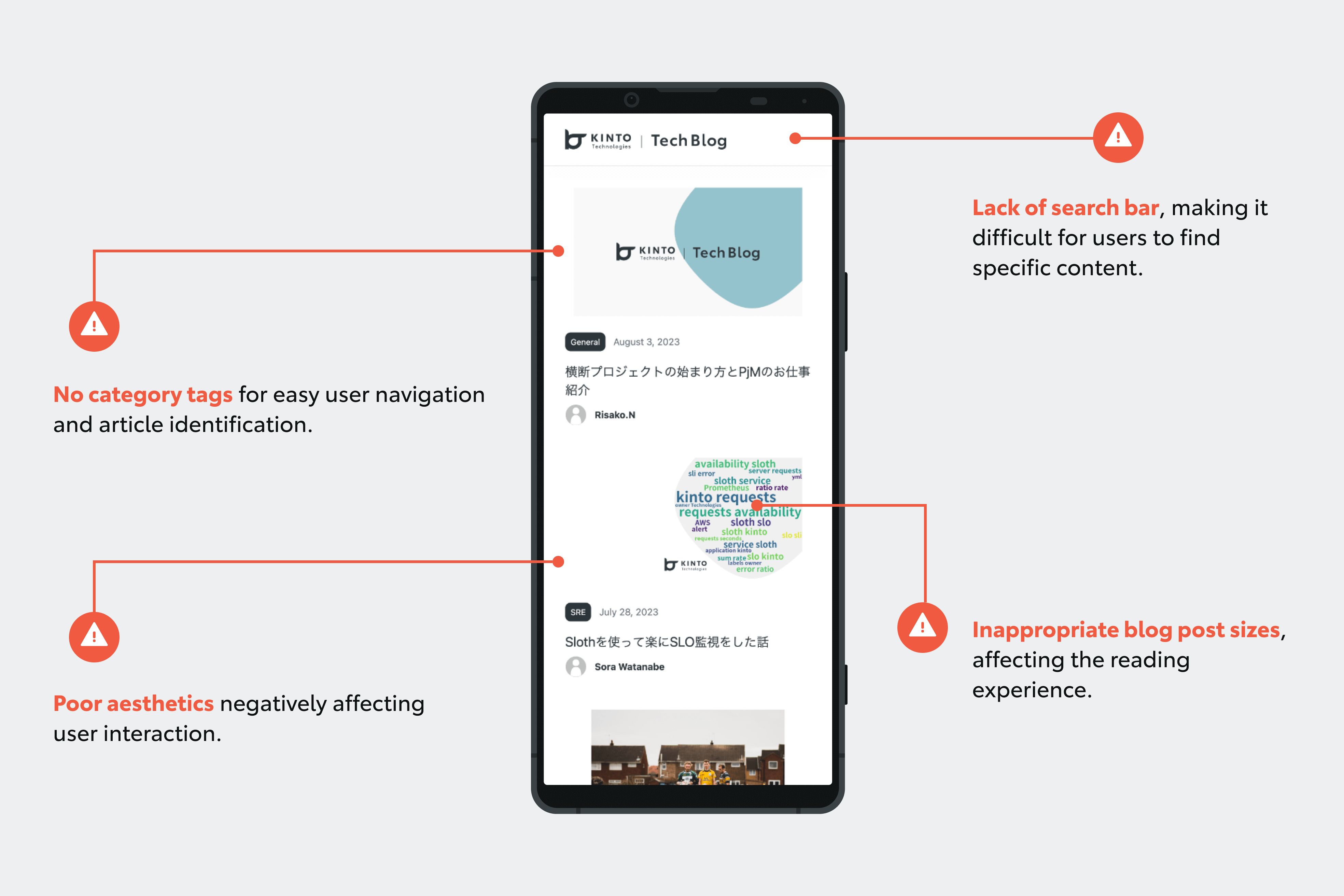
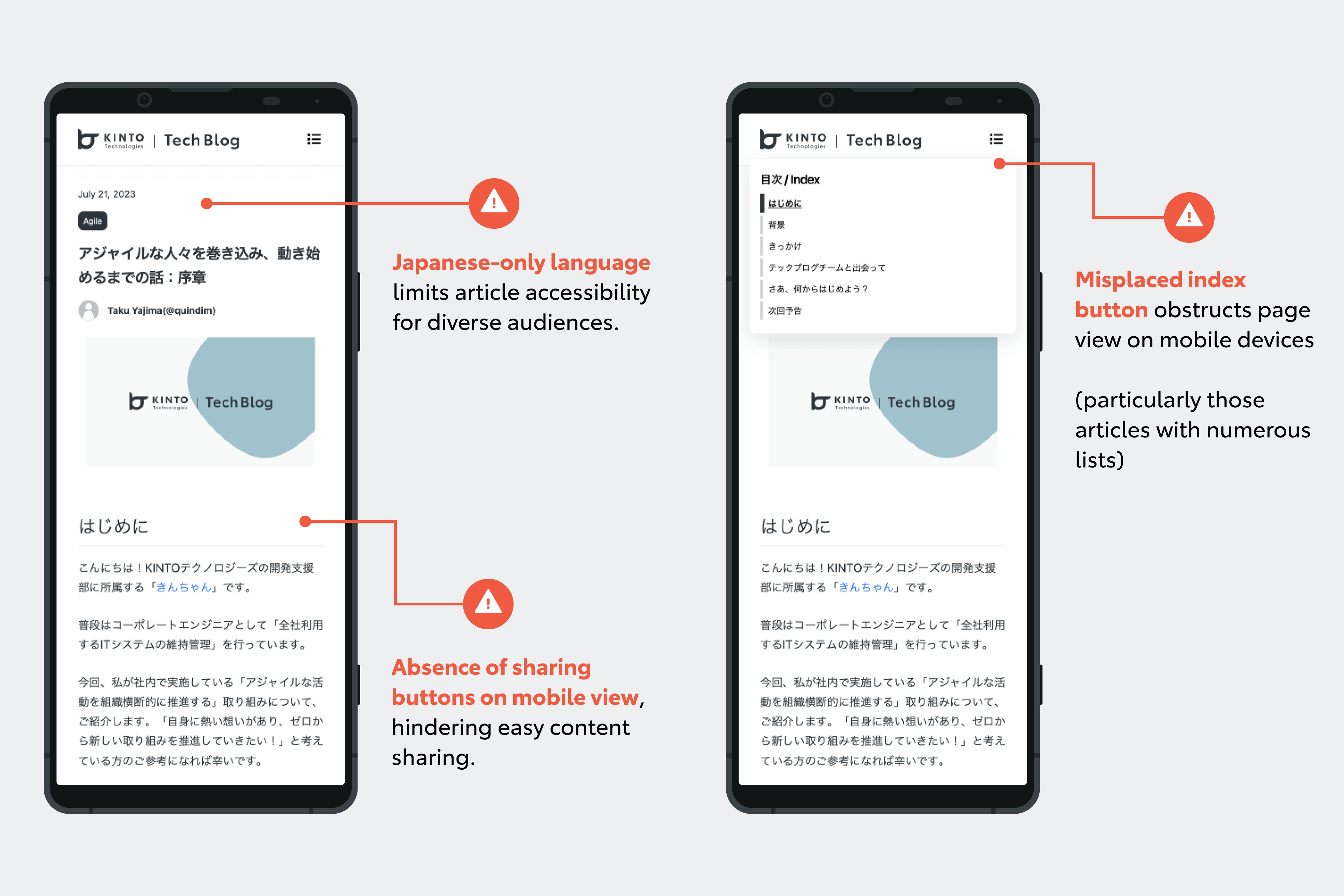
モバイルビューの主な問題点
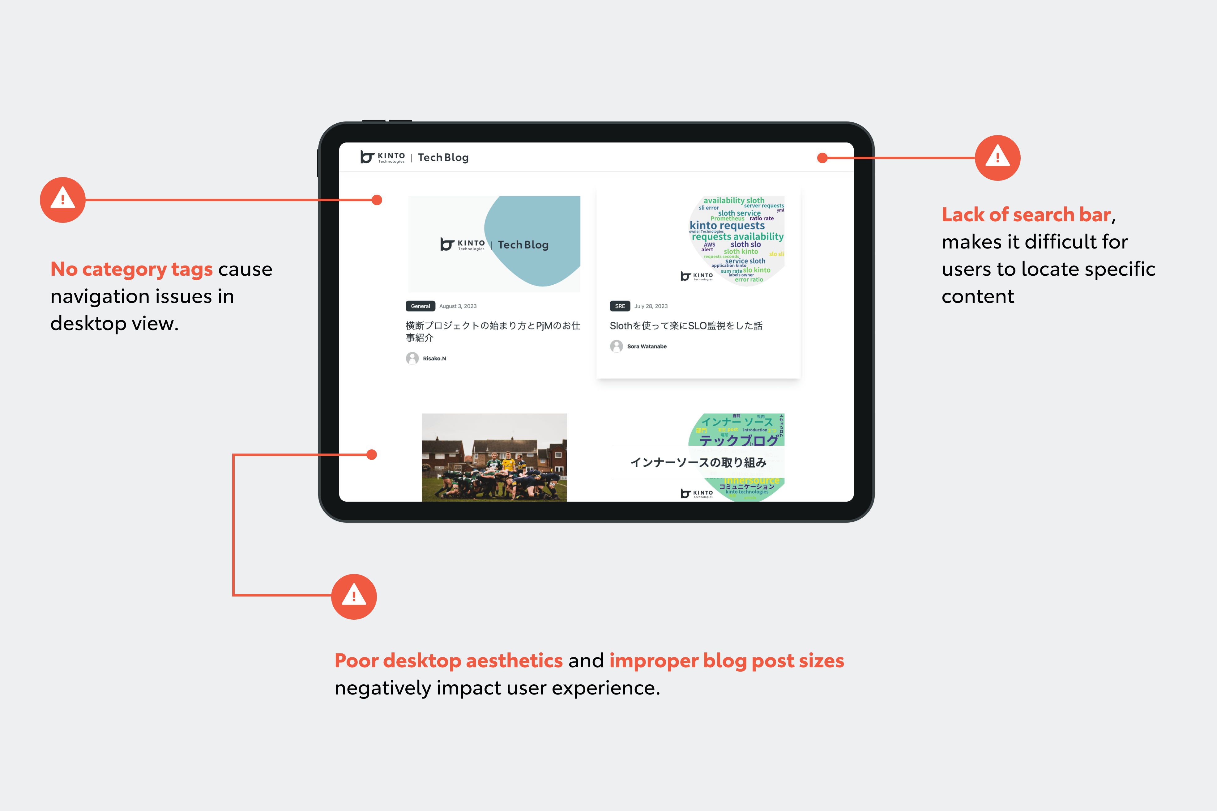
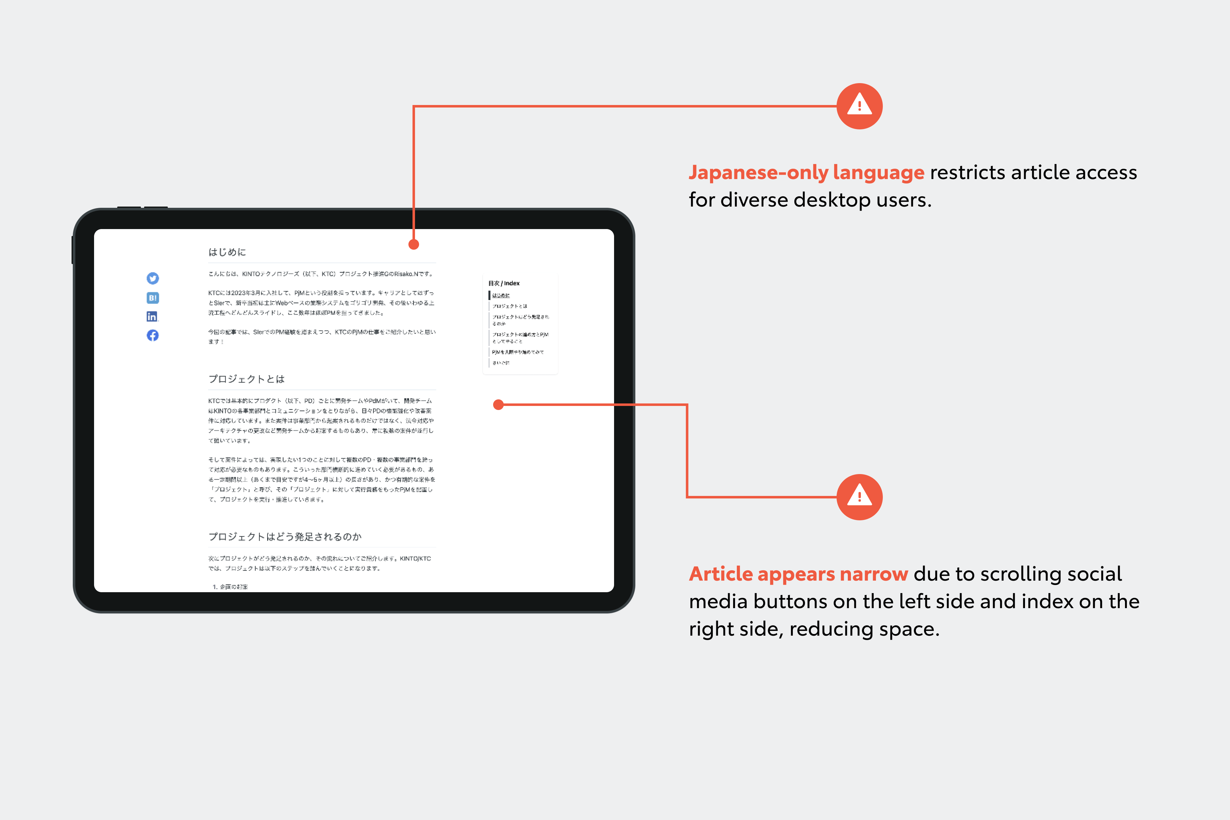
デスクトップビューの主な問題点
第1フェーズ:ユーザビリティとアクセシビリティ重視
デザイン変更プロセスの初めの段階では、主にデスクトップとモバイルの両方でTechBlogのユーザビリティとアクセシビリティを向上させることに取り組みました。
関連する記事や情報にアクセスしやすくするための重要機能として、検索バーを導入しました。
読者は、この機能があることで幅広いブログコンテンツをスムーズに検索することができるようになります。
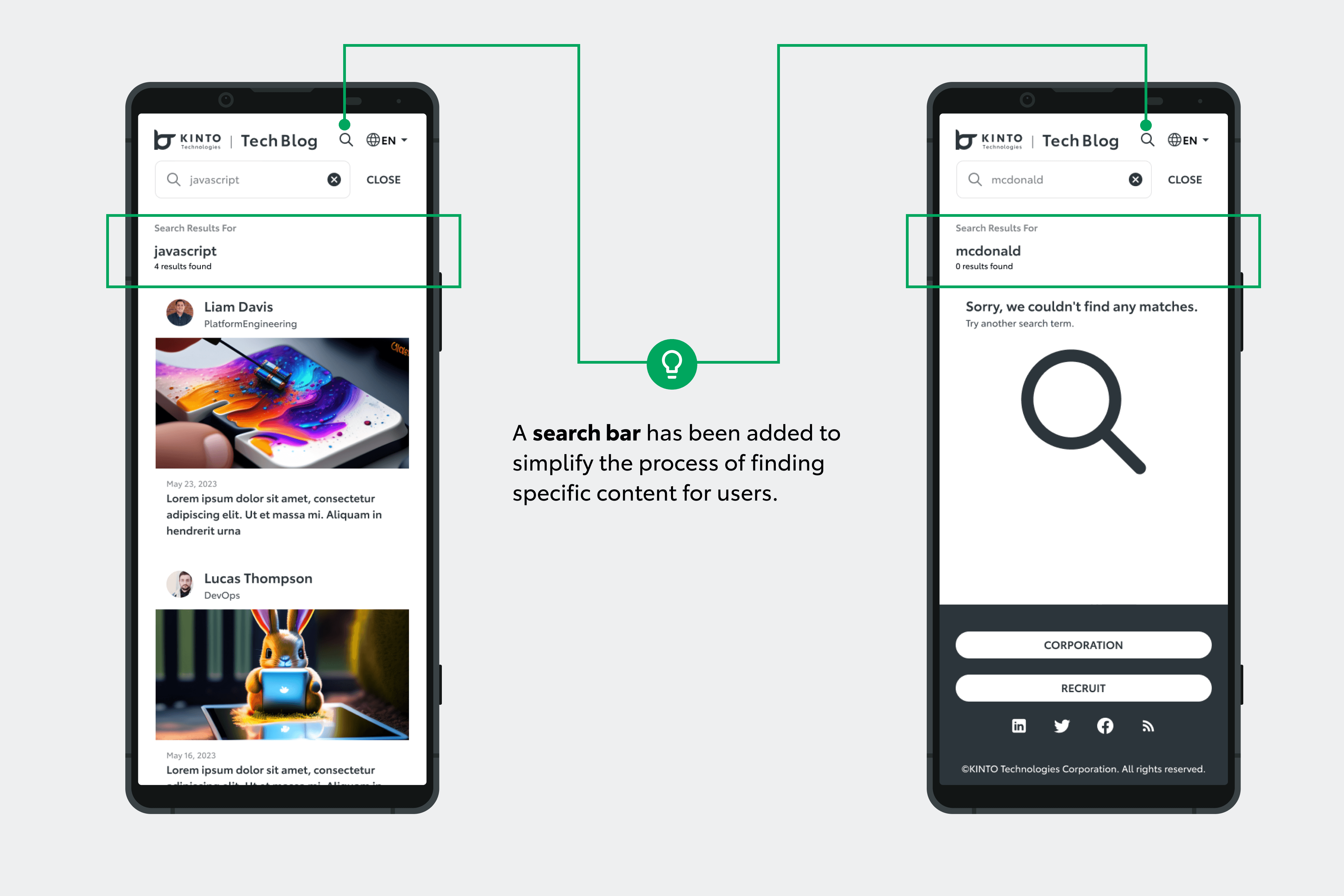
モバイルビューの検索バー
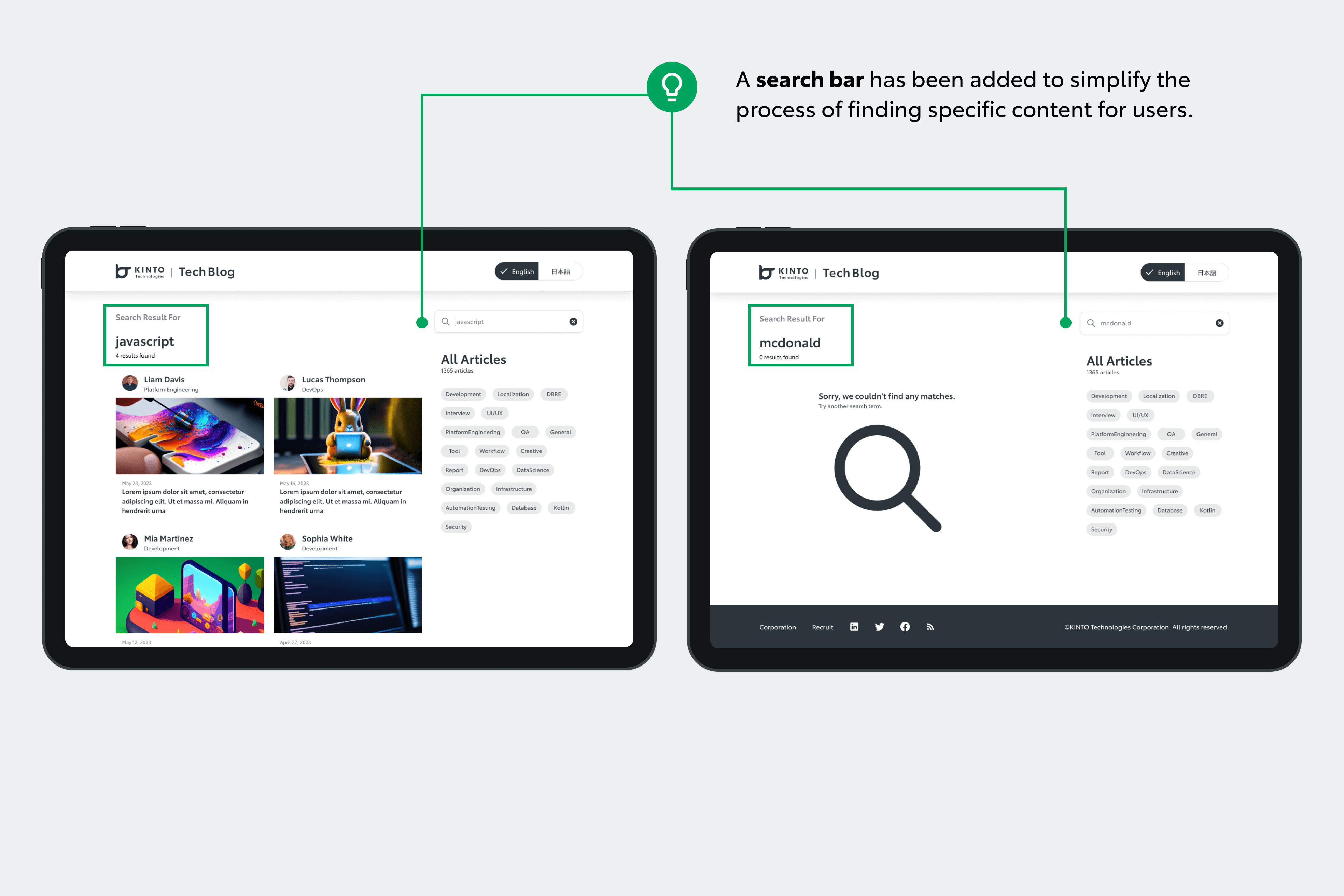
デスクトップビューの検索バー
このフェーズでのもうひとつの大きな改善ポイントとして、カテゴリータグを配置しました。この機能を利用すれば、読者はテクノロジー関連のトピック全体を簡単に分類、把握できます。コンテンツを検索するプロセスが強化され、閲覧体験の向上につながります。
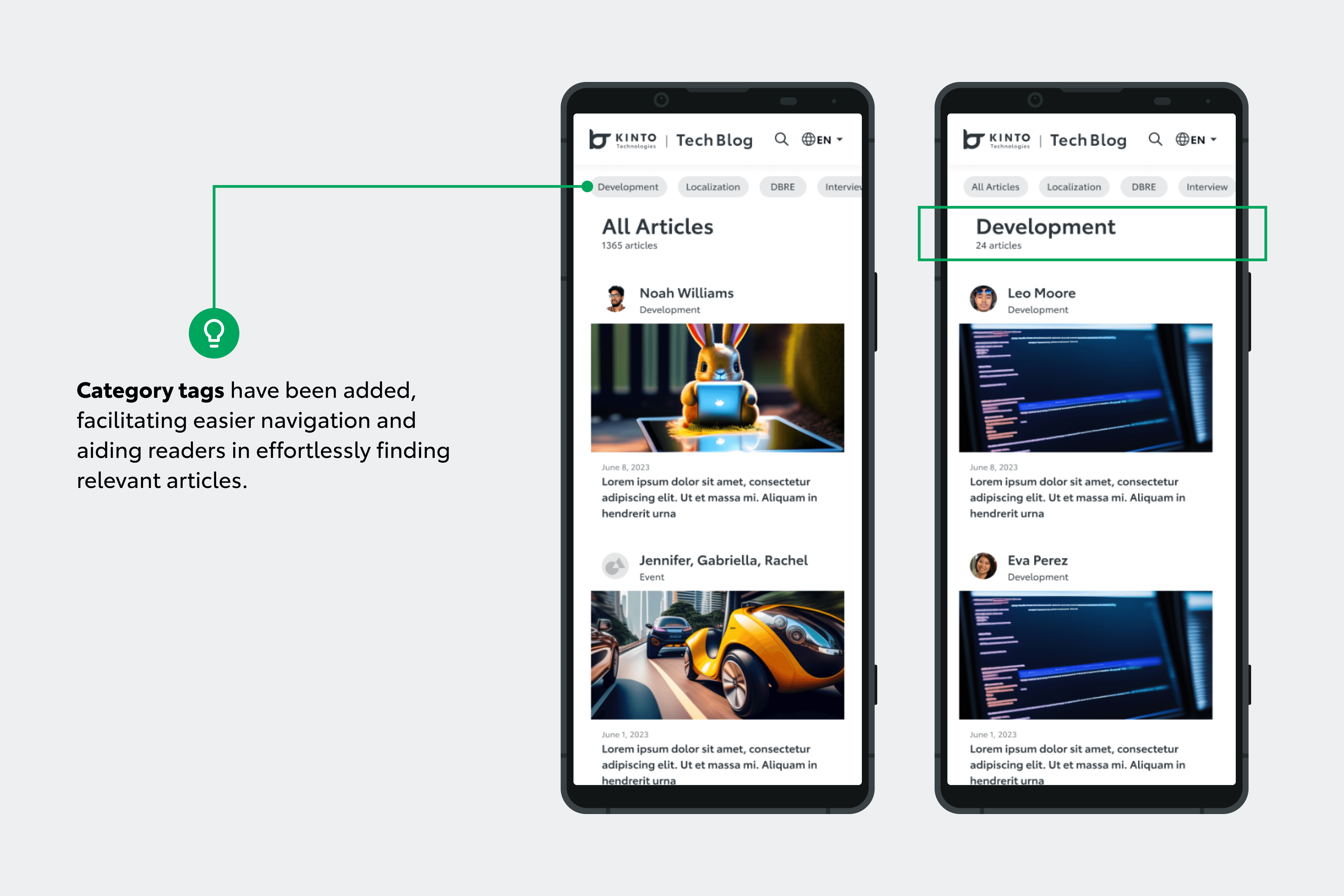
スクロール可能なカルーセル形式のカテゴリータグ
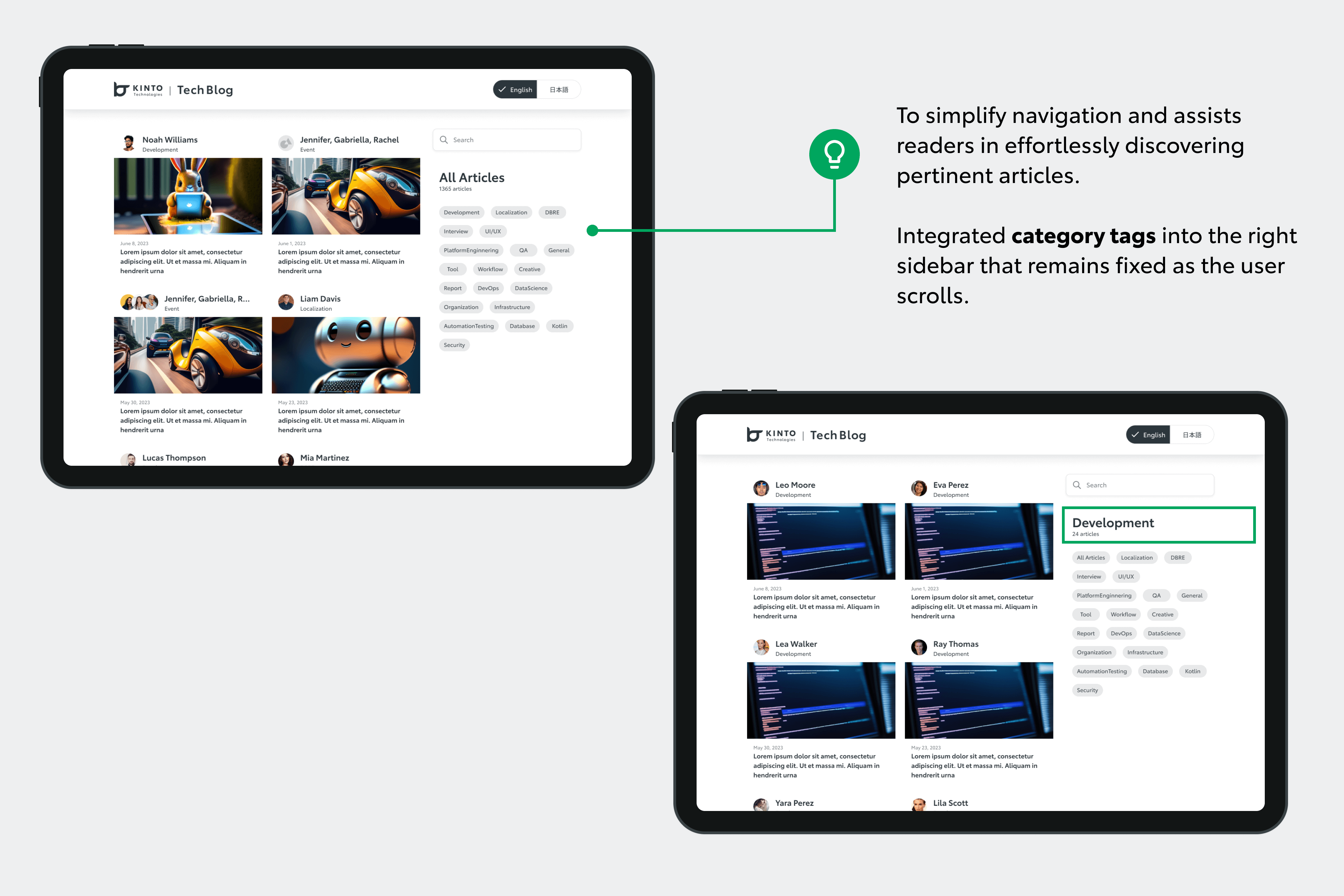
カテゴリータグを右サイドバーに配置
このフェーズでの重要なビジュアル変更は、トップページのブログ記事サイズの調整でした。
デスクトップとモバイルの両方でこの変更を行いました。これにより、コンテンツの読みやすさと全体的な視覚アピールのバランスが良くなり、ユーザーインターフェースが向上しました。
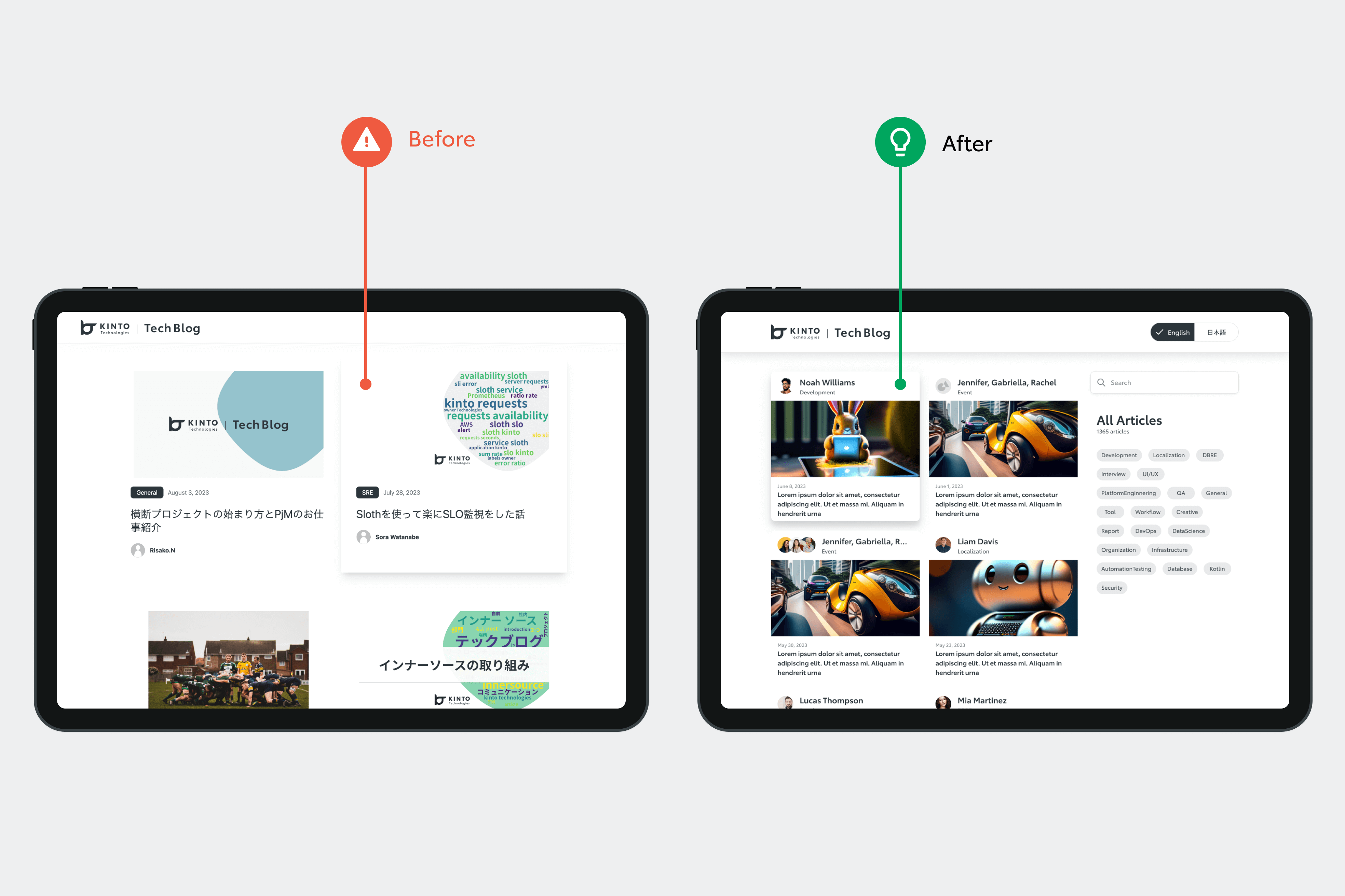
デスクトップビューでのブログ記事サイズ ビフォーアフター
第2フェーズ:機能性と多言語アクセスの強化
TechBlogデザイン変更の第二フェーズでは、他にも便利な機能が統合され、全体的な機能性とユーザーエクスペリエンスの向上につながりました。
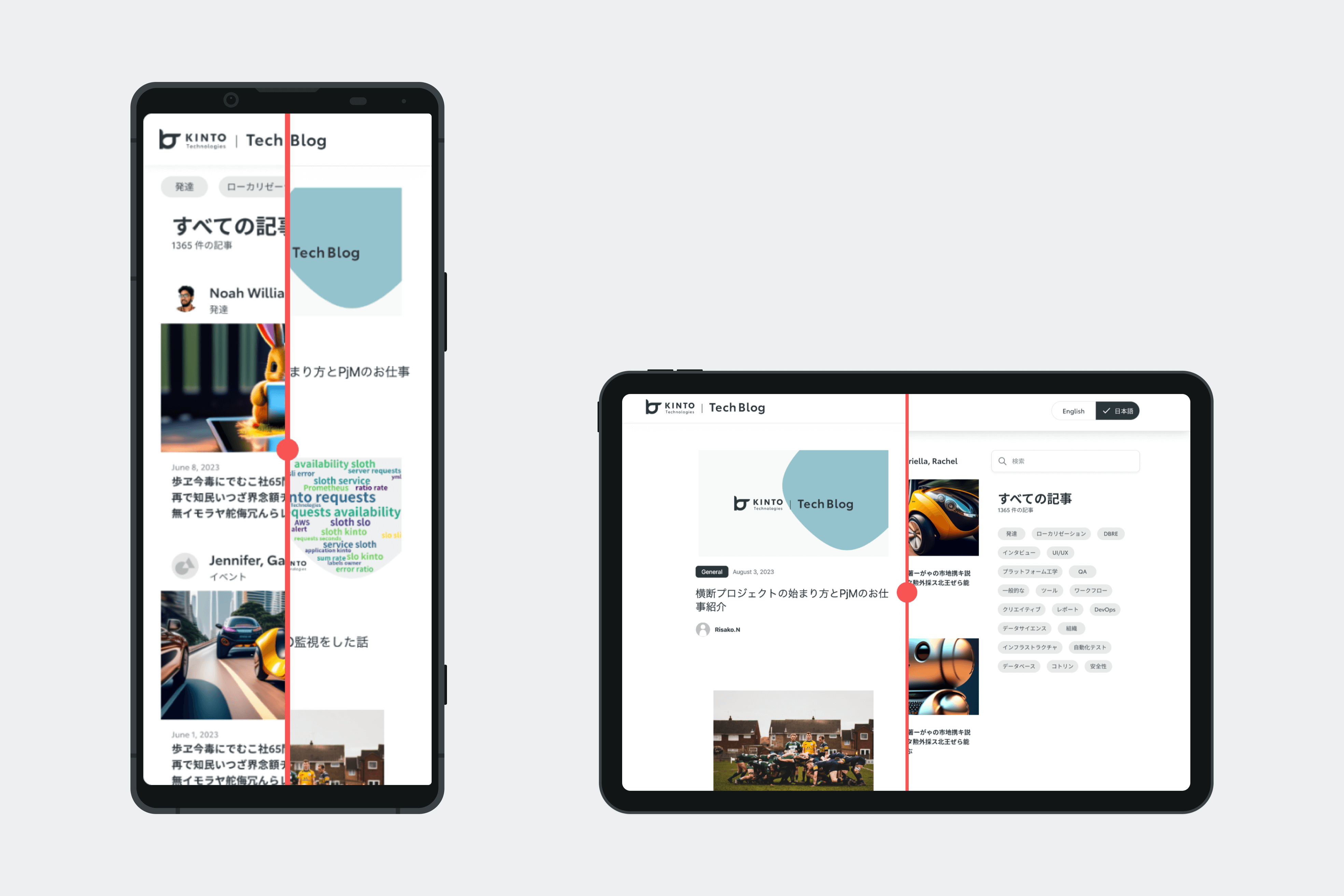
特筆すべきは、言語切り替えが導入され、英語と日本語両方の読者に対応できるようになったことです。
この機能は、トップ・ナビゲーション・バー(モバイルビュー)のスペースの制約があるため当初は難航したものの、最終的には、読者が簡単に言語オプションを切り替えられるような形で盛り込むことができました。
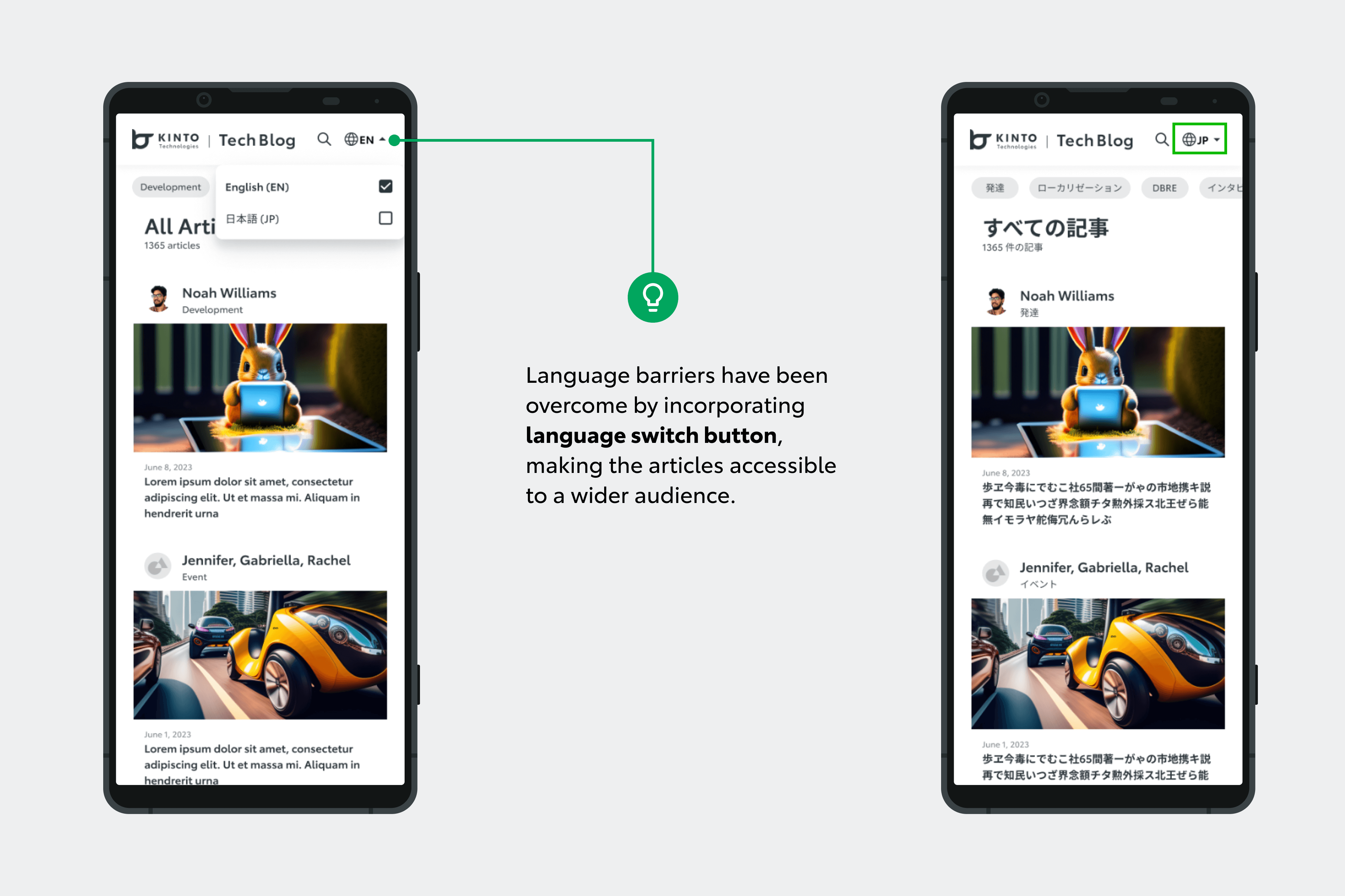
モバイルビューでの言語切り替え
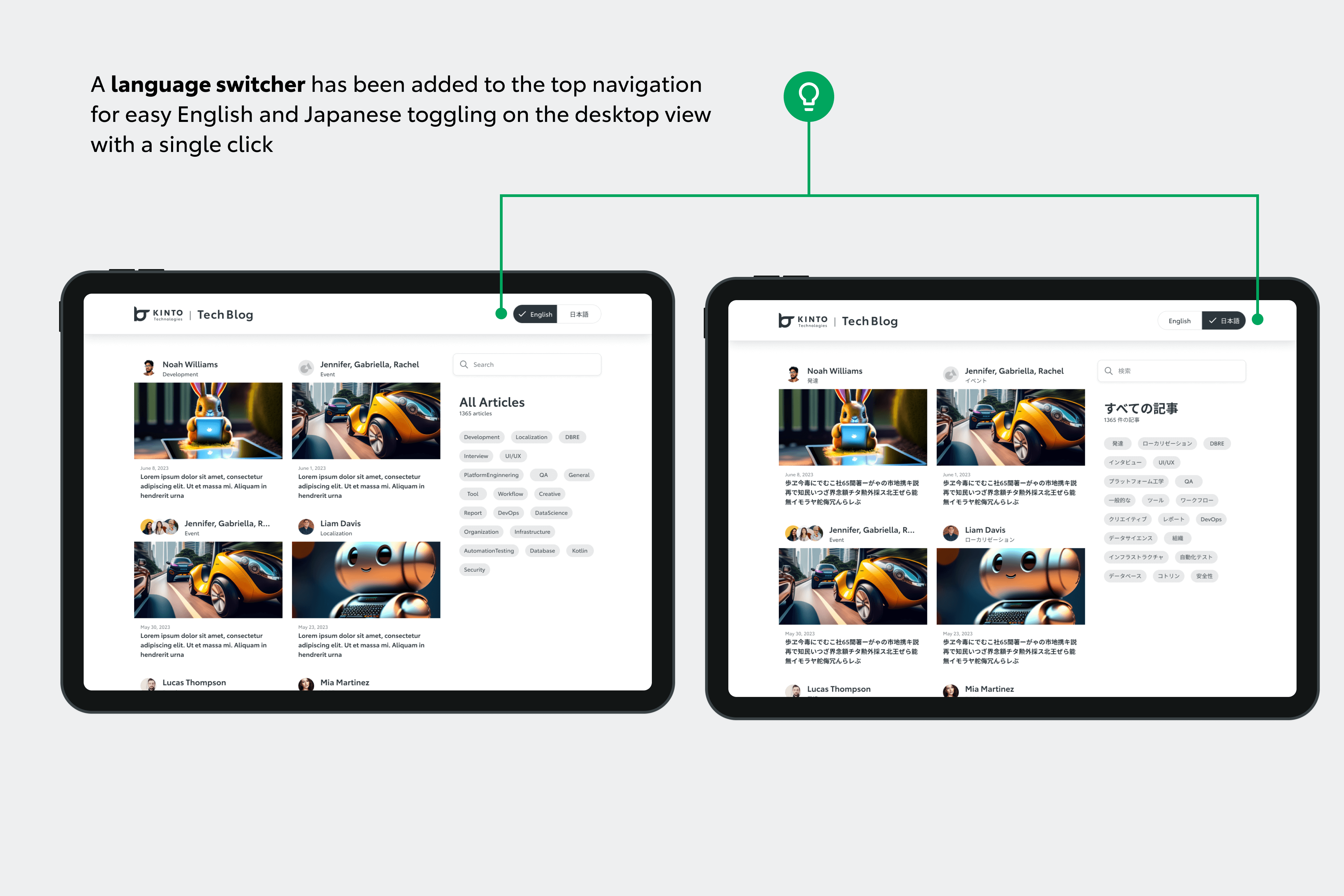
デスクトップビューの言語切り替え
このデザイン変更のフェーズでは、記事ページのインデックスの配置をモバイルビュー用に調整し、長文のブログ内のナビゲーションを効率化しました。
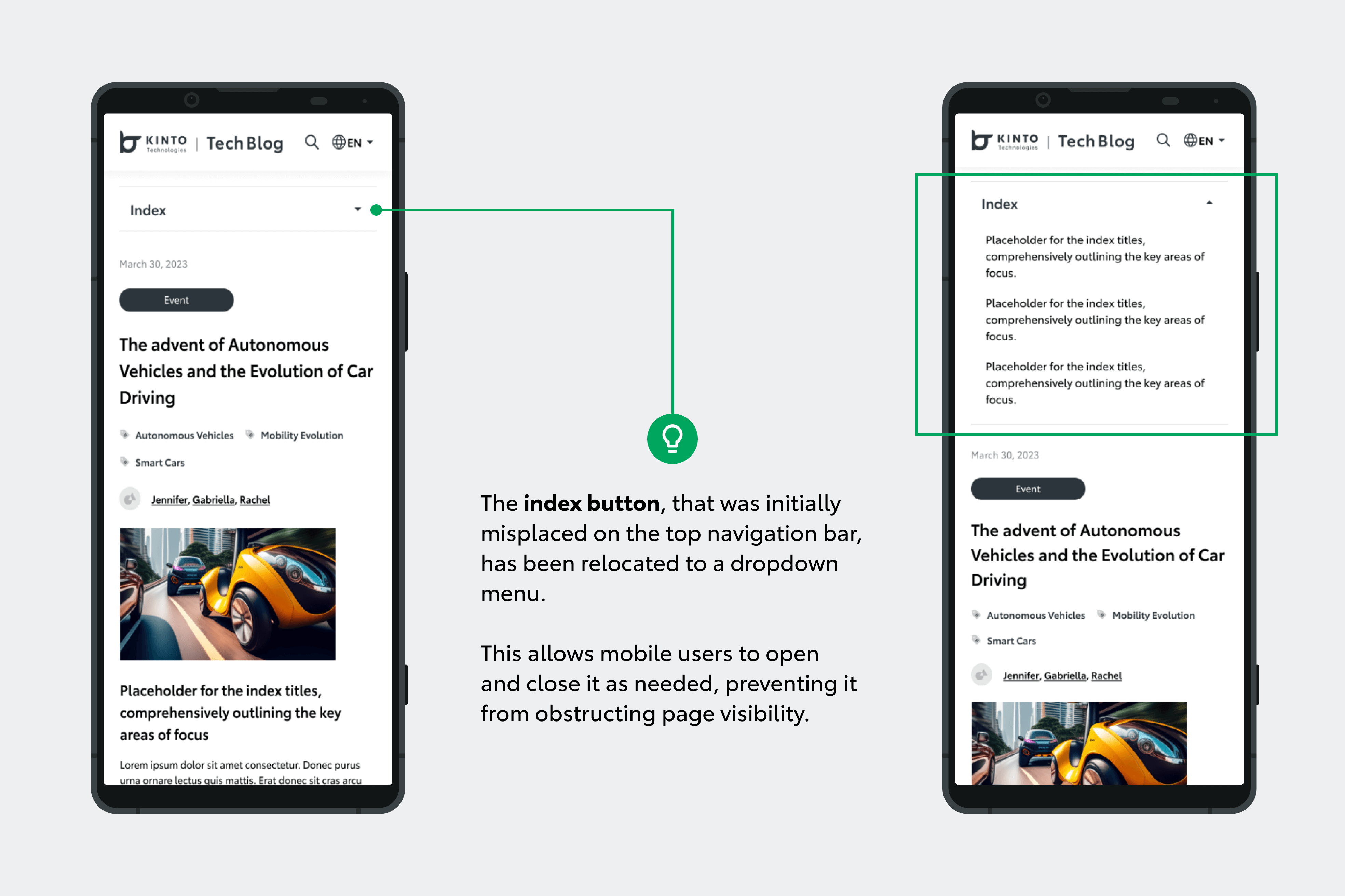
モバイルビューのインデックス配置
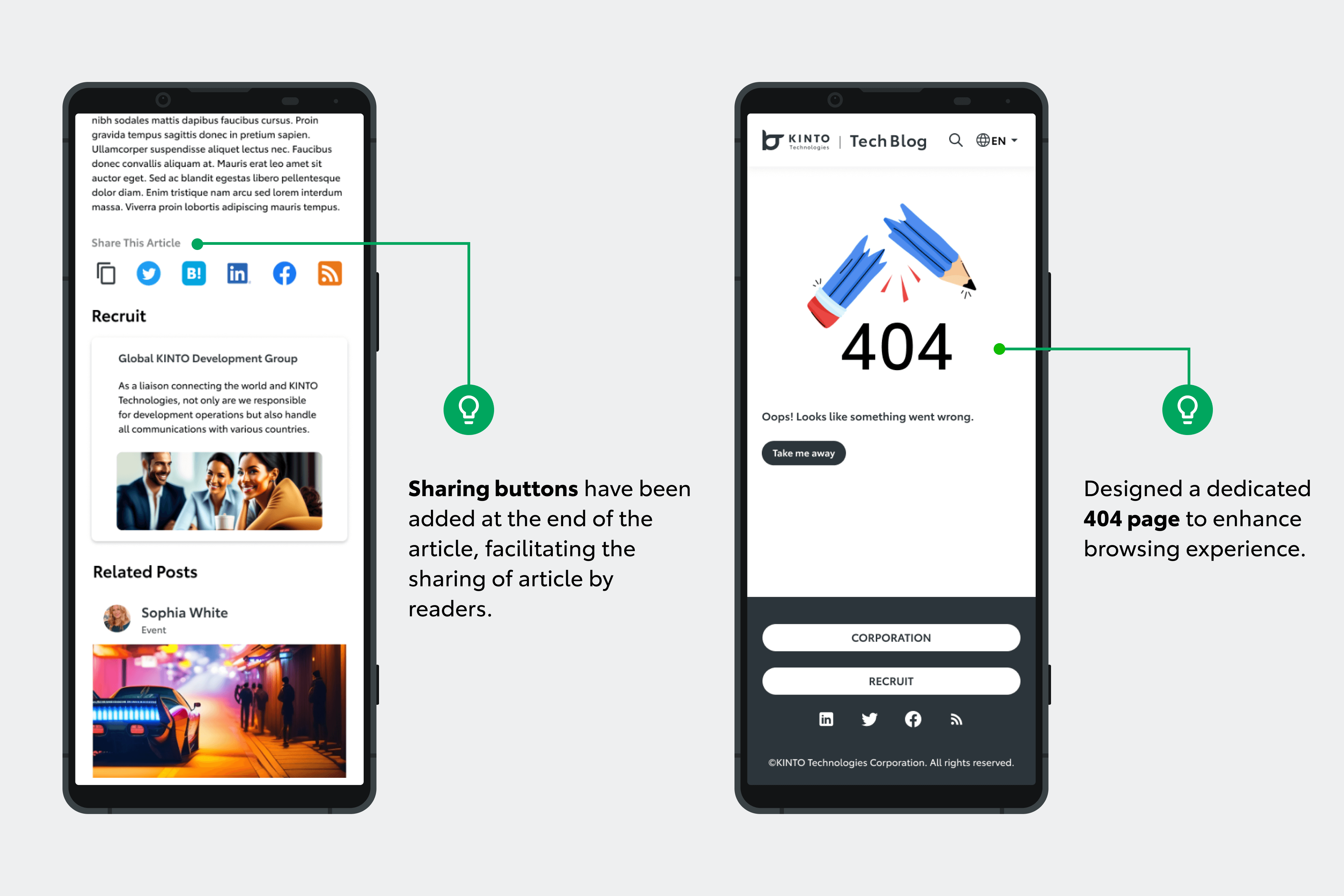
さらに、ソーシャルメディアボタンも配置変更したことで、共有が簡単になり、デスクトップビューでのユーザーエンゲージメント向上に寄与します。
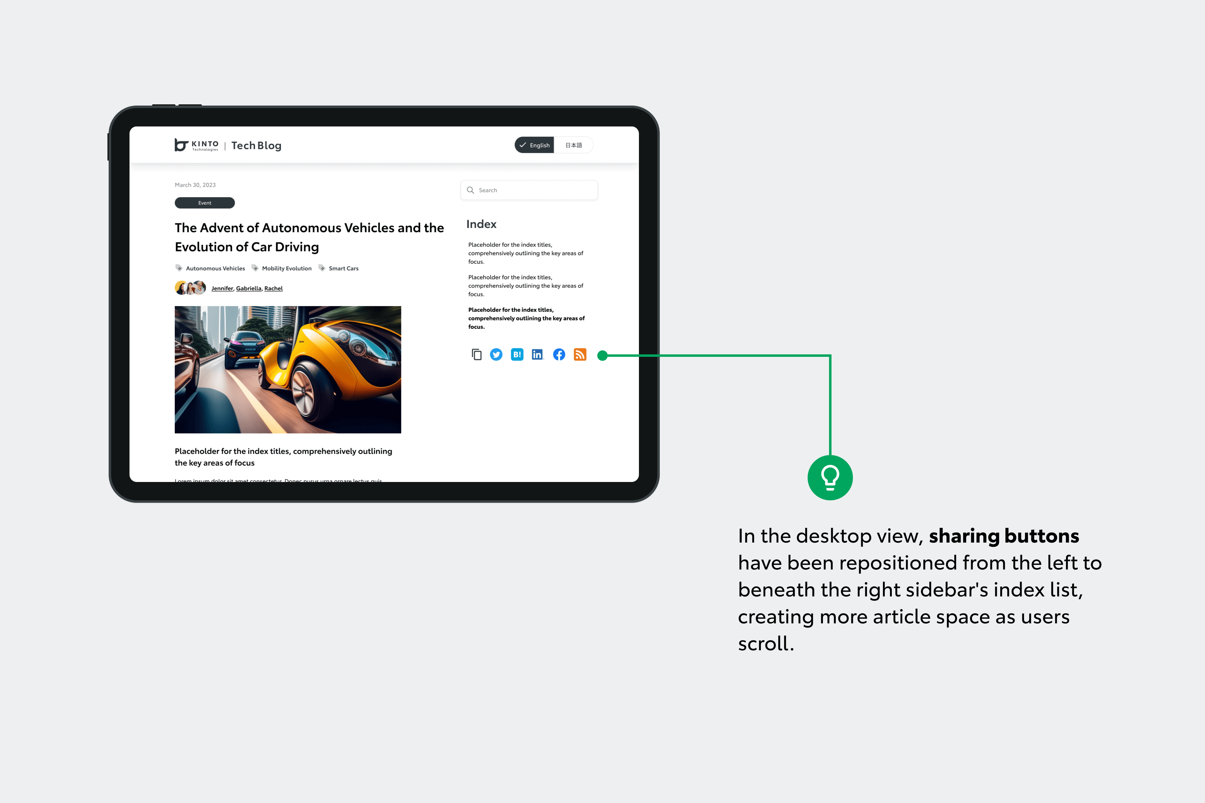
デスクトップビューの共有ボタンの配置
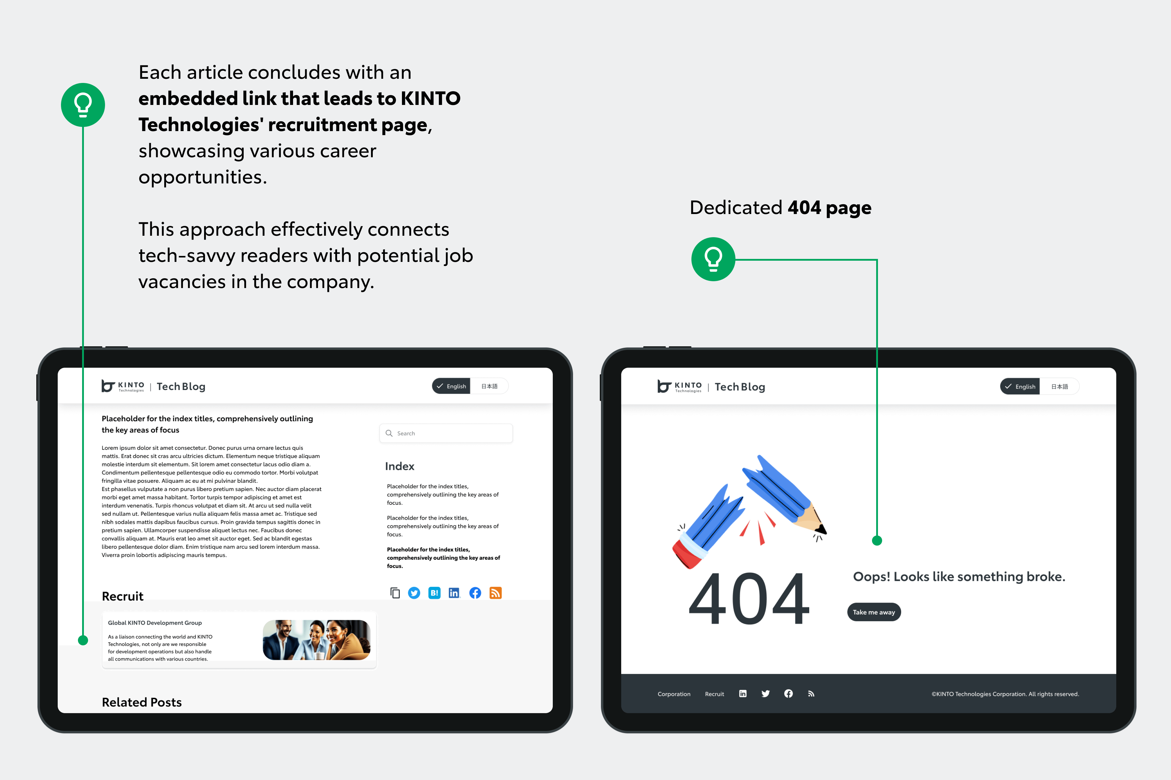
存在しないページや削除されたページにつまずく可能性のあるユーザーを誘導するため、404ページも本フェーズの一環としてデザインしました。
また、各記事の末尾にはKINTOテクノロジーズの採用セクションへの直接リンクを貼り、技術に精通した読者を優しく誘導し、キャリアの可能性を探ってもらうことができます。
モバイルビュー
デスクトップビュー
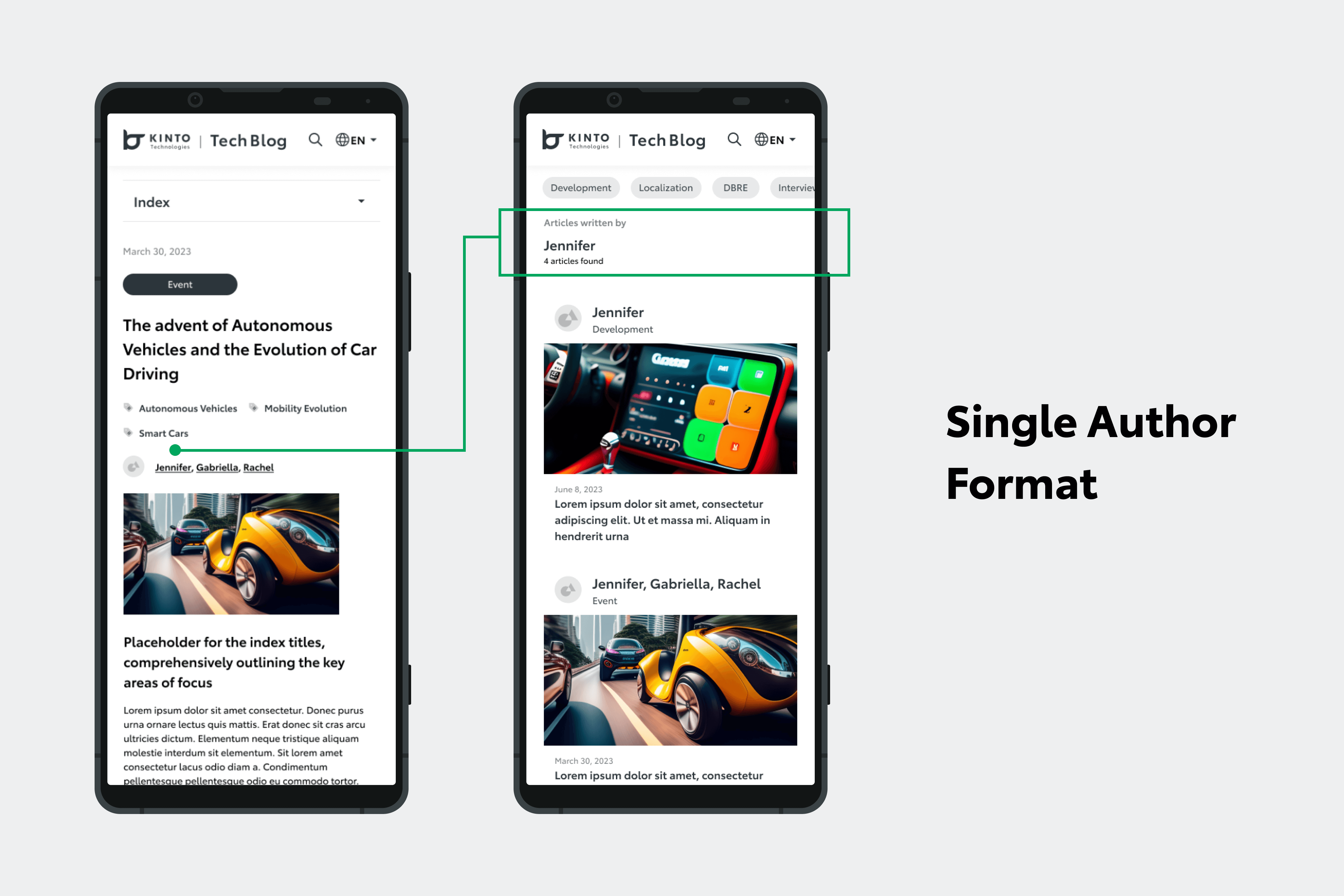
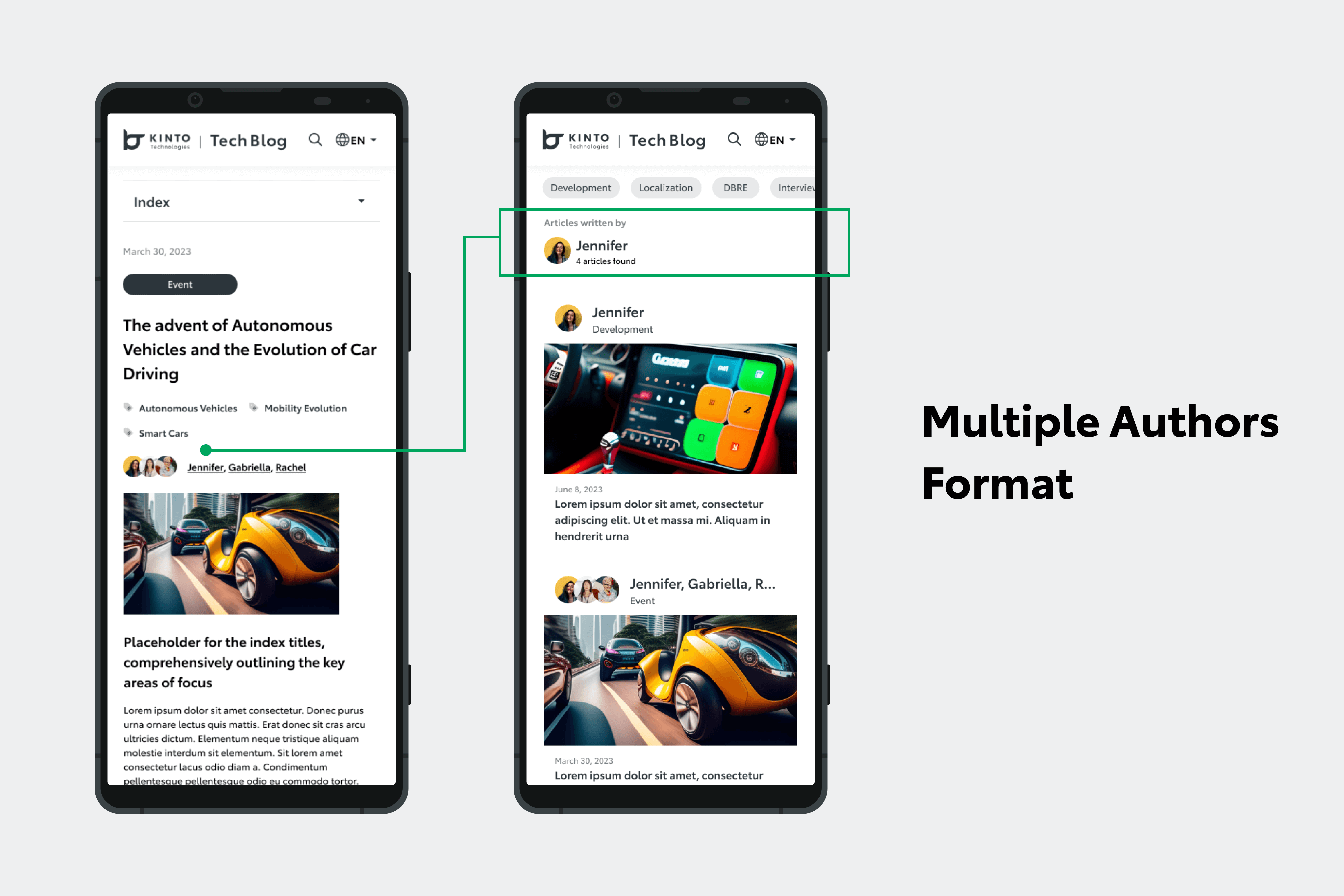
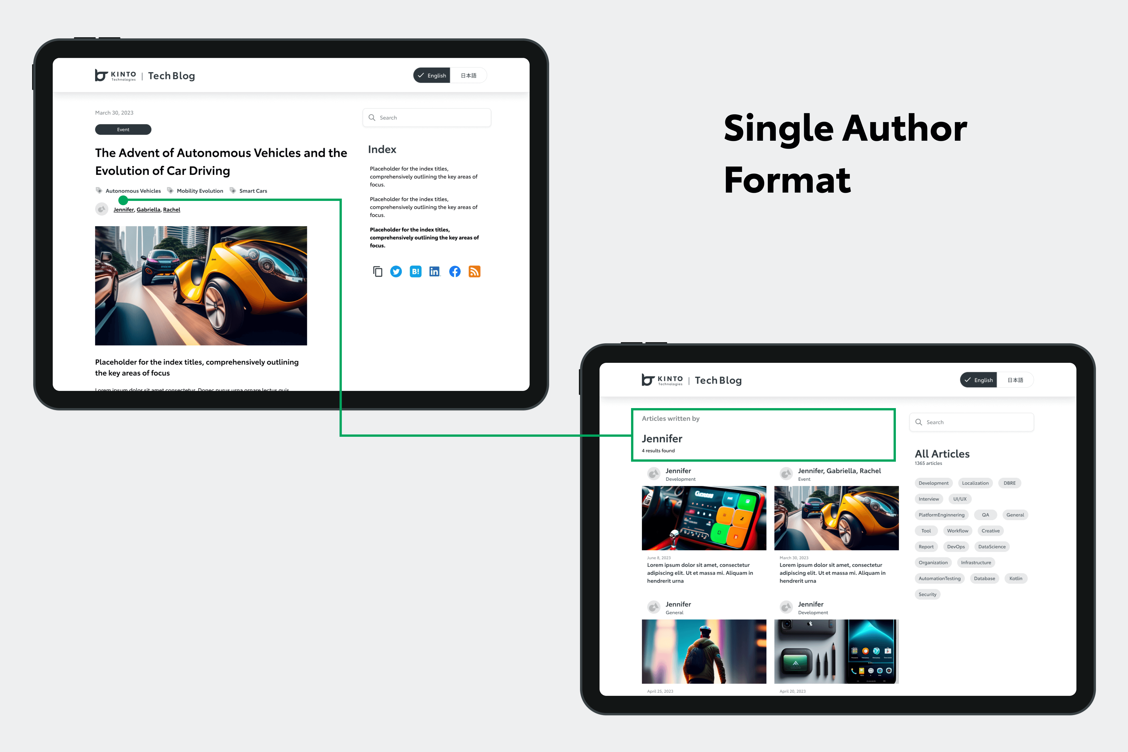
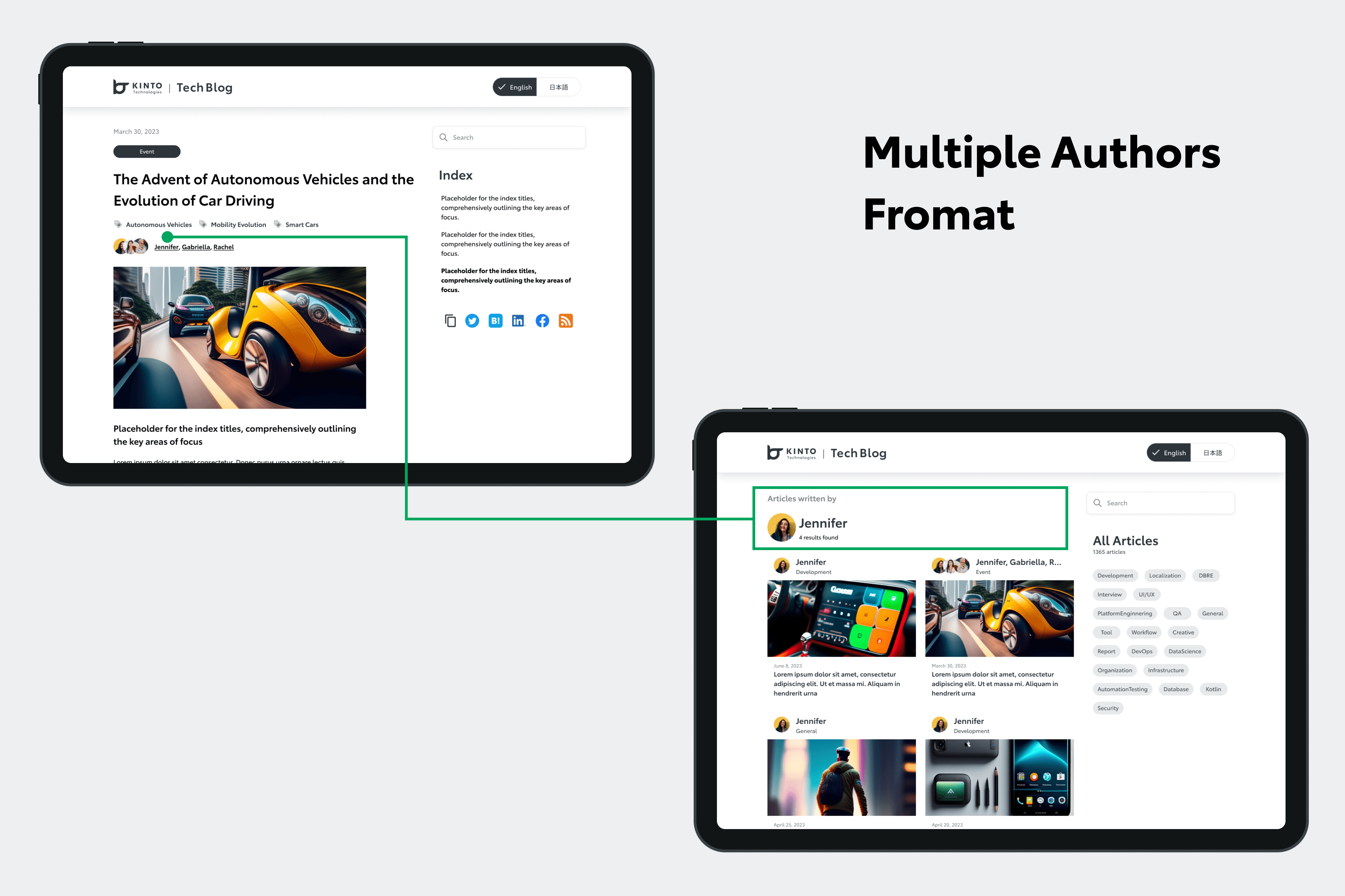
さらにこのフェーズでは、記事を執筆者の名前で検索できる機能を組み込みました。このために2つのフォーマットをデザインしました:
-
シングルオーサー(単著)フォーマット:複数の執筆者を1つのプロフィールに収容。各ライターの名前をクリックして記事検索が可能。
-
マルチオーサー(共著)フォーマット:執筆者の名前で記事を整理できるほか、それぞれの専用プロフィールを表示。
2つ目のフォーマットは優先順位が低かったため、開発チームは1つ目のフォーマットでまず進めました。執筆者のプロフィールを合理的なアプローチで表現することでユーザーエクスペリエンスの向上を図ります。
モバイルビュー
モバイルビュー
デスクトップビュー
デスクトップビュー
目的
このデザイン変更の根本的な目的は、ユーザーエクスペリエンスを豊かにすることでした。
検索のしやすさ、関連コンテンツへのアクセスのしやすさ、ユーザーインターフェースの全体的な向上を目指し、微修正・追加・調節をしていきました。
モバイルビューおよびデスクトップビューでのデザイン変更前と変更後
KINTOデザインシステムが重要な役割を果たしました。このシステムに依拠してはいますが、必要な改造も行いました。いくつかのコンポーネントはスクラッチで作成したり、ファイル内でローカルな微調整をするなどして、要求を正確に満たせるよう段階的に作業していきました。
このようなアプローチをとることで、ダイナミックなデザインシステムとTech Blog特有の機能要件の両方に対しバランスよく沿うことができました。
以下の画像では、最初にTech Blogで使用できるようデザインされたフッターコンポーネントが、KINTOデザインシステムへ組み込まれ、他のプロジェクトに適用された際にどのようになるかを示しています。
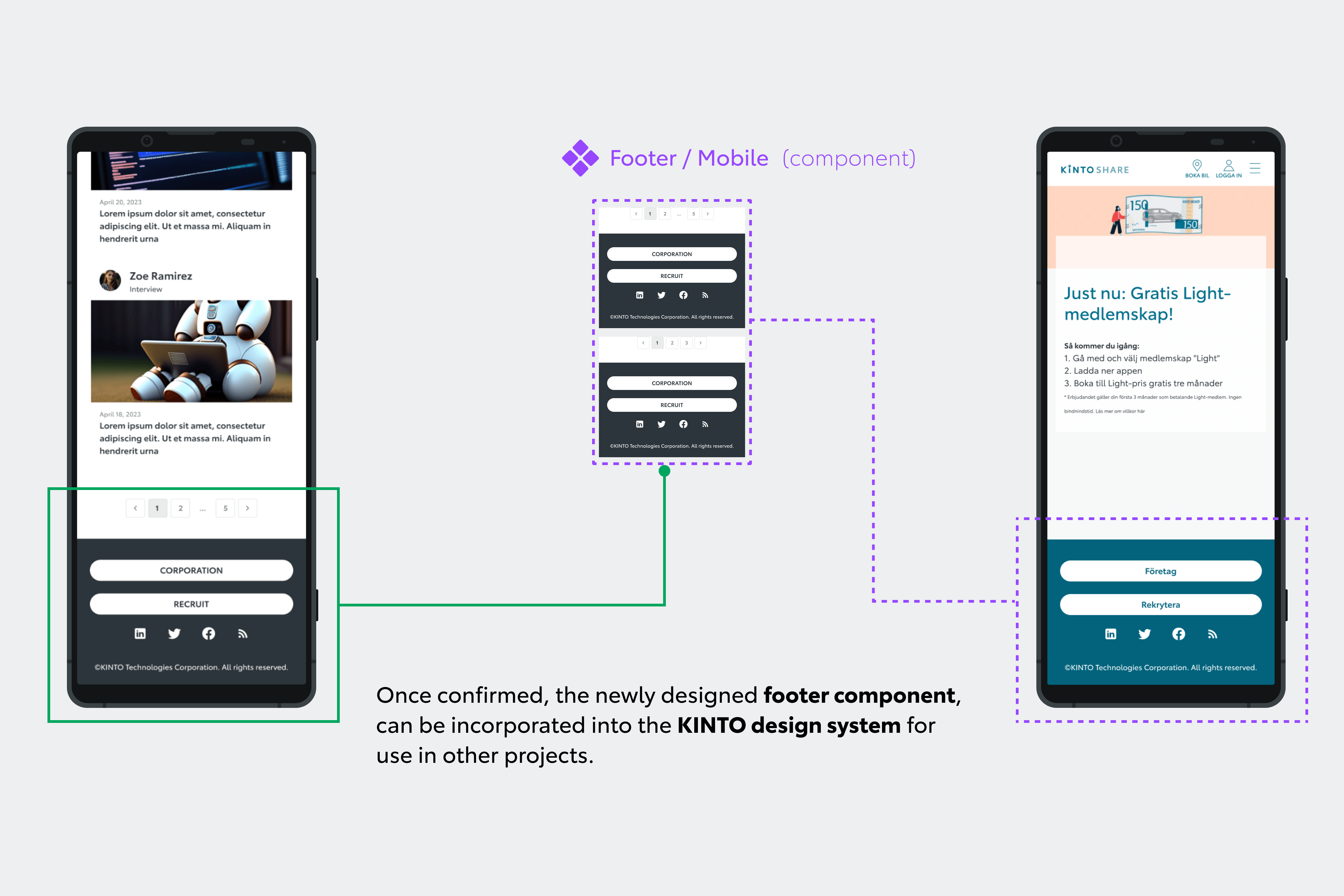
モバイルビューでのフッターコンポーネントの例
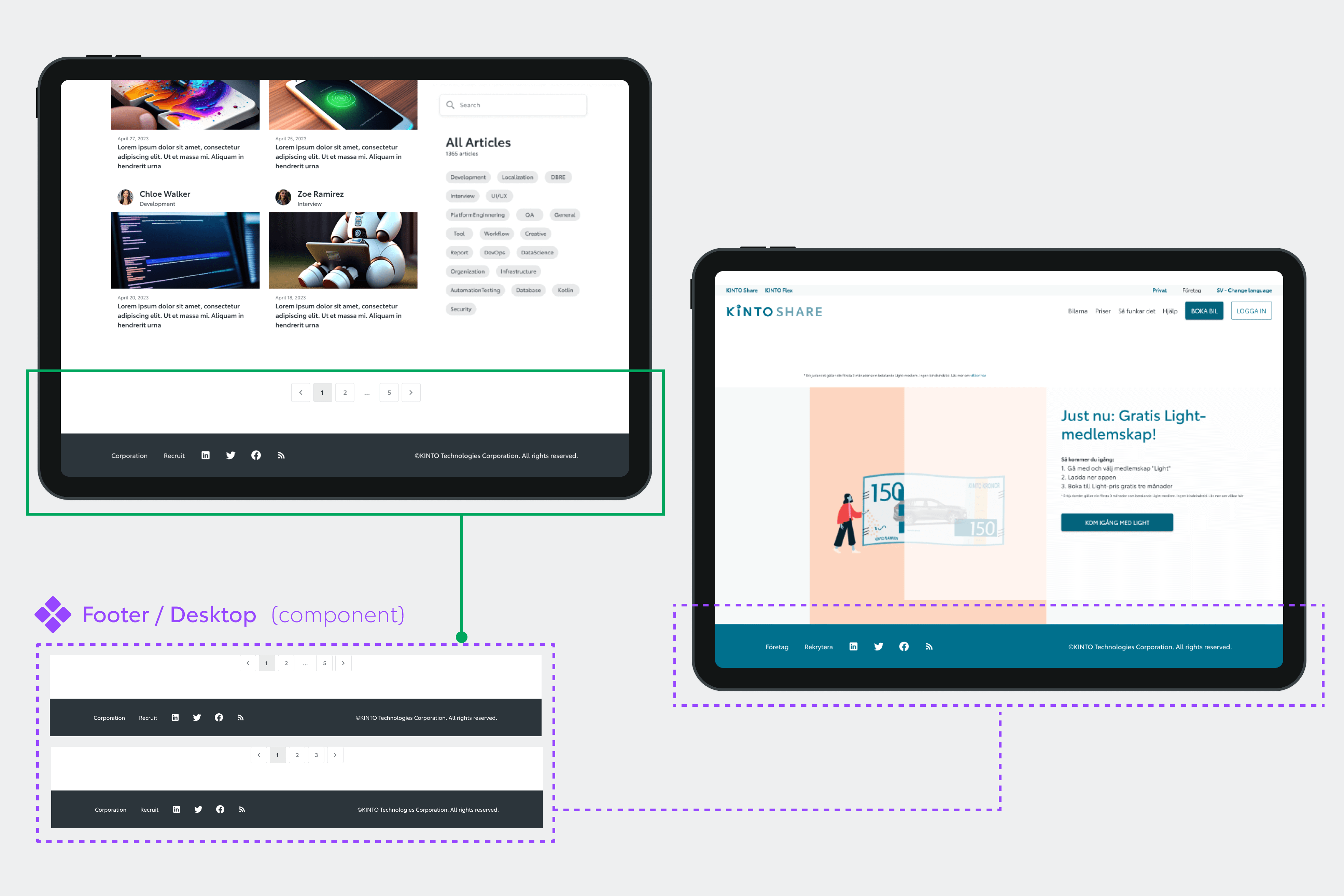
デスクトップビューでのフッターコンポーネントの例
予想される効果
期待される主な効果について、以下に概要をご説明します:
-
検索バーとカテゴリータグを組み込むことにより、記事の検索がしやすくなりました。検索の手間を省き、コンテンツ発見プロセスの改善につながっています。
-
多言語機能の導入により、言語の壁が無くなり、多様な読者(特に英語または日本語を使う方)に記事を理解してもらえるようになりました。
-
デザインを修正したことで、ブログ記事の見栄えと実用性が改善されると考えられます。SNS共有ボタンを配置し、404ページを工夫、記事サイズの調節も行い、機能拡充を図りました。これによりユーザーエンゲージメントの飛躍的向上が期待されます
-
各記事の末尾に採用情報のリンクを付けたことで、技術志向の読者がKINTOテクノロジーズの採用スペースにうまく誘導されるだろうと考えています。
これら2つのフェーズにわたるデザイン変更は現在進行中です。見栄えと機能拡充、ユーザビリティ向上をバランスよく達成したいと思っています。
完成後は、ユーザビリティテストプロセスを実施し読者からのフィードバックを収集します。今回の変更があらかじめ定めていたゴールを達成できたかを確認していきます。
次のステップ
これらのデザイン変更は始まりにすぎず、改善プロセスは今後も続きます。
Tech Blog向けとしてローカルコンポーネントの微調整とデザインを行ったわけですが、これらがKINTOデザインシステムに統合できるかどうか、精査することになります。
承認が下りれば、他プロジェクトでも利用できるようになります。これにより今回のデザイン変更は、当ブログの枠を超えた将来的な統合に向けてポジティブな効果を及ぼしていくことと考えられます。
急速に変わるデジタル社会の中で、KINTOテクノロジーズが変化し続けていく中、今回のデザイン変更がテックブログの今後にどう影響するか、楽しみです。
参考
関連記事 | Related Posts
We are hiring!
【PdM】オープンポジション/東京・名古屋・大阪
募集背景KINTOテクノロジーズでは新たな事業展開と共に開発するプロダクトが拡大しています。サービスの新規立ち上げ、立ち上げたプロダクトのグロースを推進し、KINTOの事業展開を支えるプロダクトマネージャーを求めています。
プロダクトマネージャー(Webプロダクト)/KINTOプロダクトマネジメントG/東京
KINTOプロダクトマネジメントグループについてTOYOTAのクルマのサブスクリプションサービスである『 KINTO 』のWebサイトの開発、運用をしています。