UIガイドライン
こんにちは、またはこんばんわ。
美味しい紅茶を飲みながら機械の分解をするのと写真を撮るのが大好きなグローバル開発 UIUXチームのazがお送りします。
UIガイドラインとは
そもそもUIガイドラインとは何でしょうか?
どんな人が使うものでしょうか?
誰がHappyになれるのか?
少しずつ紐解いていきたいと思います。
ブランドガイドラインとUIガイドラインの違い
一般的なブランドガイドラインとUIガイドラインの違いについて説明します。
KINTOにも一般には公開していませんが、ブランドガイドラインは存在しています。
ブランドガイドラインとは?
主に「ブランディング」として守るべき、以下のようなルールが提示されています。
- ブランドの思想、理念
- ブランド名やライティングの表記ルール
- 利用するカラーやイメージ
- 求めるべきユーザー体験
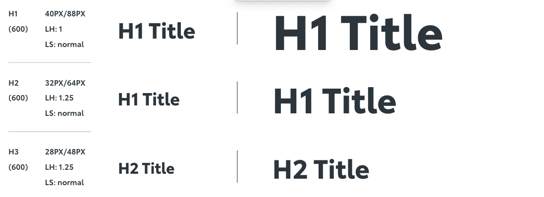
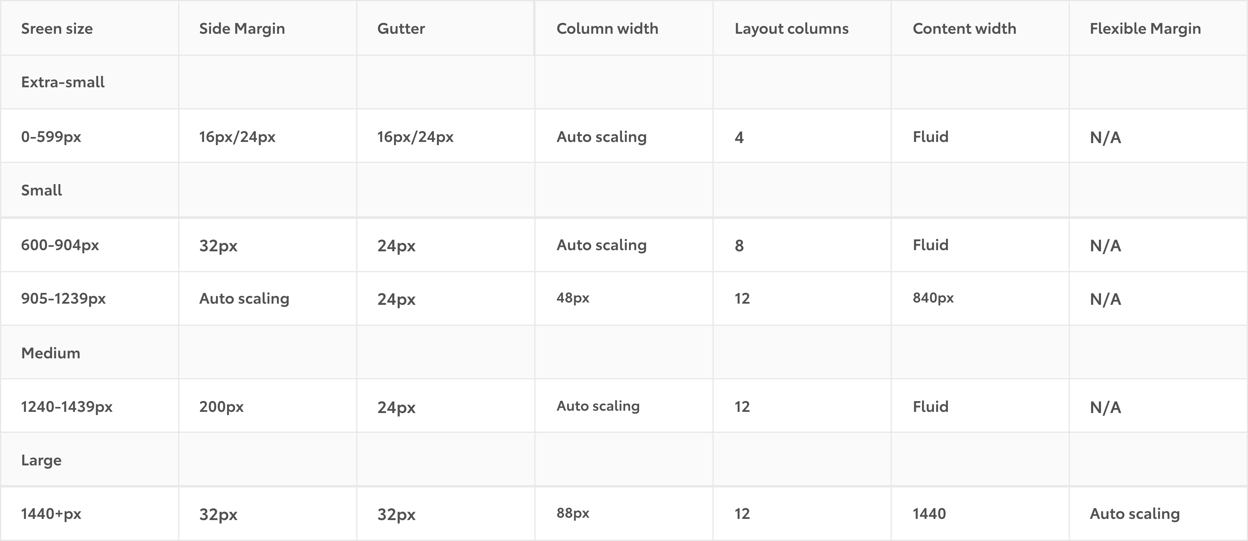
※画像はイメージです
このルールをベースにデザイナー達が表現方法やデザインを考えていきます。
UIガイドラインとは?
一方UIガイドラインはデザインシステムなどを用いて「これを使えばOK」という具体的な事例を提供します。
- ボタンやテキストなどに使う色や形
- 画面レイアウトの比率
- アイコンやイメージの使い方
基本的にデザインも実装もそのまま使えばいい状態のパーツやスペックが載っています。
要件から実装すると何が起こる?
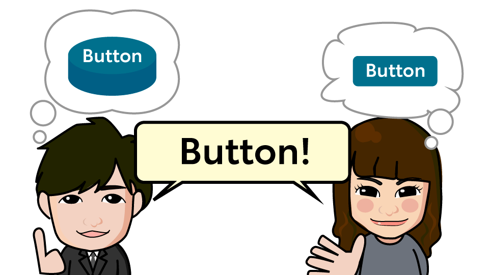
例えば「KINTOらしい」ボタンを作るにはどんな条件があるでしょうか。
- 決まっている色を使って
- 四角くて
- 読みやすいラベルがあって
- ボタンだと分かるもの
イメージできましたね。
出来上がったものがこちら。
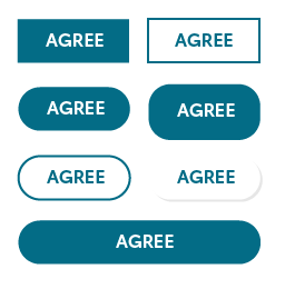
どれも条件は合っていますが、思っていたボタンと違ってる部分が出てしまいました。
- 1段目…4方の角丸がない
- 2段目左…ボタン内の余白の縦横比がおかしい
- 3段目左…他では使わない影が入っている
同じ条件で同じものを作っているのになぜ細かい部分で揃わないのでしょう?
何が違っていたのでしょうか?
それは共通認識です
いつものメンバーがいつものように制作できれば同じものができる可能性が高いですが、実際にはメンバーもチームも流動的です。
出来てから「あぁ…思ってたのと違う…」となると作り直しが発生するのは時間も気持ちもロスが大きいです。
UIガイドラインではメインボタンは「角丸:30px、上下余白:10px、幅:画面比1/12…」といった細かい数値まで設定しているのでアウトプットにずれが生じなくなります。
UIガイドラインの考え方・使い方
フォーマットに則ってデザインすれば、デザイナーもフロントエンドもラクになります。
実際によくある例で説明していきたいと思います。
デザイナーがいなくてもガイドラインに沿えばOK
避けては通れないテキストサイズやスタイルの設定も、使われるスタイル数が決まっているので細かい設計に悩む必要が少なくなります。
サイズや余白が適切に設定されておらずクオリティの安定しないケースもよくありますが、
ガイドラインで設定された余白に沿っていればデザイナーが調整しなくても、見た目が崩れることなく画面が構成しやすいです。
画面サイズ問題が減る
デザインファイルの立ち上げ時によく起こる「スクリーンサイズ何pixelにするか」問題。
ガイドラインで比率やブレイクポイントの設定しているのでそこで差異がでないようになっています。
「いつもの仕様」で作れるものが多い
入力フォームの配置
同じような内容や項目が多い代表例が入力フォームですが、項目追加や順番の変更も圧倒的に多いです。
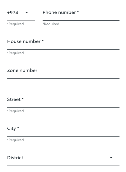
最近のプロジェクトでも変更が何度もありましたが、ガイドラインを使ったデザインだったためデザインファイルの修正と実装を並行で行うことができました。
メッセージの出し方
結果画面やエラー画面のように文言や組み合わせが多数ある場合はとても多いです。
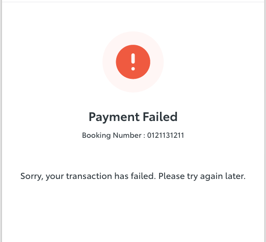
ステータス毎のアイコン、テキスト間のレイアウトが決まっているので、特殊な例をのぞけば全てのパターンを網羅して準備する必要がありませんでした。
困る人が少なくなーれ!
- 経験値やスキルの差があっても最低限同じアウトプットを出せること
- 口頭や文字での伝達ロスを減らし共通認識を保つ
この2つがガイドラインの大きな役割です。
困ったらここ見ればいい!解決!
となれるようにこれからも拡充していきたいと思います。
関連記事 | Related Posts
We are hiring!
シニアQAエンジニア(責任者候補)/Quality Engineering G/東京・大阪
「テストするQA」から「品質戦略を描くQA」へ。AIがコードを書くことが当たり前になりつつある今、品質保証のあり方そのものが問われています。
【PdM】契約管理システム開発G/東京
契約管理システム開発グループについて契約管理システム開発グループは、クルマのサブスクリプションサービス『KINTO』(新車・中古車)を中心とした国内向けサービスにおいて、申込から契約満了(中途解約を含む)までの社内業務プロセスのシステム化と、契約状態の管理を担っています。