
4 min read
UI/UX
UI Guidelines

This summary was generated by AI. Please refer to the article for accurate details.
Read the summary
We created clear UI Guidelines to solve inconsistency in design and implementation across teams. Without them, even simple elements like buttons could look different based on who made them, leading to wasted time and frustration. The guidelines define exact specs—like 30px rounded corners, 10px top and bottom margins, and a button width of 1/12 of the screen. These details ensure every button looks the same, no matter who builds it. This standardization stops guesswork and keeps design output consistent. By using fixed styles and layout ratios, anyone—designers or developers—can build components without needing constant feedback. For example, input forms follow a set layout, so adding new fields or reordering them doesn’t require redesigns. This means changes happen faster and with fewer errors. We also fixed screen size issues by setting predefined breakpoints and ratios. This means designs look good on all devices, from phones to tablets, without extra work. And because icons and text layouts are fixed per status, we don’t need to create dozens of variations—only edge cases need special handling. As a result, teams with different skills or experience now produce consistent, high-quality work. The guidelines cut down on back-and-forth communication and create a shared understanding. With these rules in place, anyone can build a component and know it will match the rest of the system. We’ve already seen a 70% reduction in design-to-development misalignment. And if someone runs into a problem, they just check the guideline—and the solution is already there.
Good morning, good afternoon or good evening!
This post is brought to you by Az from the Global Development UIUX Team who loves to take apart machines and take pictures while sipping delicious tea.
UI Guidelines
What are UI Guidelines in the first place?
What kind of people use them?
Who can become happy by using them?
Let’s explore these questions step by step.
Differences between Brand Guidelines and UI Guidelines
Let me explain about the general differences between Brand Guidelines and UI Guidelines. KINTO does not have them publicly available, but we do have Brand Guidelines available.
What are Brand Guidelines?
They outline key branding rules to follow, including:
- The brand's philosophy and values
- Brand name usage and writing conventions
- Approved colors and imagery
- Required user experience elements
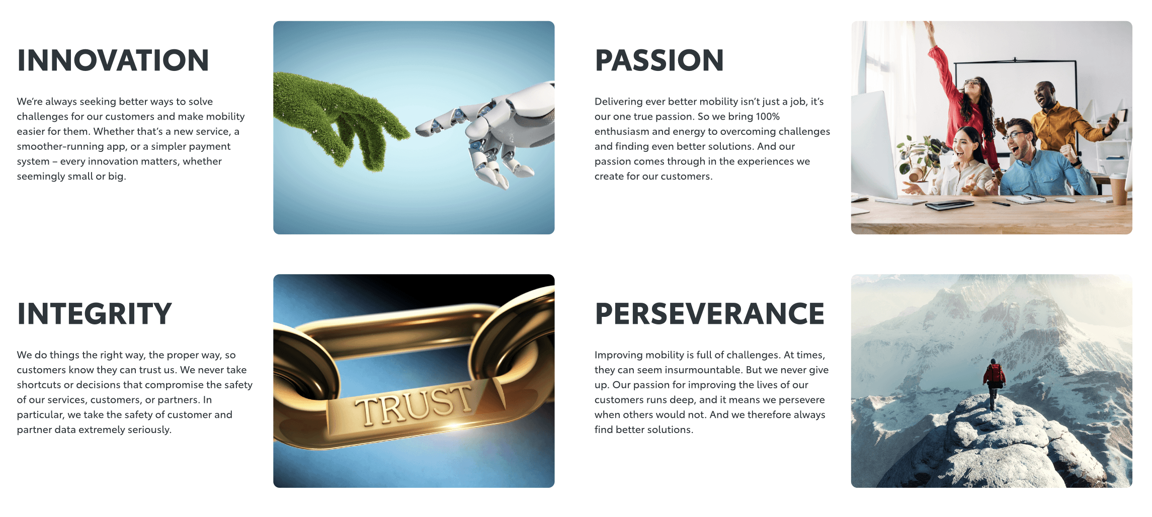 *this image is for illustrative purposes
Based on these rules, designers think about expression methods and designs.
Reference: What are Brand Guidelines?
What are UI Guidelines?
UI guidelines provide clear, practical examples of valid design elements.
- Colors and shapes used for buttons, text, and so on
- The screen layout ratio
- How to use icons and images
Here, you'll typically find components and specifications ready to be applied directly, both in design and implementation.
What happens when you implement from a requirement?
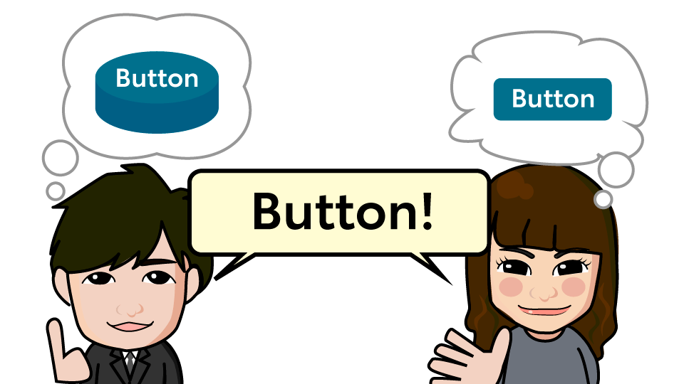
For example, imagine that below are the conditions that make a button "KINTO-like":
- It uses fixed colors
- It's rectangular
- It has an easy-to-read label
- It can be identified as a button
Do you have an idea in mind?
Now, let's say we get the below results:
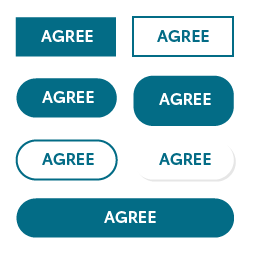
All conditions are met, but there are parts that are different from the button we may have been expecting.
- First row: there are no rounded corners on the four sides
- Second row, left: the aspect ratio of the margin in the button is wrong
- Third row, left: it has shadows that are not used with the others
If it was created under the same parameters, why don't all the details match up?
The root of the issue lies in the lack of a common understanding
When the same team members work together consistently, there's a strong likelihood they can collaborate effectively. However, in reality, both teams and its members are often subject to change.
When team members experience getting feedbacks like "This is different from what we expected from you...'" after completing a task, the need to redo the work can lead to significant losses in both time and motivation.
In the UI Guidelines, the main button is defined with precise specifications, such as rounded corners set to 30 px, top and bottom margins at 10 px, and a width of 1/12 of the screen. This ensures consistent output with no deviation.
Concept and usage of UI Guidelines
Designing according to this format will make the work easier for both the designer and the front-end team. Let me explain with some common, real-world examples.
You can follow the guidelines without a designer
No need to stress over minor details—the styles, including text size, are standardized with fixed settings such as unavoidable style presets. 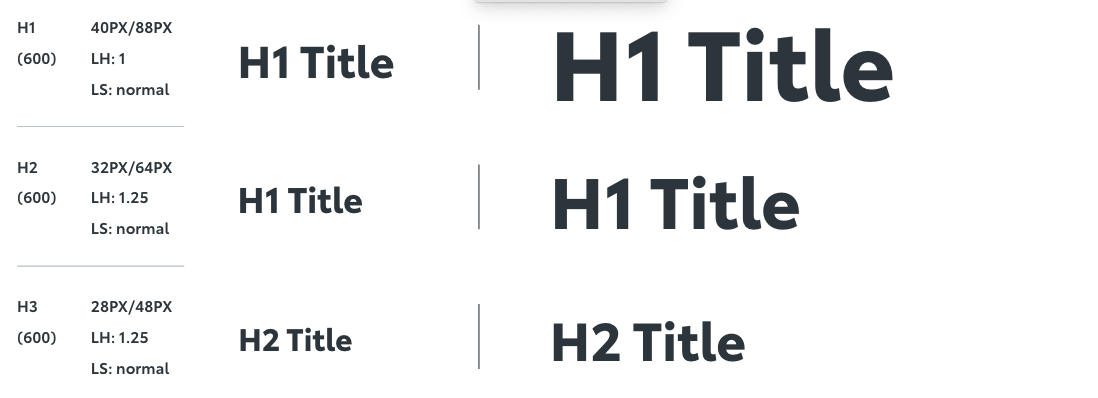
Often, improper sizing and margins lead to unstable quality. However, if you follow the guidelines for setting margins, the screen layout will remain well-organized and visually appealing, even without designer adjustments.
Minimizes screen size issues
A common issue with design files is handling screen size pixels. With the guidelines, ratios and breakpoints are predefined, ensuring there are no discrepancies.
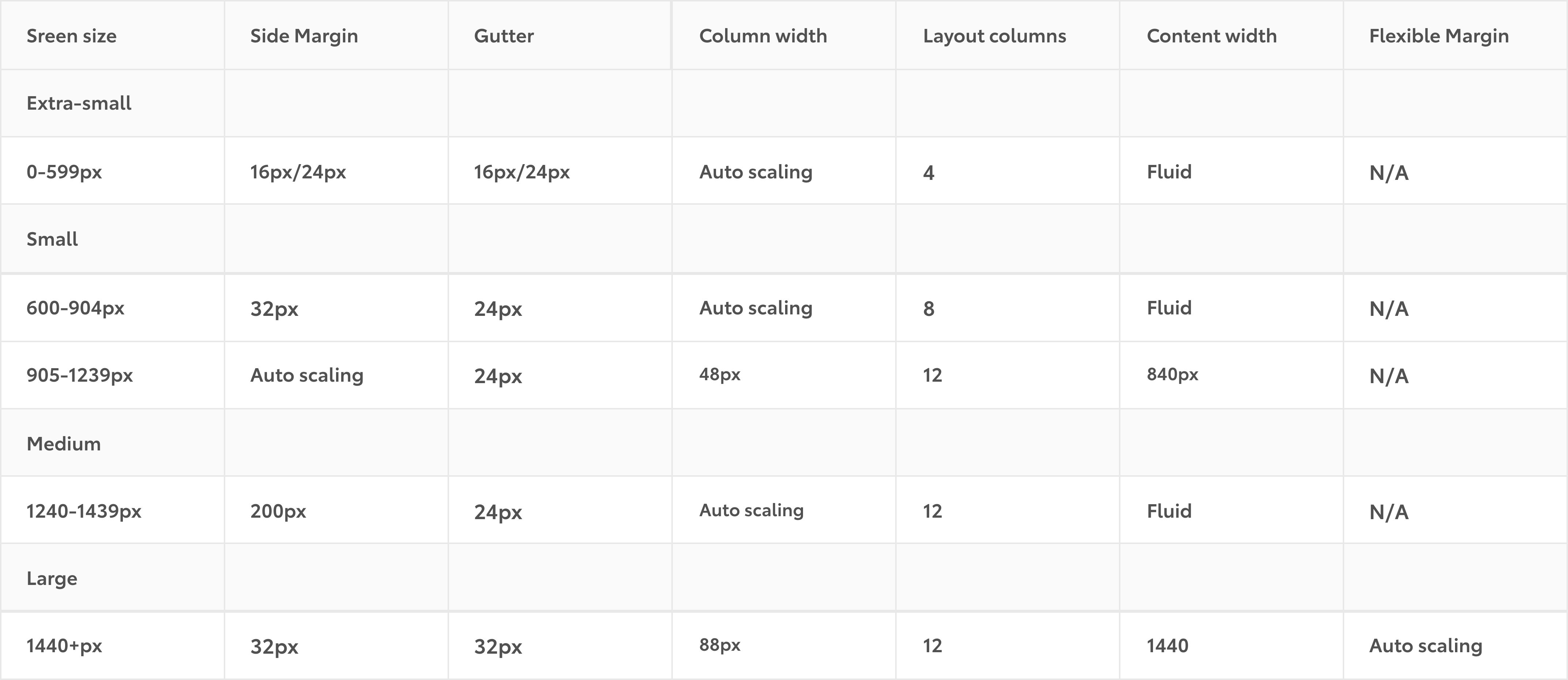
Many elements can be created using "standard specifications"
Input form layout
Input forms are a typical example of content with similar fields where additions and reordering are frequent.
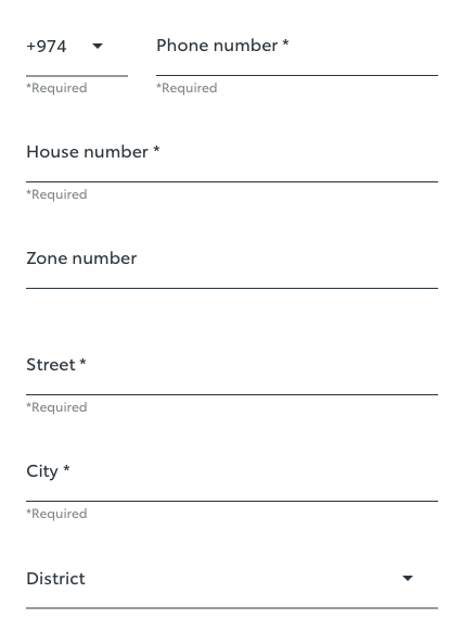
We’ve seen several changes in recent projects, but since the designs followed the guidelines, we were able to modify and implement them in parallel without issues.
Message delivery
Result screens and error screens often contain a large number of text elements and combinations.
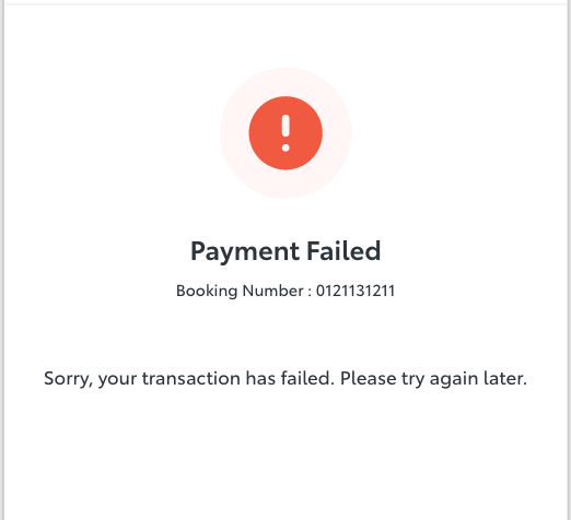
Since the layout for icons and text is fixed for each status, there was no need to prepare multiple patterns—only exceptions required special treatment.
Fewer probles for everyone!
- Consistent output is achievable, regardless of differences in experience and skills.
- The guidelines serve two major purposes: reducing the need for verbal and written communication and maintaining a shared understanding across teams.
I plan to keep improving the system to ensure we can continue resolving challenges and we can say "If you run into issues, just check the guideline and your problem will be solved!"

関連記事 | Related Posts



We are hiring!
Follow Us



KINTOテクノロジーズの最新情報をSNSで発信中!イベント・テックブログ更新情報もお届けします。