Behind the Scenes of Novelty Production for Creating a Sense of Unity at KINTO Technologies
Hello! My name is Mayu, and I work as a designer in the Creative Office at KINTO Technologies. I usually focus on UI/UX design for apps, but this time, I was in charge of creating novelty items to distribute at a company event. In this article, I'll share a behind-the-scenes look at the process, from planning to design. I hope this will offer some helpful insights for those involved in novelty production.
Novelty Selection
The theme is "something that gives a sense of unity"
For this event, we aimed to create a novelty item that fosters a sense of unity. We developed ideas based on the following conditions:
- Creates opportunities to communicate with people you don't usually interact with.
- Strengthens a sense of unity.
- Promotes innovation.
- Appeals to all, regardless of age or gender.
- Meets the needs of multiple people.
- Easy for anyone to use immediately.
- Budget: a few hundred to around a thousand yen per person.
- Offers lasting value.
After considering various ideas, we ultimately decided to produce a "Magnetic Card Stand" and an "Original Name Card".
Reasons for choosing the "Magnetic Card Stand" and "Name Card"
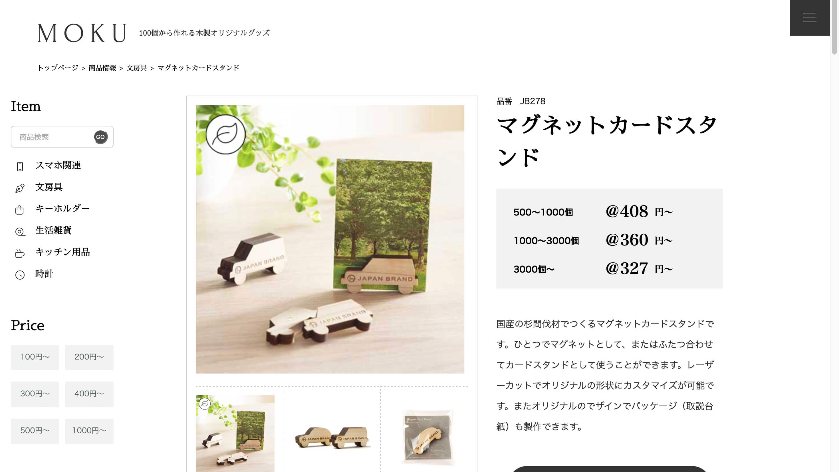
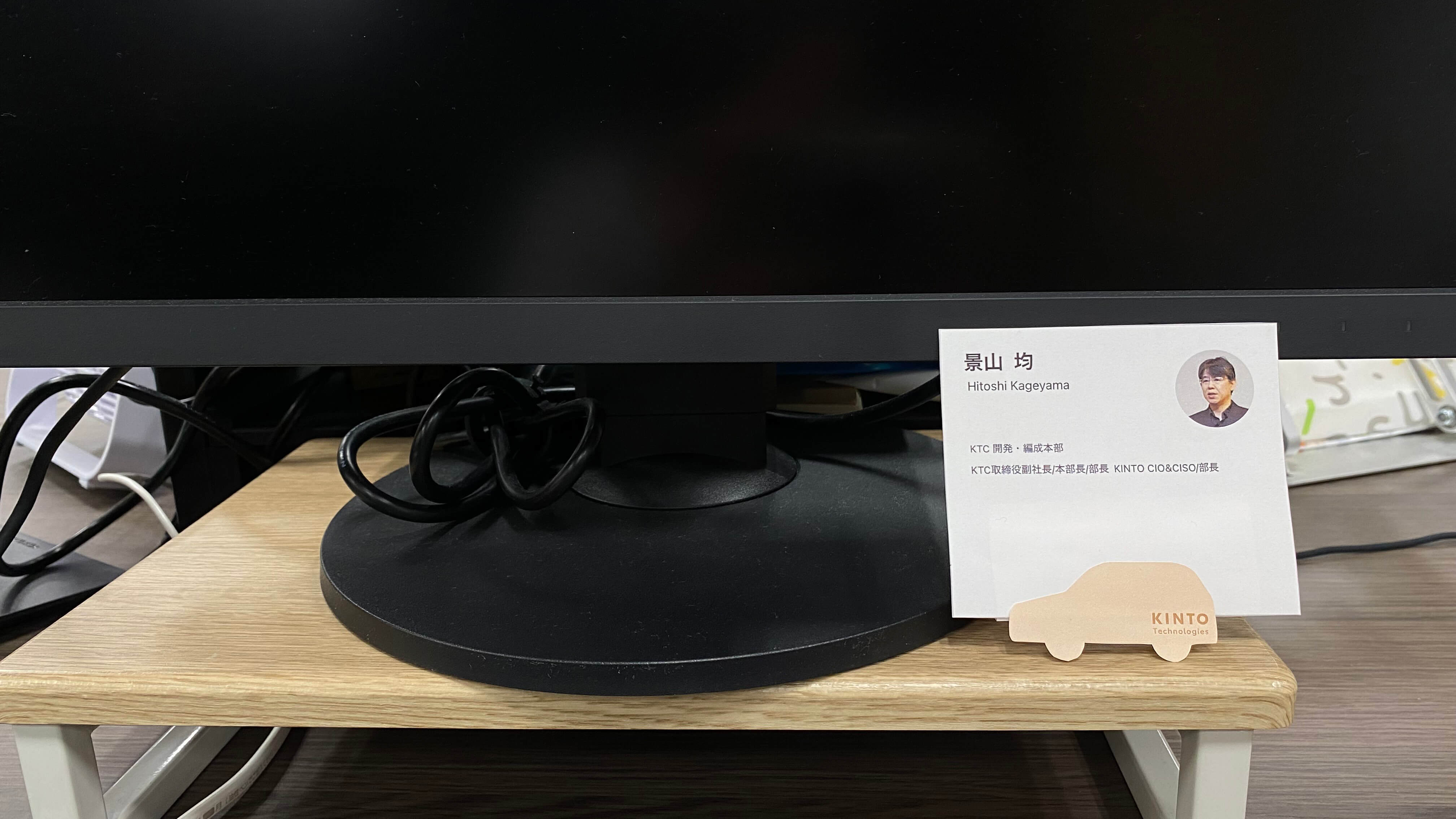
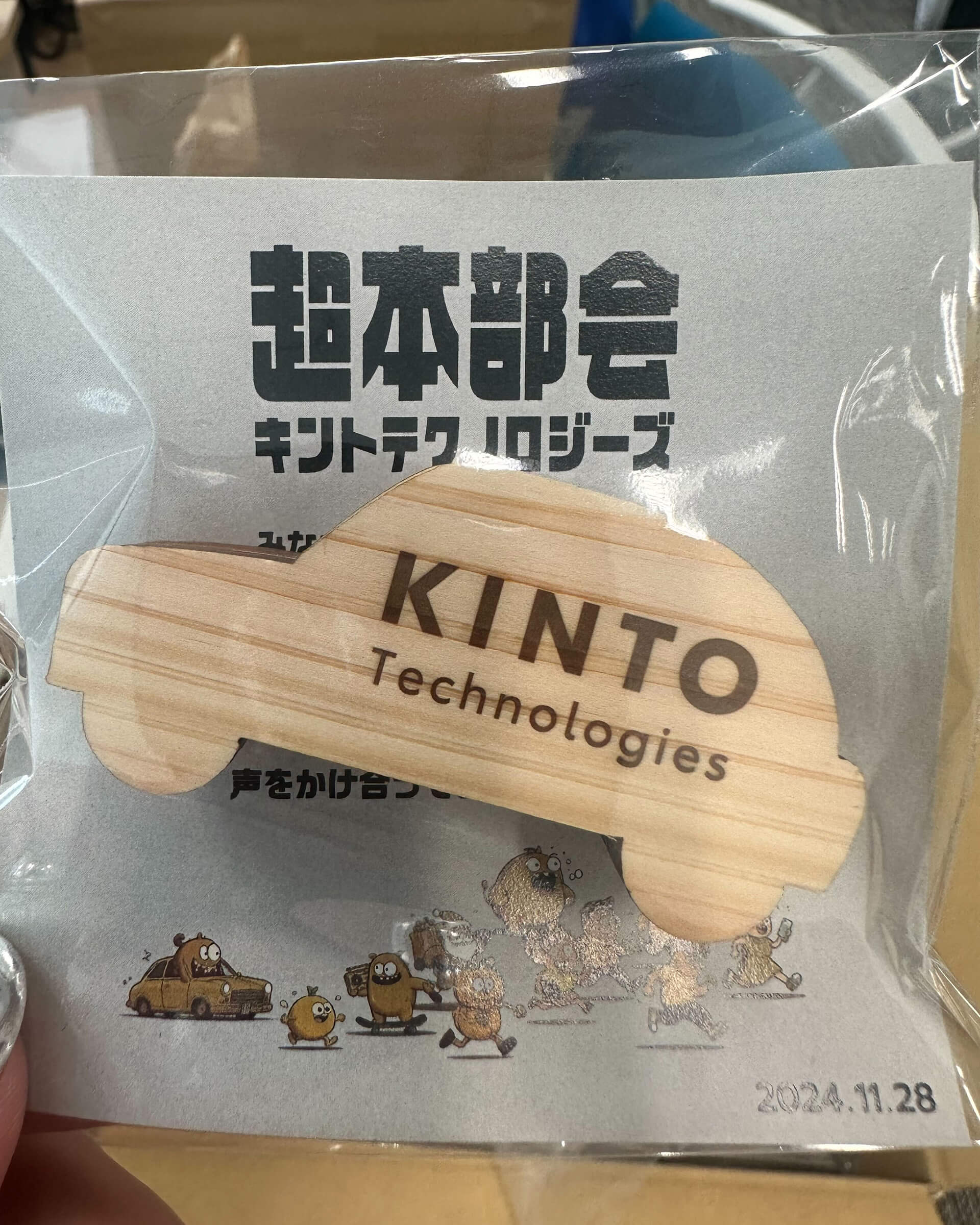
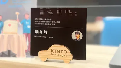
Magnetic Card Stand:
- Placing it on the desk makes it easier to naturally engage with others, promoting communication.
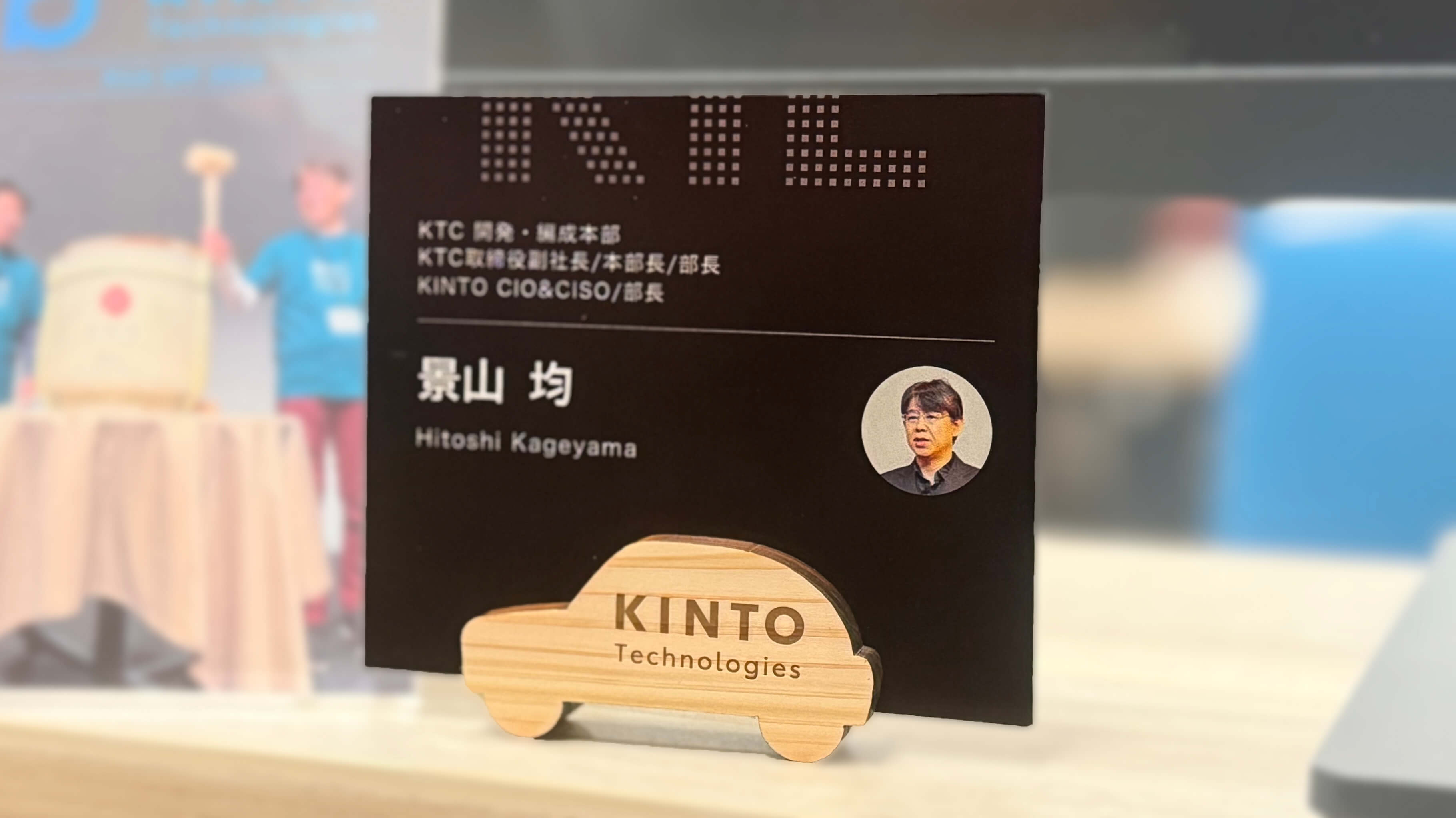
- Featuring the KINTO Technologies logo and car shape helps foster attachment to the company and boost motivation.
- Its simple design makes it easy for anyone to use in daily situations.
Name Card:
- Creating name cards with each employee's name makes it easier to approach one another even on first meetings, promoting communication across the company.
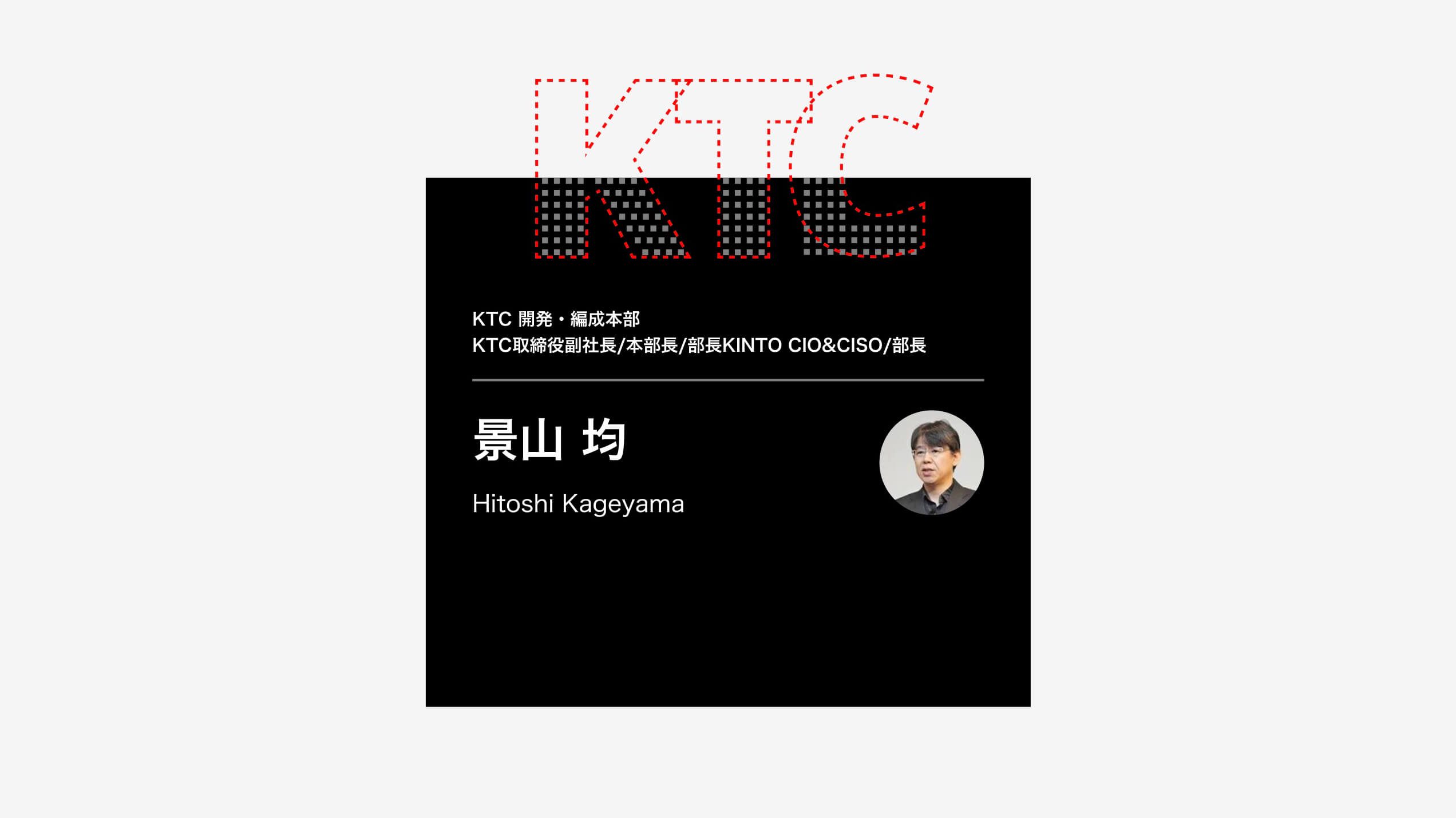
- The cut-off KTC lettering design visually expresses a sense of unity throughout the organization.
- The cards can be used as name tags during the event and placed on desks afterward for continued use.
Production of Magnetic Card Stand
**1. Contractor Selection and Request **
We commissioned the production of the magnetic card stand to the original goods specialty website "MOKU." The deciding factor was MOKU's high level of customization, which made it possible to create original magnetic card stands simply by submitting design data.
2. Prototyping
We created a simple paper prototype to check the size and usability. We then placed it on an actual desk to evaluate visibility and practicality.
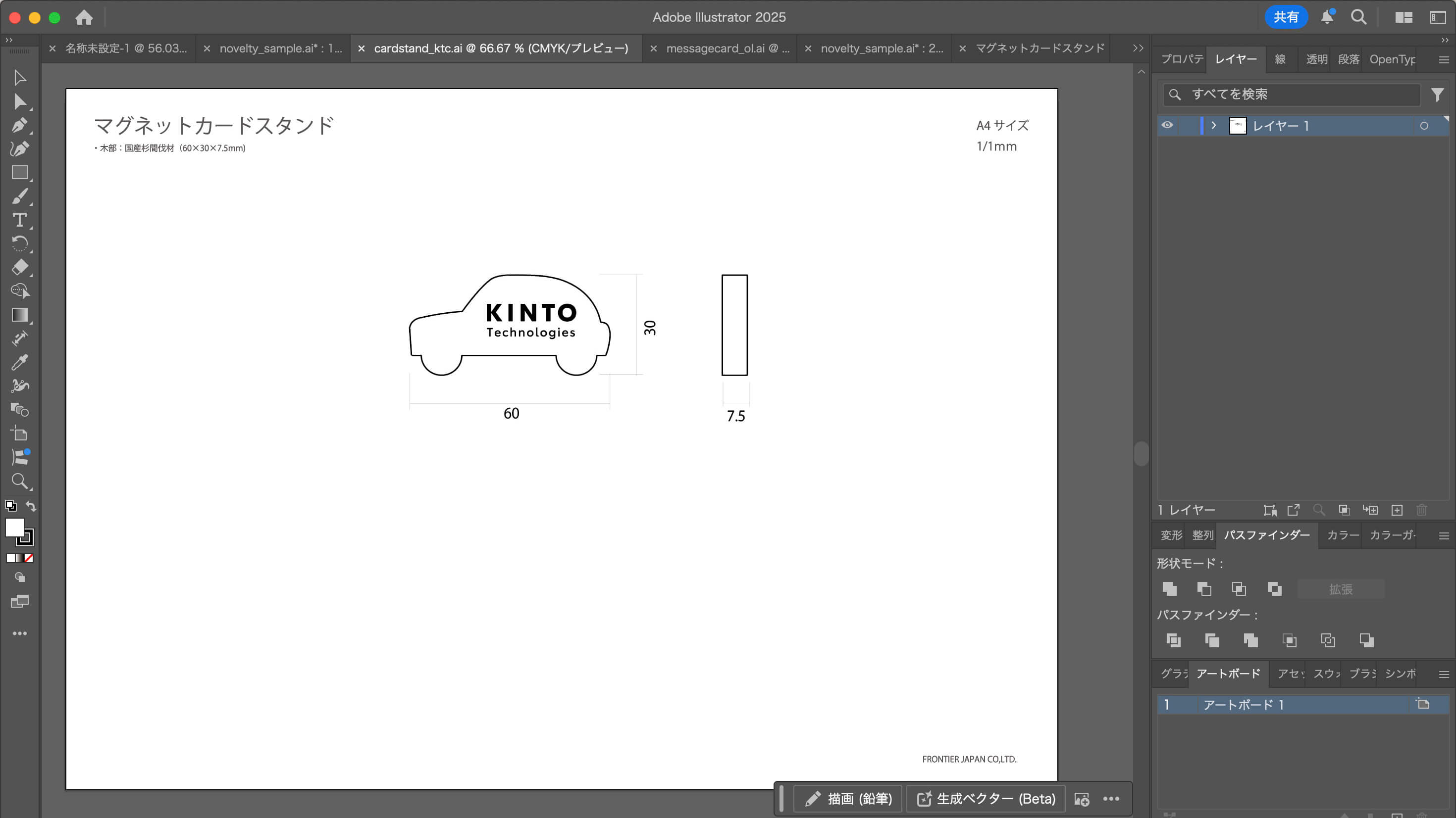
**3. Design of Magnetic Card Stand **
Using Adobe Illustrator, we created a design with the logo positioned on a specified template. The result is a simple design that highlights the KINTO Technologies logo.
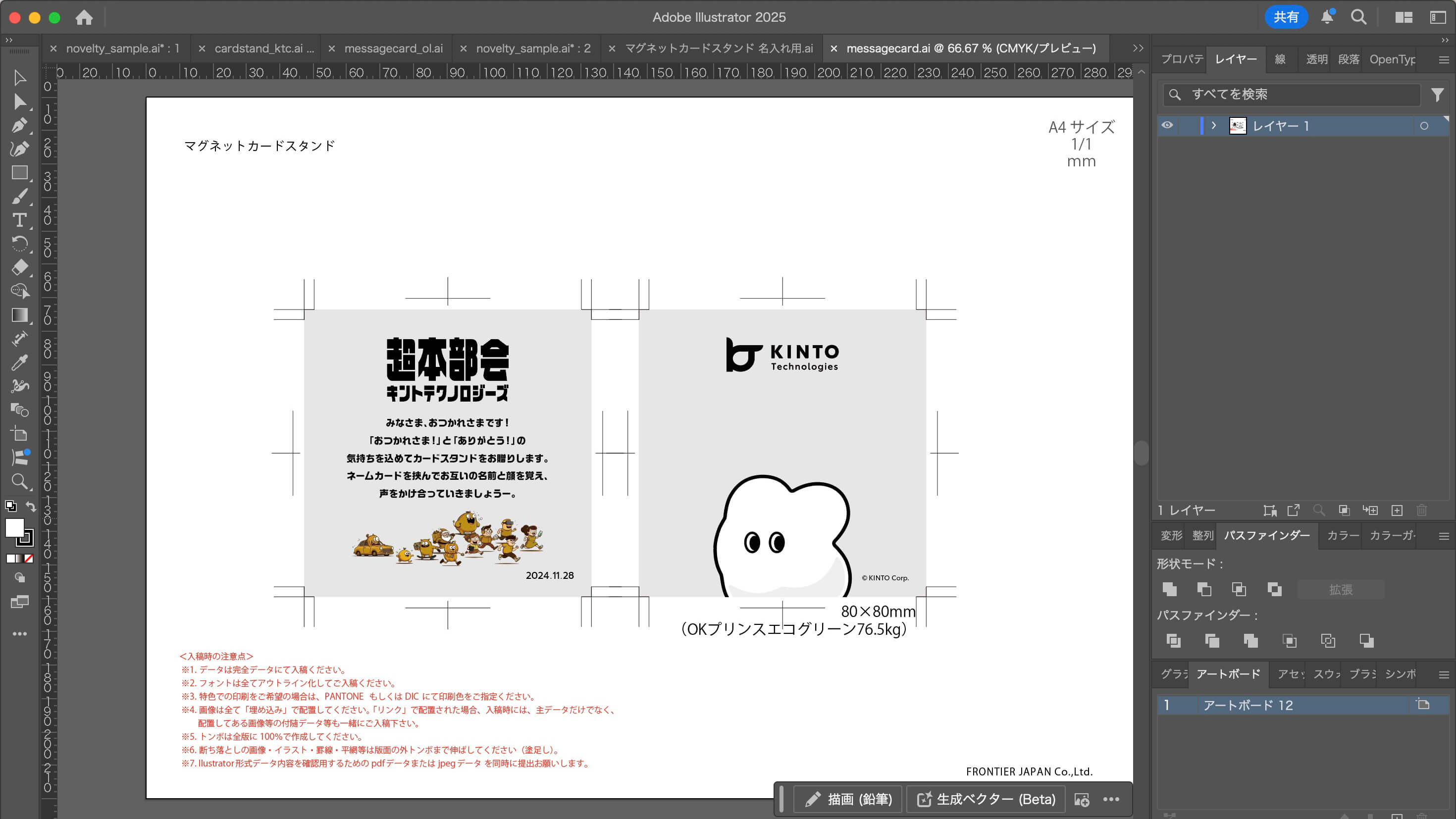
4. Design of Instruction Manual
To ensure ease of use, we created an original instruction manual. Here too, we used Adobe Illustrator and produced the design data based on the specified template.
5. Data Submission and Delivery
The design data was submitted, and delivery was completed in about three weeks! (Order quantity: 500 pieces)
Production of Name Card
1. Create a Name Card Design
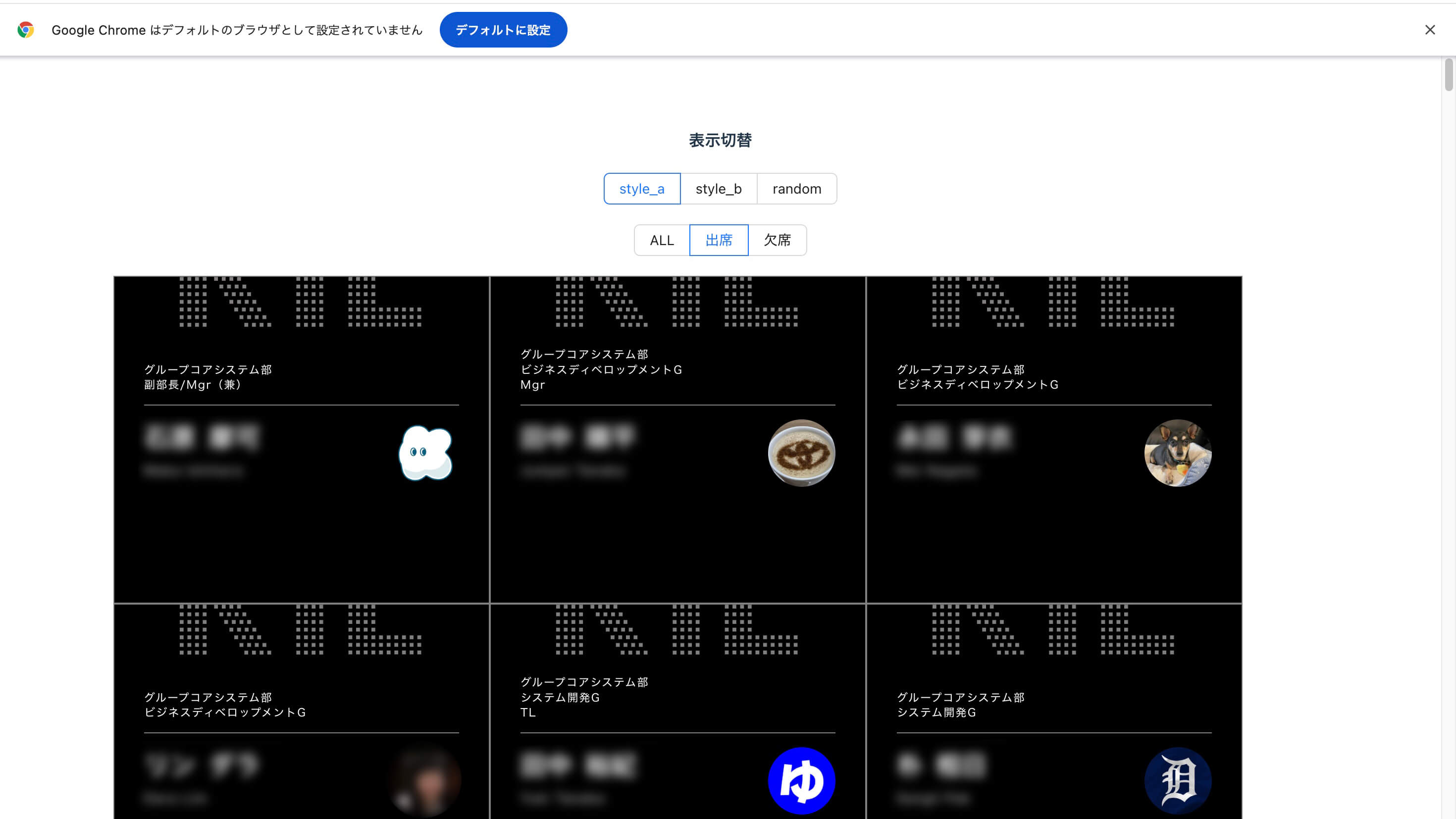
Using Figma, we created an original design featuring names, division, and custom Slack emojis. We made a prototype to ensure it fit properly with the magnetic card stand.
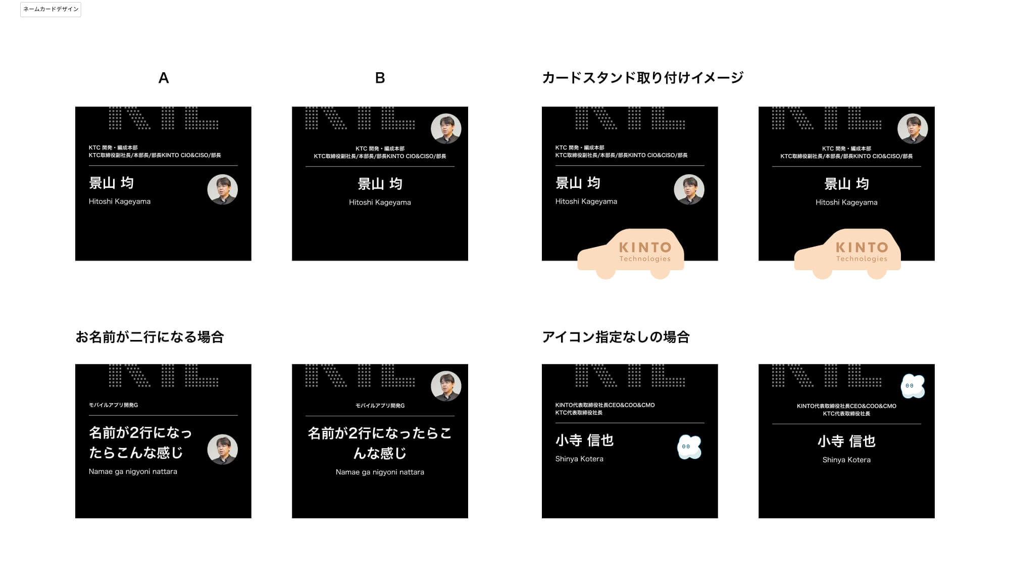
The key feature is this half-cut KTC lettering. KTC stands for "KINTO Technologies." The small squares represent employees, symbolizing the idea that "each individual comes together to form KTC." With a simple, stylish black-based design, it also brings out the essence of a tech company.
2. Automatic Data Generation
Creating data manually for everyone would have been overwhelming, so we enlisted our in-house engineers to help automatically generate the data in HTML. We built a system that imports employee information from a CSV file and automatically populates it into a template.
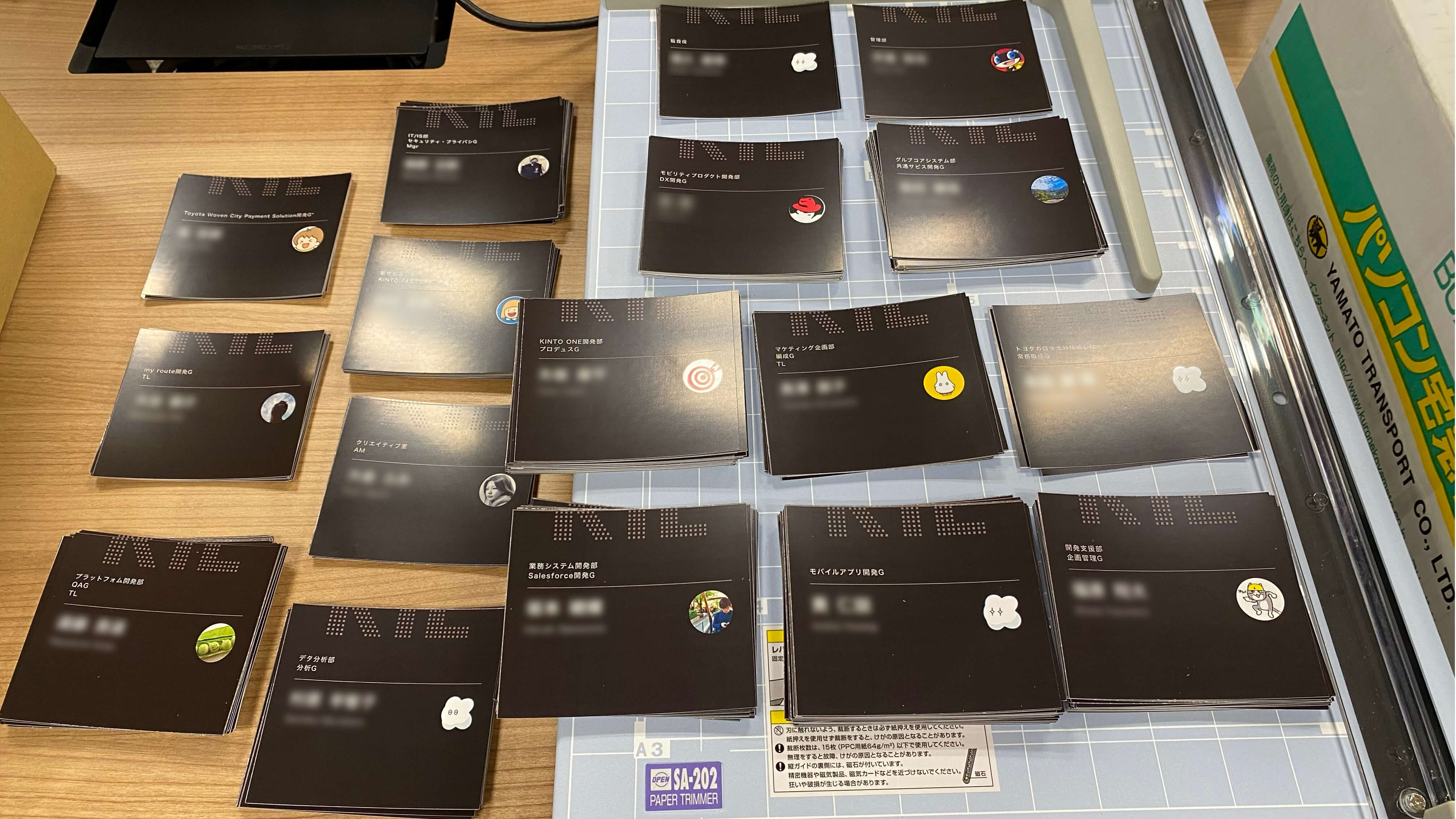
3. Printing and Cutting
Printed the materials using the office printer and cut them all by hand. It was tough, but it saved a lot of money! lol
Project Results and Learnings
After distributing the giveaways, we received a lot of encouraging feedback from employees, such as:
- "It's easier to start conversations now!"
- "The design is so cute!"
- "The Slack icon makes it feel even more personal!"
The giveaways helped foster a sense of unity, and the project was incredibly rewarding for me as well. This experience also reinforced the importance of not just designing something attractive, but thinking carefully about how it will actually be used. I believe we were able to showcase the true power of purpose-driven design.
Finally
I hope to apply what I've learned from this project to future design work. If you thought, "KINTO Technologies sounds like a fun place!" please check out our recruitment page! Looking forward to hearing from you! Thank you for reading!
関連記事 | Related Posts
We are hiring!
【PdM】オープンポジション/東京・名古屋・大阪
募集背景KINTOテクノロジーズでは新たな事業展開と共に開発するプロダクトが拡大しています。サービスの新規立ち上げ、立ち上げたプロダクトのグロースを推進し、KINTOの事業展開を支えるプロダクトマネージャーを求めています。
【オープンポジション】「気になる!」方はまずはこちらからご応募ください。/東京・名古屋・大阪・福岡
業務内容国内外のKINTOサービスや、トヨタグループの金融、モビリティサービスの内製開発組織である同社にて、ご経験・ご志向性に応じて配属を決定し、ご活躍いただきます。