
5 min read
Culture
How I Designed the Logo for Our Internal Event

This summary was generated by AI. Please refer to the article for accurate details.
Read the summary
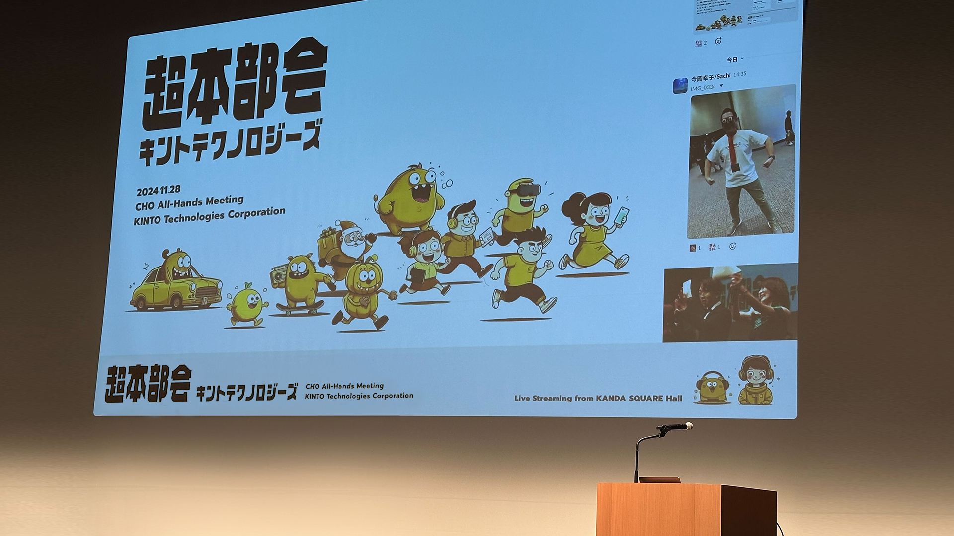
The logo for the CHO All-Hands Meeting was designed to reflect the event’s core values: initiative and connection. It wasn’t just about looking cool—it had to feel alive, welcoming, and true to the company culture. After talking with the art director, I settled on a concept that blended "free and fun" energy with a sense of teamwork. The event wanted to feel like a space where people could take initiative and connect naturally. That meant the logo had to feel energetic, not stiff or formal. To express that vibe, I explored “otaku culture x technology” as a theme. Since many attendees come from development and creative teams, anime, mecha, and manga elements felt natural. I tested ideas like robot details, comic-style speech bubbles, and digital typography. Sketching by hand helped me explore ideas without pressure, letting the design flow freely. Once the direction was clear, I moved to Illustrator to refine the design. I cleaned up the sketches, created several variations, and shared them with the art director. While many ideas were dropped, that trial-and-error process was key—each version taught me something about what worked and what didn’t. I then focused on the font, which is one of the most important parts of a logo. Instead of using existing fonts, I created a custom one. I adjusted letter spacing, reduced sharp edges, and made sure kanji and katakana looked balanced. The final font is smoother, more readable, and feels unified—changing significantly from the original red guidelines. The final logo balances playfulness and practicality. It works well in presentations, emails, and social posts. The mix of subculture and tech feels authentic, and the overall design is polished and consistent. This project proved that small choices—like font curves or spacing—can deeply shape how people feel about a brand.
Introduction
Hello! My name is K, and I work as a designer at KINTO Technologies. I usually work mainly on UI/UX design for e-commerce sites, but sometimes I also have the opportunity to work on communication design.
Back in November 2024, I was responsible for designing the logo that became the face of our internal event, the CHO All-Hands Meeting! Since this was a special opportunity, I would like to take this opportunity to casually introduce the behind-the-scenes aspects of the production and the points I paid particular attention to.
What is a Logo?
A logo is more than just decoration; it serves as the face of a brand or event.
At a glance, people can recognize it and think, "Oh, that's the event!" or "Hey, I've seen this before!" It plays a big role in shaping the impression it leaves on them.
Instead of just creating something because it seems cool, I ask myself, "What kind of vibe will this event have?" "What message is it trying to send?" "What impression do I want people to walk away with?" It was a good reminder of how important it is to design with intention.
Defining the Concept: Understanding the Core of the Event
First, I had a chat with the art director in charge of the event's overall artwork. As we clarified the event's purpose and key message, I started shaping the concept behind the logo.
The concept of the CHO All-Hands Meeting event was "initiative" and "connection."

- A space where everyone proactively connects with their colleagues
- A place where we truly feel that our company encourages taking initiative
- An energetic, lively atmosphere with colleagues that fuels our motivation for the next challenge
I wanted to capture all of that through a design that feels "free and fun," and had "an energetic vibe that brings people together."
Exploring Design Directions
The next phase was to find out what kind of visuals would fit the concept. How do I express "a design that feels free and fun," and "an energetic vibe that brings people together."? When I thought about this, one theme came to mind: "otaku culture x technology."
The event draws lots of people from development and creative teams. For many of them, things like anime, games, mecha, and manga are not only familiar, but also genuinely exciting. By blending that with a futuristic tech vibe, I felt we could create a world that feels even more open, energetic, and full of positive momentum.
Some visual elements we considered were:
- Elements of mecha, robots, and tokusatsu-inspired details: To bring in that mechanical, industrial edge.
- Manga and comic-style elements: To experiment with bold, energetic lettering and speech bubble shapes.
- Digital-style typography: To add a subtle futuristic vibe.
I started by sketching out rough ideas by hand, letting the concepts flow freely from there.

From Sketch to Digital
Once the direction became clear from the sketches, I moved into Illustrator to start digitizing the design.
- Cleaned up the rough drafts and created the base shape.
- From there, made several variations, each with subtle tweaks in nuance.
- Discussed with the art director which design best embodies the concept.
Of course, plenty of ideas didn't make the cut—but going through that trial-and-error process really reminded me how essential it is for creating great design.

Polishing the Details
Once the rough draft was locked in, it was time to move into the final phase. At this stage, I kept refining things, tweaking the details until everything felt just right.
And, one of the key elements that really shapes the impression of a logo is the font.
For example, rounded fonts can give off a soft, friendly vibe, while sharper fonts feel more sleek and polished. Even small differences like that can completely change the overall tone of the logo.
This time, instead of relying on existing fonts, I created an original font. While keeping the event's core themes—autonomy and interaction—in mind, I made adjustments with a focus on the following points:
- Improve readability: Adjust letter width, proportions, and spacing to make the text easier to read and give the overall design a cohesive feel.
- Refine curves: Reduce the number of paths to create a smoother, more polished shapes.
- Harmony between kanji and katakana: Be mindful of consistent shapes so the characters would feel balanced when placed together.
When compared to the original red guidelines, the final shape has changed significantly. This process really reminded me how even the smallest design choices, like font style and tiny shape tweaks, can greatly affect the impression a logo gives.

Finalizing the Logo: Balancing Playfulness and Versatility
And finally—the logo was complete!

- It strikes a nice balance between playful vibes and practical versatility, making it easy to use in all kinds of contexts.
- The mix of subculture and tech came through naturally in the design.
- By sticking to the shapes and fonts, the overall finish and quality really leveled up!
Summary
Logo design is something where even the tiniest details can totally change the impression it gives. This project reminded me how important it is to keep pushing until you hit that "This is it!" moment.
This time, I think I managed to go beyond just making "something that looks cool." I created a design that really "captures the spirit of the event and works across different contexts."
If this article sparks even a little inspiration or insight for someone out there, I'll be happy!

関連記事 | Related Posts





We are hiring!
Follow Us

KINTOテクノロジーズの最新情報をSNSで発信中!イベント・テックブログ更新情報もお届けします。